Transportation
Cross-Border
A preview-led transportation prompt for generating a polished AI-built interface.
by MotionSites View full prompt
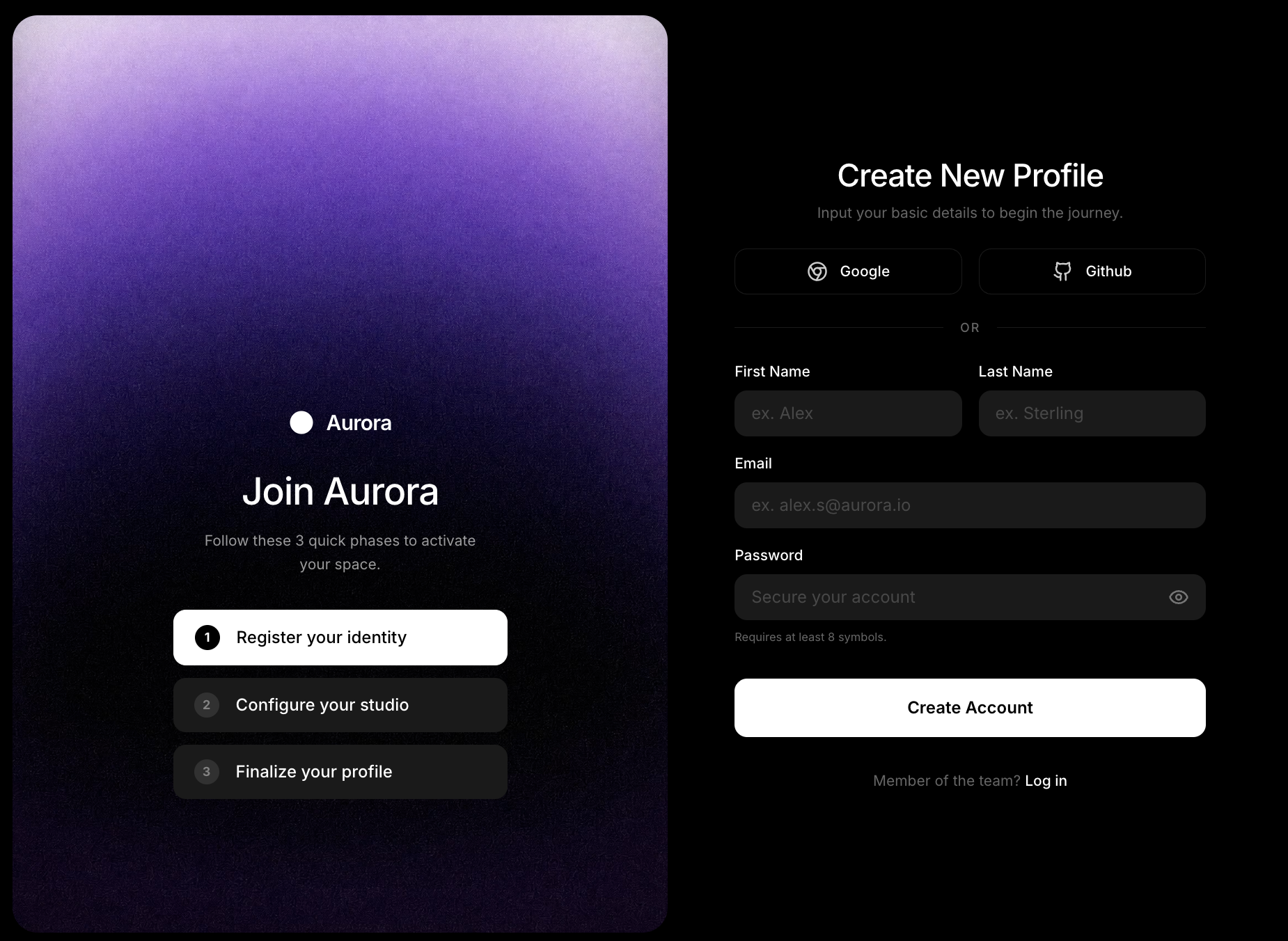
A preview-led sign up prompt for generating a polished AI-built interface.
Direct delivery
619 words · 49 linesPlease build a modern, two-column registration interface called "Aurora Sign Up". Use React, Tailwind CSS (v4), `motion/react` (for animations), and `lucide-react` (for icons). The app should be contained entirely in `App.tsx` and `index.css`. ### 1. Global Setup & CSS (`index.css`) - Import the "Inter" font from Google Fonts (weights 300, 400, 500, 600, 700). - Extend the Tailwind theme with `--font-sans: "Inter", ui-sans-serif, system-ui, sans-serif;` and a custom color: `--color-brand-gray: #1A1A1A`. - Apply base styles to the `body`: `@apply font-sans bg-black text-white antialiased;`. ### 2. Main Layout (`App.tsx` container) - The `<main>` element should have: `flex min-h-screen w-full bg-black selection:bg-white/30 p-2 transition-all duration-500`. - On `lg` breakpoints: `lg:h-screen lg:overflow-hidden lg:p-4`. - Split this container into a Left Column (Hero) and a Right Column (Form). ### 3. Left Column (Hero & Background Video) - Width on large screens should be exactly `w-[52%]`. It should be hidden on mobile/tablet and only visible `lg:flex`. - Styles: `relative flex-col items-center justify-end pb-32 px-12 rounded-3xl overflow-hidden shadow-2xl h-full`. - **Background Video**: Add an absolutely positioned `<video>` tag (`inset-0`, `w-full`, `h-full`, `object-cover`). It must have `autoPlay`, `muted`, `loop`, and `playsInline`. - **CRITICAL**: The `<source>` MUST be exactly `https://d8j0ntlcm91z4.cloudfront.net/user_38xzZboKViGWJOttwIXH07lWA1P/hf_20260506_081238_406ed0e3-5d83-436e-a512-0bbff7ec5b95.mp4` (`type="video/mp4"`). - **CRITICAL**: Do NOT add any dark overlay, gradient, or tint mask over the video. Let it play purely without overlays. - **Hero Content Container**: Place content over the video (`z-10 w-full max-w-xs space-y-8`). - **Animations**: Use `motion.div` for a staggered reveal. The container should transition `opacity: 0` to `1` with `staggerChildren: 0.15` and `delayChildren: 0.2`. Every child element inside should fade in and slide up (`y: 10` to `y: 0`, duration `0.5`). - **Brand/Logo**: A flex row with the `Circle` icon from Lucide (fill-white text-white) and the text "Aurora" (`text-xl font-semibold tracking-tight`). - **Heading Block**: "Join Aurora" (`text-4xl font-medium tracking-tight whitespace-nowrap`). Below it, a description: "Follow these 3 quick phases to activate your space." (`text-white/60 text-sm leading-relaxed px-4`). - **Steps**: Render a custom `<StepItem>` component three times. 1: "Register your identity" (active state) 2: "Configure your studio" 3: "Finalize your profile" ### 4. Right Column (Sign Up Form) - A container with `flex-1 flex flex-col items-center justify-center py-12 lg:py-6 px-4 sm:px-12 lg:px-16 xl:px-24 overflow-y-auto lg:overflow-hidden`. - **Animation**: Wrap the interior content in a `motion.div` that fades in (`opacity: 0` to `1`, `duration: 0.8`, `ease: "easeOut"`). Inner width `w-full max-w-xl`, spacing `space-y-8 lg:space-y-6 sm:space-y-10`. - **Header**: "Create New Profile" (`text-3xl font-medium tracking-tight`). Subtitle: "Input your basic details to begin the journey." (`text-white/40 text-sm`). - **Social Buttons**: A 2-column grid (`grid grid-cols-2 gap-4`). Render Google (`Chrome` icon) and Github (`Github` icon) using a `<SocialButton>` component. - **Divider**: A horizontal line (`border-white/10`) with the text "Or" in the center (`bg-black px-4 text-xs font-medium text-white/40 uppercase tracking-widest`). - **Form Layout**: - First Name and Last Name in a 2-column grid. - Email (full width). - Password (full width) with a custom `lucide-react` `Eye` toggle icon in the absolute right of the input, and a tiny helper text "Requires at least 8 symbols." - **Submit Button**: "Create Account" (`w-full h-14 bg-white text-black font-semibold rounded-xl hover:bg-white/90 active:scale-[0.98] mt-4`). - **Footer Link**: "Member of the team? Log in". ### 5. Reusable Components to Create Create these exact functional components at the bottom of the file: 1. **`<StepItem>`**: Takes `number`, `text`, and an optional `active` boolean. - If active: Apply `bg-white text-black border border-white`. The number circle is `bg-black text-white`. - If inactive: Apply `bg-brand-gray text-white border-none`. The number circle is `bg-white/10 text-white/40`. 2. **`<SocialButton>`**: Takes `icon` and `label`. Button has `bg-black border border-white/10 rounded-xl hover:bg-white/5`. 3. **`<InputGroup>`**: Takes `label`, `placeholder`, and `type`. The label is `text-sm font-medium text-white`. The input is `bg-brand-gray border-none rounded-xl h-11 px-4 text-white placeholder:text-white/20 focus:ring-2 focus:ring-white/20`. Ensure the final code uses `export default function App()` at the top.
Keep exploring
A preview-led transportation prompt for generating a polished AI-built interface.
A preview-led app prompt for generating a polished AI-built interface.
A preview-led travel prompt for generating a polished AI-built interface.

.webp)