.webp)
Features
Max Reed Portfolio
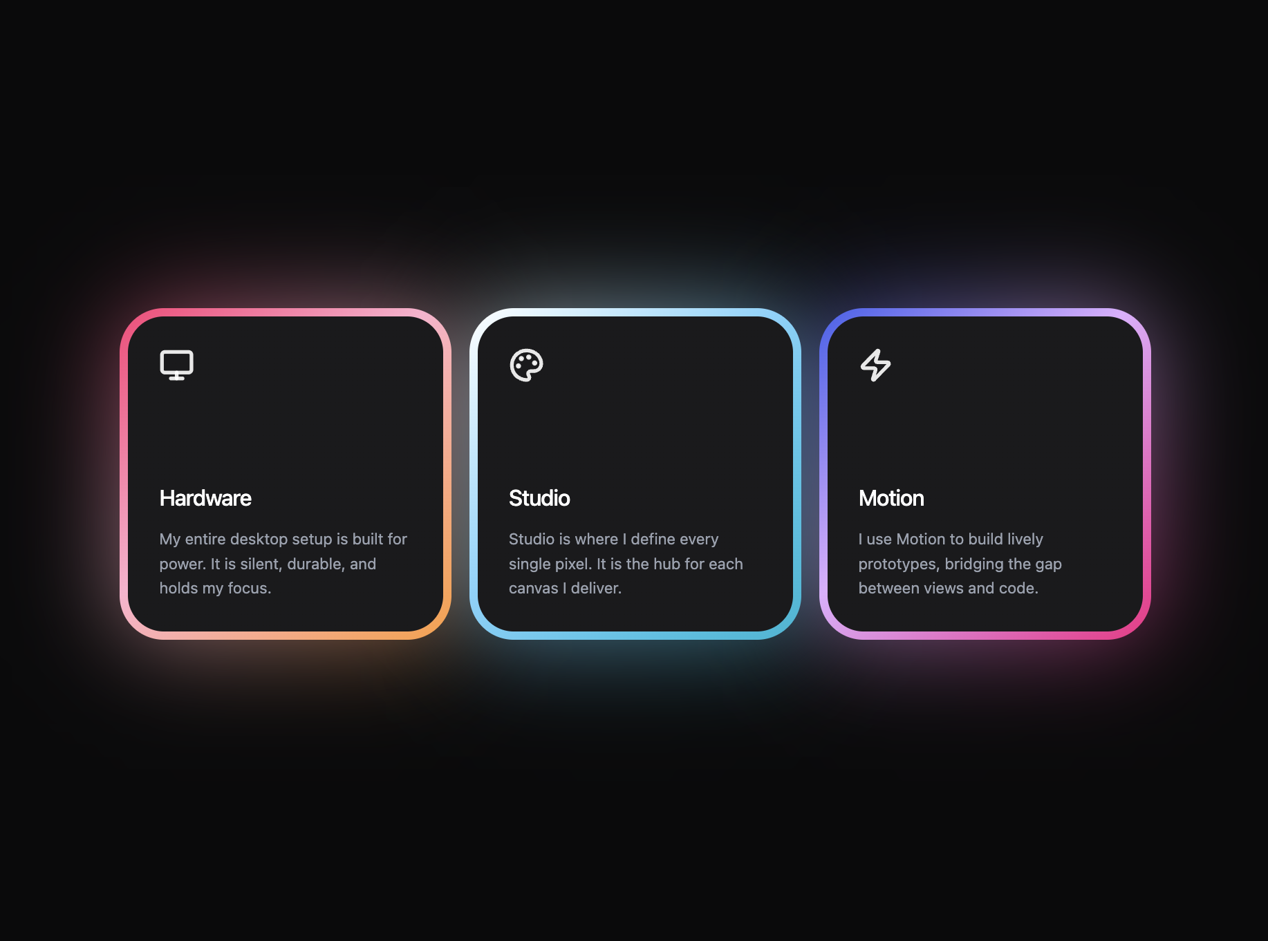
A preview-led features prompt for generating a polished AI-built interface.
by MotionSites View full prompt
.webp)
A preview-led blog prompt for generating a polished AI-built interface.
Direct delivery
558 words · 47 linesBuild a "Behind the Lens" photography blog section with the following exact specifications: **Layout and Structure:** - White background page, max-width 1200px, centered, 60px vertical padding, 20px horizontal padding - Header with: a small grey "Blog" badge (bg #f4f4f4, 8px border-radius), a large heading "Behind the lens" (64px, Outfit font, weight 500, letter-spacing -2.5px), a subtitle paragraph and a "View all posts" button side by side - Subtitle: "Thoughts, insights, and stories from my photography journey. Take a peek into my creative process and recent projects." (max-width 480px, #666 color, 18px, weight 500, opacity 0.8) - "View all posts" button: black bg, white text, 40px border-radius pill shape, 14px font, weight 600, scales 1.02 on hover **Featured Post (full-width card):** - 2-column grid (1fr 1fr), 20px border-radius, 1px solid #f0f0f0 border, min-height 520px, bg #fcfcfc - Left side: autoplaying looped muted video, object-fit cover, fills the entire area - Right side: 60px padding, contains a black "Must Read" pill badge (12px font, 20px border-radius), title in Outfit font 48px weight 500 (letter-spacing -1.5px), description in #666 at 17px, and a footer with author name and colored category badge pushed to the bottom via margin-top auto - Featured post data: title "Full-Frame vs. Crop Sensor: Which for Photography?", description "An honest look at the real-world differences between these camera systems to help you choose what's actually right for your photography needs.", author "By August Renner (c)", category "Gear" with color #7d1a4a - Featured video URL: `https://d8j0ntlcm91z4.cloudfront.net/user_38xzZboKViGWJOttwIXH07lWA1P/hf_20260507_155500_808e6fdd-761f-4acd-b3be-cb7e6e700def.mp4` **Blog Grid (3 standard cards):** - 3-column grid, 25px gap, below the featured post - Each card: video with 16/10 aspect ratio, 20px border-radius, title below (Outfit 17px weight 600) with a colored category badge aligned right - Card 1: "Finding Natural Light in Unexpected Places", category "Lighting" (#2c4c34), video: `https://d8j0ntlcm91z4.cloudfront.net/user_38xzZboKViGWJOttwIXH07lWA1P/hf_20260506_030111_a9e15665-d379-4a7f-8116-695bbe452ad1.mp4` - Card 2: "My Approach to Editing: Creating a Consistent Photography Style", category "Editing" (#a63e2d), video: `https://d8j0ntlcm91z4.cloudfront.net/user_38xzZboKViGWJOttwIXH07lWA1P/hf_20260508_064122_c4750c0e-7476-4b44-94a2-a85a65c63bf2.mp4` - Card 3: "Pricing Your Photography: Strategies That Work", category "Business" (#1a2b8c), video: `https://d8j0ntlcm91z4.cloudfront.net/user_38xzZboKViGWJOttwIXH07lWA1P/hf_20260507_154232_f8809bd2-a6c3-4a38-908d-2005e5b3cb3e.mp4` **Hover Interactions (on all video containers):** - Videos scale to 1.08 on hover with cubic-bezier(0.33, 1, 0.68, 1) over 0.5s - A dark overlay (rgba(0,0,0,0.25)) fades in over 0.4s on hover - A centered "+" icon inside a 70px circle (rgba(255,255,255,0.2) bg) scales from 0.7 to 1.0 on hover over 0.3s - White "L-shaped" corner brackets (12px, 1.5px border) in all 4 corners of each video, 15px inset from edges **Category Badges:** - Pill shape (20px border-radius), white text, 11px font, weight 600, 4px 12px padding, capitalized, background color matches each post's assigned color **Fonts:** - Google Fonts: Inter (400, 500, 600) for body text, Outfit (500, 600, 700) for headings and titles **Responsive:** - At 1024px: featured post becomes single column, grid becomes 2 columns, featured content padding 40px - At 768px: heading drops to 48px, header-bottom stacks vertically, grid becomes 1 column, featured title drops to 32px **Data Source:** - Store all blog post data (type, badge, title, description, author, category, category_color, image/video URL, display_order) in a Supabase `blog_posts` table - Fetch and render dynamically, ordered by display_order ascending - Enable RLS with public read access for anon and authenticated users **Tech Stack:** - React + TypeScript + Vite + Tailwind CSS (for base resets only, use custom CSS for the blog styles) - Supabase JS client for data fetching - All videos use autoPlay, loop, muted, playsInline attributes
Keep exploring
A preview-led features prompt for generating a polished AI-built interface.
A preview-led features section prompt for generating a polished AI-built interface.
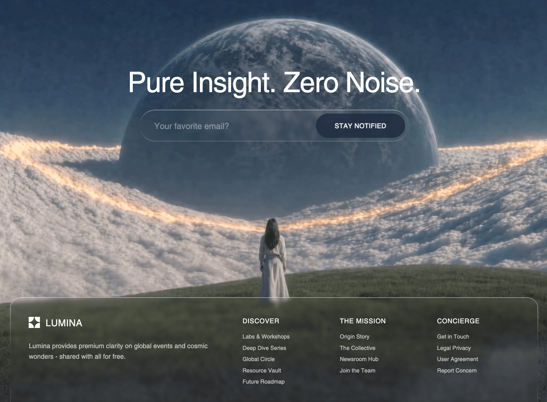
A preview-led footer section prompt for generating a polished AI-built interface.