.webp)
Features
Max Reed Portfolio
A preview-led features prompt for generating a polished AI-built interface.
by MotionSites View full prompt
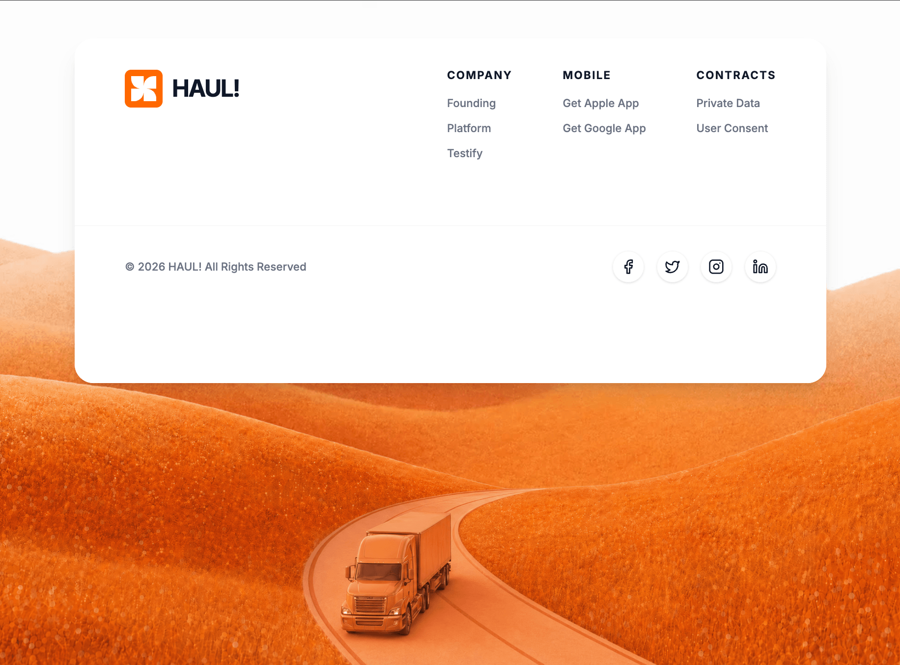
A preview-led footer section prompt for generating a polished AI-built interface.
Direct delivery
621 words · 39 linesBuild a React functional component using Tailwind CSS, `motion/react` for animations, and `lucide-react` for icons.
**1. Typography & Setup:**
- Import the "Inter" font from Google Fonts (weights 400, 500, 600, 700) and set it as the default sans-serif font in the Tailwind config/CSS.
- The overall background of the page should be `#f8f9fa`.
**2. Top Spacer Section (View Below):**
- Create a section at the top of the page. Height should be `50vh` (on mobile/lg) and `30vh` (on md screens).
- Background color: `#FDFDFD`.
- Center a text element that says "View Below". The text should be `text-gray-300`, small font, bold, uppercase, with wide `tracking-[0.5em]`.
- Animate this text with Framer Motion to fade in from `opacity: 0` to `opacity: 1`.
**3. Main Parallax Container:**
- Below the spacer, create a main full-viewport-height (`h-screen`) section.
- Set its background image to: `https://images.higgs.ai/?default=1&output=webp&url=https%3A%2F%2Fd8j0ntlcm91z4.cloudfront.net%2Fuser_38xzZboKViGWJOttwIXH07lWA1P%2Fhf_20260430_115327_3f256636-9e63-4885-8d0b-09317dc2b0a5.png&w=1280&q=85`
- Make sure the background covers the container (`bg-cover bg-center`) and set `overflow-hidden` with `relative` positioning.
- Set up a Framer Motion `useScroll` target on this container. Map the `scrollYProgress` from `[0, 1]` to `[-50, 150]` using `useTransform`. Apply this transformed y-value to the foreground truck image layer (described below).
**4. The Top-Aligned Footer Card:**
- Position a container `absolute top-0 w-full` inside the main parallax section. Give it top padding (`pt-12` mobile/lg, `pt-24` tablet).
- Inside, create a card constrained to `max-w-7xl mx-auto`.
- Card Styling: `bg-white/95`, `backdrop-blur-sm`, `shadow-xl`, rounded corners (`rounded-2xl` mobile, `rounded-3xl` desktop), `overflow-hidden`.
- Animation: The card should slide down and fade in (`initial={{ opacity: 0, y: -20 }}`, `animate={{ opacity: 1, y: 0 }}`, duration 0.8s easeOut).
- **Footer Content (Top Half):**
- Use a flex row layout (flex-col on mobile, flex-row on md+) with spread space.
- **Logo Area**: Include an orange square (`bg-orange-500`, 40x40px mobile, 48x48px desktop, rounded-lg, shadow-inner, p-2). Inside the square, place an SVG with viewBox "0 0 256 256" and this exact white path: `d="M 228 0 C 172.772 0 128 44.772 128 100 L 128 0 L 0 0 L 0 28 C 0 83.228 44.772 128 100 128 L 0 128 L 0 256 L 28 256 C 83.228 256 128 211.228 128 156 L 128 256 L 256 256 L 256 228 C 256 172.772 211.228 128 156 128 L 256 128 L 256 0 Z"`. Next to the logo block, add the text "HAUL!" (`text-gray-900`, 2xl/3xl, font-bold, tracking-tighter).
- **Links Area**: Display 3 columns of links using flex. Layout: `Company` (Founding, Platform, Testify), `Mobile` (Get Apple App, Get Google App), `Contracts` (Private Data, User Consent). Section headers should be uppercase, tracking-widest, text-sm, bold. Link items should be gray-500, font-medium, and hover to `orange-600` with transition.
- **Footer Content (Bottom Bar):**
- Add a top border (`border-gray-100`) and use a solid white background (`bg-white`).
- Layout: flex, space between, aligning text to the left and social icons to the right.
- Text: "© 2026 HAUL! All Rights Reserved" (text-sm, gray-500, medium).
- **Social Icons**: Map through an array of icons imported from `lucide-react`: Facebook, Twitter, Instagram, Linkedin (w-5 h-5). Wrap them in `a` tags shaped as 40x40px circles with `border-gray-100`. On hover, they should turn `bg-orange-500` with white text and an `orange-500` border (transition all duration-300).
**5. Background Truck Parallax Layer:**
- Add a `motion.div` placed absolutely at the bottom of the container (`absolute inset-x-0 bottom-0 h-full`).
- Add standard pointer-events-none and z-20.
- Ensure the `y` axis style is tied to the `useTransform` created in step 3 so it scrolls at a different speed than the background.
- Inside, place an image with `src="https://roof-wish-40038865.figma.site/_components/v2/f31fd17907ce60745d45e83a61d44fd3810d5f25/truck_1.8c4bff83.png"`.
- Image styling: `w-full h-full object-contain object-bottom origin-bottom`. Add scale responsive classes (`scale-[1.5]` mobile, `scale-110` sm, `scale-[2.0]` md, `scale-105` lg) to ensure the truck fits properly on various screen widths.Keep exploring
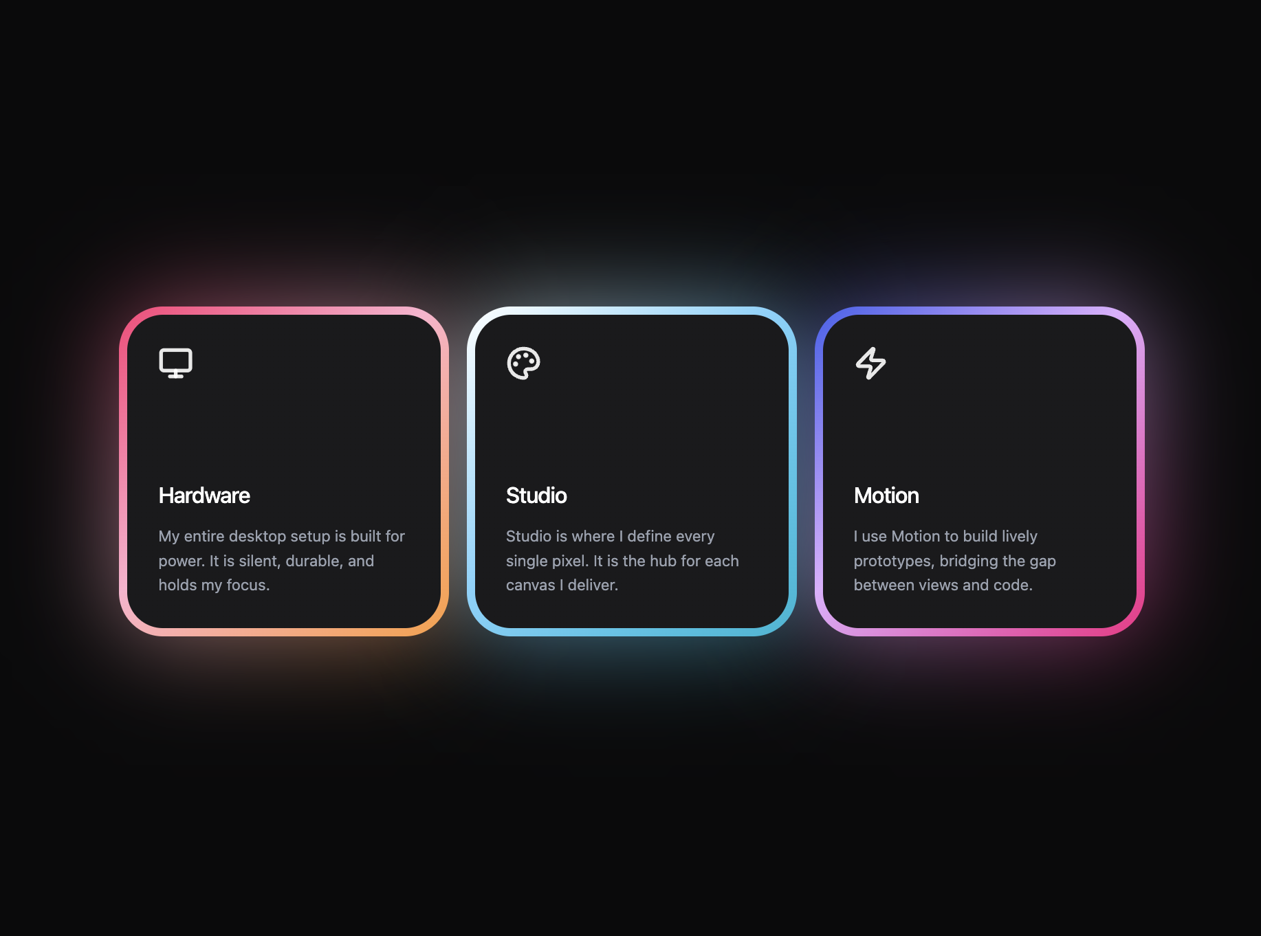
A preview-led features prompt for generating a polished AI-built interface.
A preview-led features section prompt for generating a polished AI-built interface.
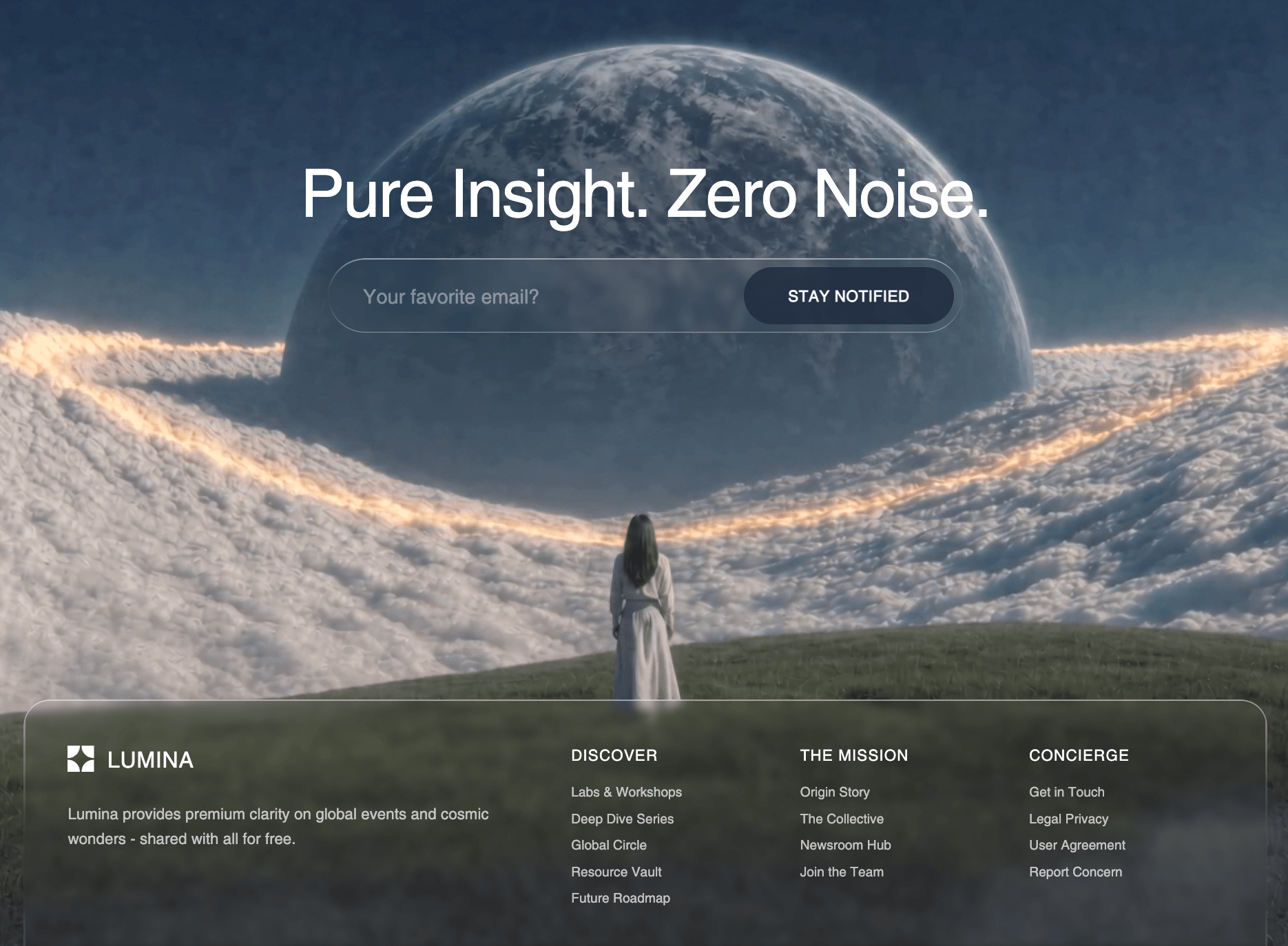
A preview-led footer section prompt for generating a polished AI-built interface.

%20and%20set%20it%20as%20the%20default%20sans-serif%20font%20in%20the%20Tailwind%20config%2FCSS.%0A-%20The%20overall%20background%20of%20the%20page%20should%20be%20%60%23f8f9fa%60.%0A%0A**2.%20Top%20Spacer%20Section%20(View%20Below)%3A**%0A-%20Create%20a%20section%20at%20the%20top%20of%20the%20page.%20Height%20should%20be%20%6050vh%60%20(on%20mobile%2Flg)%20and%20%6030vh%60%20(on%20md%20screens).%0A-%20Background%20color%3A%20%60%23FDFDFD%60.%0A-%20Center%20a%20text%20element%20that%20says%20%22View%20Below%22.%20The%20text%20should%20be%20%60text-gray-300%60%2C%20small%20font%2C%20bold%2C%20uppercase%2C%20with%20wide%20%60tracking-%5B0.5em%5D%60.%0A-%20Animate%20this%20text%20with%20Framer%20Motion%20to%20fade%20in%20from%20%60opacity%3A%200%60%20to%20%60opacity%3A%201%60.%0A%0A**3.%20Main%20Parallax%20Container%3A**%0A-%20Below%20the%20spacer%2C%20create%20a%20main%20full-viewport-height%20(%60h-screen%60)%20section.%0A-%20Set%20its%20background%20image%20to%3A%20%60https%3A%2F%2Fimages.higgs.ai%2F%3Fdefault%3D1%26output%3Dwebp%26url%3Dhttps%253A%252F%252Fd8j0ntlcm91z4.cloudfront.net%252Fuser_38xzZboKViGWJOttwIXH07lWA1P%252Fhf_20260430_115327_3f256636-9e63-4885-8d0b-09317dc2b0a5.png%26w%3D1280%26q%3D85%60%0A-%20Make%20sure%20the%20background%20covers%20the%20container%20(%60bg-cover%20bg-center%60)%20and%20set%20%60overflow-hidden%60%20with%20%60relative%60%20positioning.%0A-%20Set%20up%20a%20Framer%20Motion%20%60useScroll%60%20target%20on%20this%20container.%20Map%20the%20%60scrollYProgress%60%20from%20%60%5B0%2C%201%5D%60%20to%20%60%5B-50%2C%20150%5D%60%20using%20%60useTransform%60.%20Apply%20this%20transformed%20y-value%20to%20the%20foreground%20truck%20image%20layer%20(described%20below).%0A%0A**4.%20The%20Top-Aligned%20Footer%20Card%3A**%0A-%20Position%20a%20container%20%60absolute%20top-0%20w-full%60%20inside%20the%20main%20parallax%20section.%20Give%20it%20top%20padding%20(%60pt-12%60%20mobile%2Flg%2C%20%60pt-24%60%20tablet).%0A-%20Inside%2C%20create%20a%20card%20constrained%20to%20%60max-w-7xl%20mx-auto%60.%0A-%20Card%20Styling%3A%20%60bg-white%2F95%60%2C%20%60backdrop-blur-sm%60%2C%20%60shadow-xl%60%2C%20rounded%20corners%20(%60rounded-2xl%60%20mobile%2C%20%60rounded-3xl%60%20desktop)%2C%20%60overflow-hidden%60.%0A-%20Animation%3A%20The%20card%20should%20slide%20down%20and%20fade%20in%20(%60initial%3D%7B%7B%20opacity%3A%200%2C%20y%3A%20-20%20%7D%7D%60%2C%20%60animate%3D%7B%7B%20opacity%3A%201%2C%20y%3A%200%20%7D%7D%60%2C%20duration%200.8s%20easeOut).%0A-%20**Footer%20Content%20(Top%20Half)%3A**%0A%20%20-%20Use%20a%20flex%20row%20layout%20(flex-col%20on%20mobile%2C%20flex-row%20on%20md%2B)%20with%20spread%20space.%0A%20%20-%20**Logo%20Area**%3A%20Include%20an%20orange%20square%20(%60bg-orange-500%60%2C%2040x40px%20mobile%2C%2048x48px%20desktop%2C%20rounded-lg%2C%20shadow-inner%2C%20p-2).%20Inside%20the%20square%2C%20place%20an%20SVG%20with%20viewBox%20%220%200%20256%20256%22%20and%20this%20exact%20white%20path%3A%20%60d%3D%22M%20228%200%20C%20172.772%200%20128%2044.772%20128%20100%20L%20128%200%20L%200%200%20L%200%2028%20C%200%2083.228%2044.772%20128%20100%20128%20L%200%20128%20L%200%20256%20L%2028%20256%20C%2083.228%20256%20128%20211.228%20128%20156%20L%20128%20256%20L%20256%20256%20L%20256%20228%20C%20256%20172.772%20211.228%20128%20156%20128%20L%20256%20128%20L%20256%200%20Z%22%60.%20Next%20to%20the%20logo%20block%2C%20add%20the%20text%20%22HAUL!%22%20(%60text-gray-900%60%2C%202xl%2F3xl%2C%20font-bold%2C%20tracking-tighter).%0A%20%20-%20**Links%20Area**%3A%20Display%203%20columns%20of%20links%20using%20flex.%20Layout%3A%20%60Company%60%20(Founding%2C%20Platform%2C%20Testify)%2C%20%60Mobile%60%20(Get%20Apple%20App%2C%20Get%20Google%20App)%2C%20%60Contracts%60%20(Private%20Data%2C%20User%20Consent).%20Section%20headers%20should%20be%20uppercase%2C%20tracking-widest%2C%20text-sm%2C%20bold.%20Link%20items%20should%20be%20gray-500%2C%20font-medium%2C%20and%20hover%20to%20%60orange-600%60%20with%20transition.%0A-%20**Footer%20Content%20(Bottom%20Bar)%3A**%0A%20%20-%20Add%20a%20top%20border%20(%60border-gray-100%60)%20and%20use%20a%20solid%20white%20background%20(%60bg-white%60).%0A%20%20-%20Layout%3A%20flex%2C%20space%20between%2C%20aligning%20text%20to%20the%20left%20and%20social%20icons%20to%20the%20right.%20%0A%20%20-%20Text%3A%20%22%C2%A9%202026%20HAUL!%20All%20Rights%20Reserved%22%20(text-sm%2C%20gray-500%2C%20medium).%0A%20%20-%20**Social%20Icons**%3A%20Map%20through%20an%20array%20of%20icons%20imported%20from%20%60lucide-react%60%3A%20Facebook%2C%20Twitter%2C%20Instagram%2C%20Linkedin%20(w-5%20h-5).%20Wrap%20them%20in%20%60a%60%20tags%20shaped%20as%2040x40px%20circles%20with%20%60border-gray-100%60.%20On%20hover%2C%20they%20should%20turn%20%60bg-orange-500%60%20with%20white%20text%20and%20an%20%60orange-500%60%20border%20(transition%20all%20duration-300).%0A%0A**5.%20Background%20Truck%20Parallax%20Layer%3A**%0A-%20Add%20a%20%60motion.div%60%20placed%20absolutely%20at%20the%20bottom%20of%20the%20container%20(%60absolute%20inset-x-0%20bottom-0%20h-full%60).%0A-%20Add%20standard%20pointer-events-none%20and%20z-20.%0A-%20Ensure%20the%20%60y%60%20axis%20style%20is%20tied%20to%20the%20%60useTransform%60%20created%20in%20step%203%20so%20it%20scrolls%20at%20a%20different%20speed%20than%20the%20background.%0A-%20Inside%2C%20place%20an%20image%20with%20%60src%3D%22https%3A%2F%2Froof-wish-40038865.figma.site%2F_components%2Fv2%2Ff31fd17907ce60745d45e83a61d44fd3810d5f25%2Ftruck_1.8c4bff83.png%22%60.%0A-%20Image%20styling%3A%20%60w-full%20h-full%20object-contain%20object-bottom%20origin-bottom%60.%20Add%20scale%20responsive%20classes%20(%60scale-%5B1.5%5D%60%20mobile%2C%20%60scale-110%60%20sm%2C%20%60scale-%5B2.0%5D%60%20md%2C%20%60scale-105%60%20lg)%20to%20ensure%20the%20truck%20fits%20properly%20on%20various%20screen%20widths.&model=Seedance%202.5%20Pro)