.webp)
Features
Max Reed Portfolio
A preview-led features prompt for generating a polished AI-built interface.
by MotionSites View full prompt
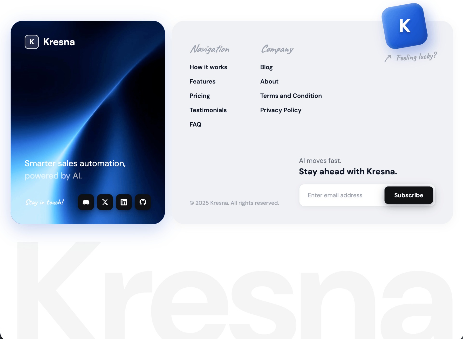
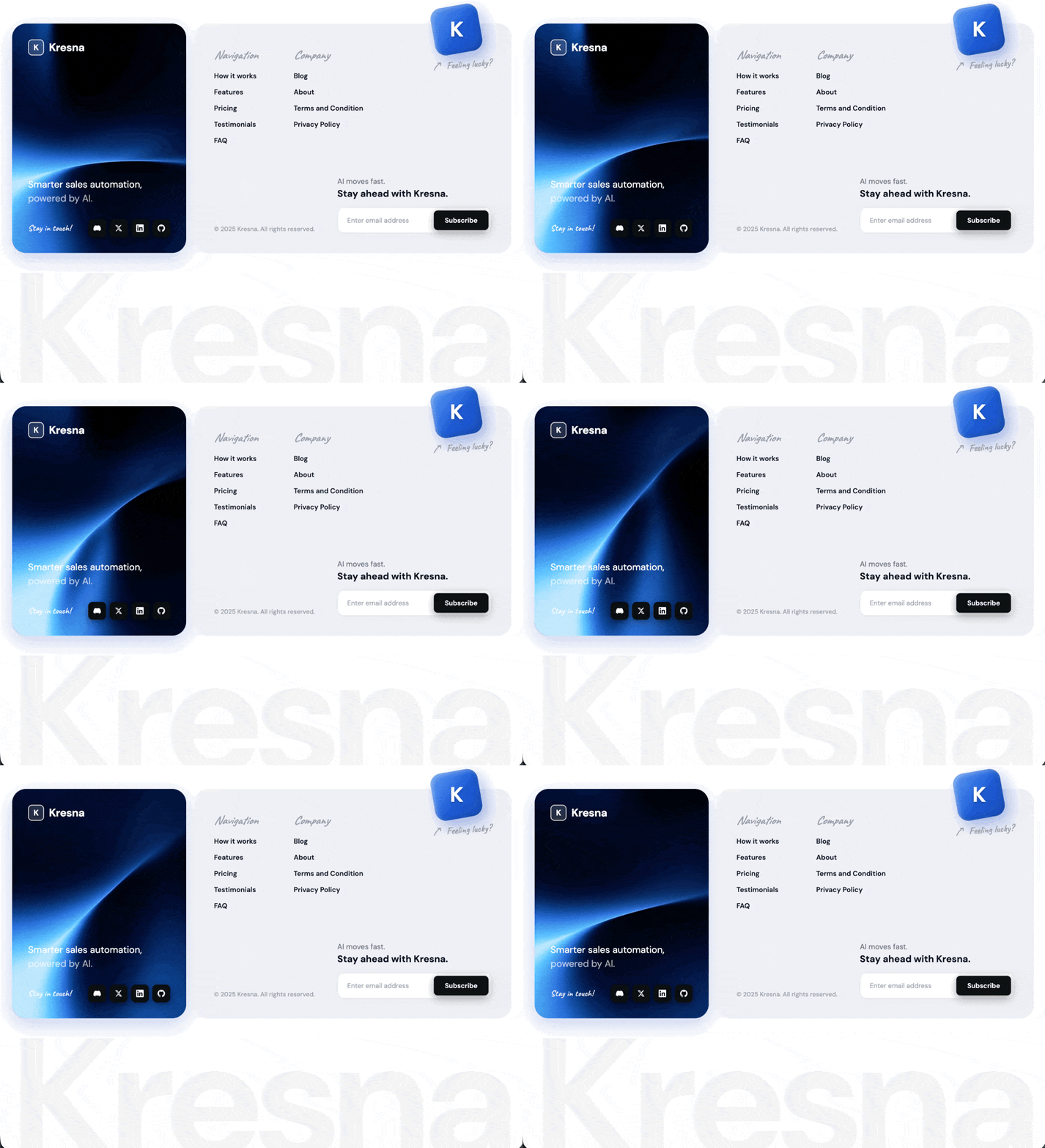
A preview-led footer section prompt for generating a polished AI-built interface.
Direct delivery
1106 words · 177 linesBuild a single-file HTML footer component called Kresna — a sales-automation SaaS brand. The deliverable is one self-contained .html file with inline <style> and inline <script>. Render it inside a <section class="footer-section"> on a white page (body { background: #ffffff; padding: 48px 24px; }).
Fonts
Load from Google Fonts in the <head>:
DM Sans — weights 400, 500, 600, 700 (body, nav links, buttons, headings, watermark)
Caveat — weights 500, 600, 700 (handwritten accents: "Stay in touch!", "Feeling lucky?", column titles "Navigation"/"Company")
Default body font: 'DM Sans', sans-serif. Body color #2d3148.
Use *, *::before, *::after { box-sizing: border-box; margin: 0; padding: 0; }.
Layout structure
A .footer-wrapper with max-width: 1150px, centered, CSS grid grid-template-columns: 350px 1fr, gap: 16px, align-items: stretch. Two cards side by side:
Left card — .footer-left (video background)
Position relative, min-height: 340px, border-radius: 28px, padding: 32px, overflow: hidden
Box shadow: 0 12px 40px rgba(21, 76, 189, 0.25)
Fallback background: #1e4fc0
Flex column, justify-content: space-between
Contains, in order:
A <video class="footer-left-video" autoplay muted loop playsinline preload="auto"> with <source src="https://d8j0ntlcm91z4.cloudfront.net/user_38xzZboKViGWJOttwIXH07lWA1P/hf_20260503_104800_bc43ae09-f494-43e3-97d7-2f8c1692cfd7.mp4" type="video/mp4" />. Style: position: absolute; inset: 0; width: 100%; height: 100%; object-fit: cover; z-index: 0; pointer-events: none;. No overlays, no tints, no noise texture.
.footer-logo — flex row, gap: 10px, position: relative; z-index: 1. Contains:
.footer-logo-mark — a 32×32 rounded square (border-radius: 8px), background: rgba(255,255,255,0.15), border: 1.5px solid rgba(255,255,255,0.85), centered bold "K" letter inside (DM Sans, 16px, weight 700, white, letter-spacing: -0.02em)
<span class="footer-logo-name">Kresna</span> — DM Sans, 22px, weight 700, white, letter-spacing: -0.02em
.footer-tagline-container — margin-top: auto; margin-bottom: 28px, z-index: 1. Contains .footer-tagline (19px, weight 400, white, line-height: 1.45) with text:
Smarter sales automation,<br>
<span>powered by AI.</span>
The inner `<span>` uses `color: rgba(255, 255, 255, 0.65)`.
4. .footer-social-row — flex row, justify-content: space-between, align-items: center, gap: 12px, z-index: 1. Contains:
- .footer-social-label — Caveat, 17px, weight 600, color rgba(255,255,255,0.9), letter-spacing: 0.3px, text: "Stay in touch!"
- .footer-social-icons — flex row, gap: 7px. Four .social-icon divs, each 36×36, border-radius: 9px, background: #0e1014, centered 15×15 white SVG, box shadow 0 6px 18px rgba(0,0,0,0.35), 0 2px 6px rgba(0,0,0,0.2). Hover: background: #000, transform: translateY(-2px), deeper shadow, transition: background 0.2s, transform 0.15s, box-shadow 0.2s. Icons in order: Discord, X (Twitter), LinkedIn, GitHub — use the official brand path d= strings for each in a <svg viewBox="0 0 24 24">.
Right card — .footer-right (light gray)
background: #f0f1f5, border-radius: 28px, padding: 40px, overflow: visible, box-shadow: 0 4px 20px rgba(0,0,0,0.04)
Flex column, justify-content: space-between, position relative
Contains:
Floating "Feeling lucky?" badge — .footer-lucky-graphic
Absolutely positioned, top: -36px; right: 40px, z-index: 10, flex column, align-items: flex-start, gap: 6px. Overflows above the top edge of the card.
.lucky-cube — 96×96, border-radius: 22px, transform: rotate(-10deg), gradient linear-gradient(135deg, #5b9ffb 0%, #1e5dd7 55%, #1448be 100%), layered shadows:
inset 3px 3px 8px rgba(255,255,255,0.35),
inset -3px -3px 12px rgba(0,0,0,0.18),
8px 14px 28px rgba(20,72,200,0.35)
Inside, a <span class="lucky-cube-mark">K</span>: DM Sans, 42px, weight 700, white, letter-spacing: -0.04em, transform: rotate(10deg) (counter-rotates the cube), text-shadow: 0 3px 6px rgba(0,0,0,0.25), line-height: 1.
.lucky-text-row — flex row, gap: 6px, align-items: center, transform: rotate(-4deg), margin-top: 4px. Contains:
.lucky-arrow — 22×22 inline SVG, color: #9ca3af. SVG content: a curved hand-drawn arrow:
html <svg viewBox="0 0 24 24" xmlns="http://www.w3.org/2000/svg">
<path d="M3 20 C 6 14, 10 9, 18 5" />
<path d="M18 5 L 12 5" />
<path d="M18 5 L 18 11" />
</svg>
SVG paths: `stroke: currentColor; fill: none; stroke-width: 2; stroke-linecap: round; stroke-linejoin: round`.
.lucky-text — Caveat, 20px, weight 600, color #9ca3af, white-space: nowrap, text: "Feeling lucky?"
Top — .footer-right-top with .footer-nav-cols
Flex row, gap: 72px, padding-top: 8px. Two .footer-col columns:
Column titles (.footer-col-title): Caveat, 24px, weight 600, italic, color #9ca3af, margin-bottom: 18px
Links (.footer-col a): block, DM Sans, 14px, weight 600, color #111827, margin-bottom: 14px, no underline, hover color #1f65d6, transition: color 0.2s
Column 1 — title "Navigation", links: How it works, Features, Pricing, Testimonials, FAQ
Column 2 — title "Company", links: Blog, About, Terms and Condition, Privacy Policy
Bottom — .footer-bottom
Flex row, align-items: flex-end, justify-content: space-between, margin-top: 48px. Contains:
.footer-copyright — DM Sans, 12.5px, weight 500, color #9ca3af, text: "© 2025 Kresna. All rights reserved."
.footer-cta-mini — flex column, gap: 14px, contains:
<h4> — 15px, weight 400, color #6b7280, line-height: 1.45, with text:
AI moves fast.<br><strong>Stay ahead with Kresna.</strong>
The `<strong>` is block-level, 19px, weight 700, color `#111827`.
.footer-subscribe-row — flex row, width: 310px, background: #fff, border: 1px solid #e5e7eb, border-radius: 12px, padding: 5px, box-shadow: 0 2px 10px rgba(0,0,0,0.04). Contains:
<input type="email" placeholder="Enter email address"> — flex 1, padding: 11px 14px, transparent, no border, DM Sans 13.5px, color #111827, placeholder #9ca3af
<button type="button">Subscribe</button> — padding: 11px 22px, background: #111214, white text, DM Sans 13.5px weight 600, border-radius: 8px, shadow 0 6px 20px rgba(0,0,0,0.28), 0 2px 8px rgba(0,0,0,0.15). Hover: background: #000, deeper shadow, transform: translateY(-1px), transition: background 0.2s, box-shadow 0.2s, transform 0.15s.
Watermark — .footer-watermark (sits outside .footer-wrapper but inside the section)
A massive faded "Kresna" wordmark that scales fluidly to the full footer wrapper width with the visible glyph edges flush against the container edges.
CSS:
css.footer-watermark {
max-width: 1150px;
margin: -60px auto 0;
pointer-events: none;
user-select: none;
position: relative;
z-index: 0;
line-height: 0;
}
.footer-watermark svg {
display: block;
width: 100%;
height: auto;
overflow: visible;
}
.footer-watermark text {
font-family: 'DM Sans', sans-serif;
font-weight: 700;
letter-spacing: -0.03em;
fill: rgba(0, 0, 0, 0.04);
}
HTML:
html<div class="footer-watermark" aria-hidden="true">
<svg id="watermarkSvg" viewBox="62 95 876 175" preserveAspectRatio="xMidYMid meet" xmlns="http://www.w3.org/2000/svg">
<text id="watermarkText" x="500" y="240" text-anchor="middle" font-size="320">Kresna</text>
</svg>
</div>
Inline JS at the end of the section measures the rendered text bounding box with getBBox() and updates the SVG viewBox so the visible glyph edges sit flush against the container — runs after document.fonts.ready and on resize:
html<script>
function fitWatermark() {
const svg = document.getElementById('watermarkSvg');
const text = document.getElementById('watermarkText');
if (!svg || !text) return;
try {
const bbox = text.getBBox();
svg.setAttribute('viewBox',
`${bbox.x} ${bbox.y} ${bbox.width} ${bbox.height}`);
} catch (e) {}
}
if (document.fonts && document.fonts.ready) {
document.fonts.ready.then(fitWatermark);
} else {
window.addEventListener('load', fitWatermark);
}
window.addEventListener('resize', fitWatermark);
</script>
Responsive breakpoints
@media (max-width: 860px):
.footer-wrapper becomes grid-template-columns: 1fr
.footer-left min-height: auto, gap: 40px
@media (max-width: 560px):
.footer-right padding: 24px
.footer-nav-cols gap: 40px
.footer-bottom flex-direction: column, align-items: flex-start, gap: 24px
.footer-subscribe-row width: 100%
.footer-lucky-graphic right: 12px, top: -28px
.lucky-cube width: 72px, height: 72px
.lucky-cube-mark scaled proportionally if needed
Animations / transitions
No keyframe animations. All motion is hover-driven via CSS transition:
Social icons: background, transform, box-shadow on hover
Subscribe button: background, box-shadow, lift on hover
Nav links: color shift on hover
The video on the left card autoplays, loops, muted, plays inline (no controls).
Final markup order inside <section class="footer-section">
<section class="footer-section">
<div class="footer-wrapper">
<div class="footer-left"> [video, logo, tagline, social row] </div>
<div class="footer-right"> [floating lucky badge, nav cols, bottom row] </div>
</div>
<div class="footer-watermark"> [SVG] </div>
<script> [fitWatermark] </script>
</section>Keep exploring
A preview-led features prompt for generating a polished AI-built interface.
A preview-led features section prompt for generating a polished AI-built interface.
A preview-led footer section prompt for generating a polished AI-built interface.