.webp)
Features
Max Reed Portfolio
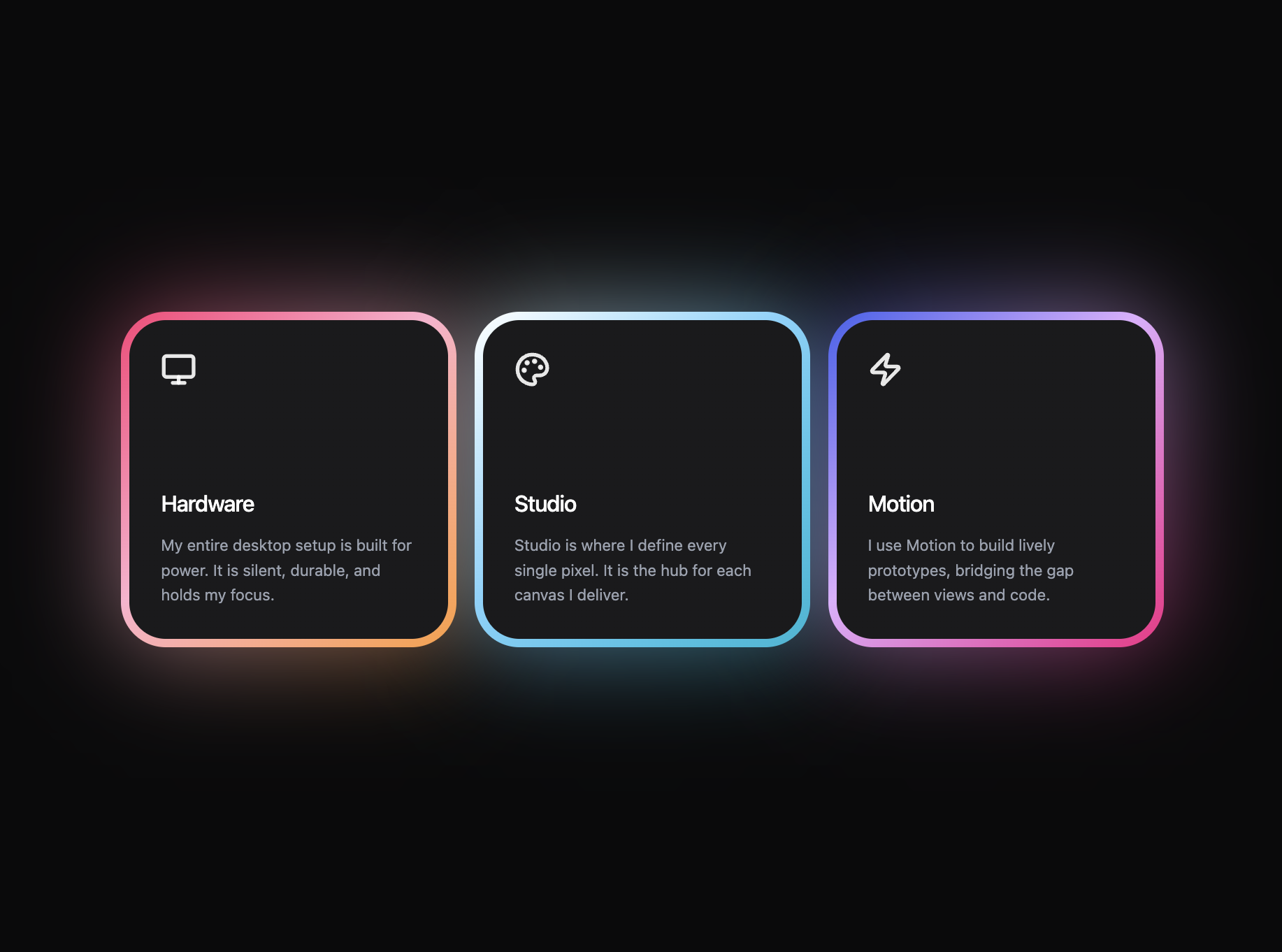
A preview-led features prompt for generating a polished AI-built interface.
by MotionSites View full prompt
.webp)
A preview-led about prompt for generating a polished AI-built interface.
Direct delivery
971 words · 101 lines--
**Prompt to recreate the About section:**
> Build a full-viewport "About the Founders" section using React with Tailwind CSS and lucide-react for icons. This is a single `<section>` with the following exact specifications:
>
> **Section container:**
> - `id="about"`
> - Background color: `#F0F5F7`
> - `min-height: 100vh`
> - Position relative
> - Padding: `py-20 sm:py-28 px-6 sm:px-10`
> - Uses `flex flex-col justify-center` to vertically center content
>
> **Inner wrapper:**
> - `max-w-7xl mx-auto`
>
> **Top row -- heading + description (side by side on desktop):**
> - A flex container: `flex flex-col lg:flex-row items-start justify-between gap-10 lg:gap-20`
> - All text color: `#154359`
>
> **Left side -- Section heading:**
> - `<h2>` with text `About` on line 1, `the founders` on line 2 (separated by `<br />`)
> - Uses custom font class `.font-firs` (font-family: `'TT Firs Neue', 'Inter', system-ui, sans-serif`)
> - Font sizes: `text-[36px] sm:text-[48px] lg:text-[54px]`
> - `font-semibold uppercase tracking-tight leading-[0.95]`
>
> **Right side -- Description block:**
> - `flex flex-col max-w-xl`
> - Text container: `text-[17px] sm:text-[18px] leading-[1.5]`, color `#154359`
> - Paragraph 1: `"Launchex.Hub is a platform that is part of a portfolio of companies Launchex, for sourcing and showcasing groundbreaking innovations."`
> - Paragraph 2: `"Launchex.Hub's mission is to offer every local-language innovator the chance to reshape our world with their pioneering creation."` -- with `mt-4` spacing
> - Below paragraphs, an external link:
> - `<a>` tag pointing to `https://base.launchex.vc/`, opens in new tab (`target="_blank" rel="noreferrer"`)
> - `group inline-flex items-center gap-4 mt-6 text-[14px] font-medium`, color `#154359`
> - Text: `"Launchex.Hub website"`
> - Next to it, an icon button: `flex items-center justify-center w-8 h-8 border`, border color `#154359`, with `transition-transform group-hover:-translate-y-0.5`
> - The icon button uses a chamfered clip-path: `polygon(8px 0, 100% 0, 100% calc(100% - 8px), calc(100% - 8px) 100%, 0 100%, 0 8px)`
> - Inside the button: `<ArrowUpRight>` from lucide-react, `w-3.5 h-3.5`, `strokeWidth={2}`
>
> **Stats cards grid (below the heading row):**
> - `mt-14 grid grid-cols-1 md:grid-cols-2 lg:grid-cols-3 gap-5`
> - Contains 3 stat cards with this exact data:
> 1. value: `"7+ years"`, text: `"Launchex has served the market, guiding ventures and their journeys"`, image: `https://images.higgs.ai/?default=1&output=webp&url=https%3A%2F%2Fd8j0ntlcm91z4.cloudfront.net%2Fuser_38xzZboKViGWJOttwIXH07lWA1P%2Fhf_20260514_154203_6c6f94dc-a07e-4ba5-8688-106f01ccd2c8.png&w=1280&q=85`, offset: false
> 2. value: `"15000+"`, text: `"innovation ventures moved through the Launchex pipeline"`, image: `https://images.higgs.ai/?default=1&output=webp&url=https%3A%2F%2Fd8j0ntlcm91z4.cloudfront.net%2Fuser_38xzZboKViGWJOttwIXH07lWA1P%2Fhf_20260514_154151_45c62c60-3bcc-4f21-8f9d-03722ebb5df8.png&w=1280&q=85`, offset: true
> 3. value: `"120+"`, text: `"accelerator sessions delivered by Launchex across Eastern Europe"`, image: `https://images.higgs.ai/?default=1&output=webp&url=https%3A%2F%2Fd8j0ntlcm91z4.cloudfront.net%2Fuser_38xzZboKViGWJOttwIXH07lWA1P%2Fhf_20260514_152238_24ec8db4-d728-4739-bb30-e985533e9637.png&w=1280&q=85`, offset: false
>
> **Each stat card:**
> - Outer wrapper: `relative w-full h-[280px] sm:h-[340px]`
> - The 2nd card (index 1, offset: true) gets `lg:mt-24` to create a staggered effect
> - Outer wrapper has `backgroundColor: 'rgba(255, 255, 255, 0.8)'` and `padding: '1.5px'` (acts as a thin white border)
> - Each card uses a unique polygon clip-path for chamfered/angular corners:
> - Card 1: `polygon(64px 0, calc(100% - 14px) 0, calc(100% - 4px) 4px, 100% 14px, 100% calc(100% - 14px), calc(100% - 4px) calc(100% - 4px), calc(100% - 14px) 100%, 14px 100%, 4px calc(100% - 4px), 0 calc(100% - 14px), 0 64px)` -- large chamfer on top-left
> - Card 2: `polygon(0 14px, 4px 4px, 14px 0, calc(100% - 64px) 0, 100% 64px, 100% calc(100% - 14px), calc(100% - 4px) calc(100% - 4px), calc(100% - 14px) 100%, 64px 100%, 0 calc(100% - 64px))` -- large chamfer on top-right and bottom-left
> - Card 3: `polygon(0 14px, 4px 4px, 14px 0, calc(100% - 64px) 0, 100% 64px, 100% calc(100% - 64px), calc(100% - 64px) 100%, 14px 100%, 4px calc(100% - 4px), 0 calc(100% - 14px))` -- large chamfer on top-right, bottom-right
> - The same clip-path is applied to both the outer div and the inner image div (creating an inset border effect)
> - Inner div: `relative w-full h-full overflow-hidden bg-cover bg-center`, with the card's image as `backgroundImage`, `mixBlendMode: 'Normal'`
>
> **Text overlay inside each card:**
> - Positioned absolutely with different placements per card:
> - Card 1: `left-6 right-6 bottom-6`
> - Card 2: `left-6 bottom-20`
> - Card 3: `left-6 right-28 bottom-6`
> - All have `max-w-[66%]`
> - The stat value uses `.font-firs font-semibold uppercase leading-none text-[36px] sm:text-[52px]`
> - Value text has a gradient fill: `linear-gradient(294deg, #185B7B 20%, #4BBDF0)` applied via `background`, `WebkitBackgroundClip: 'text'`, `backgroundClip: 'text'`, `color: 'transparent'`
> - Description text: `mt-3 text-[14px] leading-[1.4]`, color `#154359`
>
> **Bottom fade overlay:**
> - `pointer-events-none absolute inset-x-0 bottom-0 h-40 sm:h-56 z-10`
> - Background: `linear-gradient(to bottom, rgba(240, 245, 247, 0) 0%, rgba(240, 245, 247, 0.7) 60%, #F0F5F7 100%)` -- fades to the same background color
>
> **Fonts required in CSS:**
> ```css
> html, body {
> font-family: 'Inter', system-ui, -apple-system, sans-serif;
> -webkit-font-smoothing: antialiased;
> }
> .font-firs {
> font-family: 'TT Firs Neue', 'Inter', system-ui, sans-serif;
> }
> ```
>
> **Color palette used:**
> - Section background: `#F0F5F7`
> - All text: `#154359` (dark teal/navy)
> - Card outer background/border: `rgba(255, 255, 255, 0.8)`
> - Stat value gradient: `#185B7B` to `#4BBDF0` at 294deg
> - Link icon border: `#154359`
> - Bottom gradient: fades to `#F0F5F7`
>
> **Key design details:**
> - The stat cards use CSS `clip-path` polygons (not border-radius) for angular/chamfered corner shapes -- each card has a different polygon creating visual variety
> - The 1.5px padding on the outer wrapper + white background creates the appearance of a thin white border inside the clip-path
> - The 2nd card is offset downward by `lg:mt-24` to create a staggered/masonry feel on desktop
> - Background images are loaded via inline `backgroundImage` style, not `<img>` tags
> - The external link arrow icon sits inside a small chamfered square button using clip-path
> - Responsive: cards stack 1-column on mobile, 2-column on `md:`, 3-column on `lg:`
> - No animations beyond the hover lift on the external link icon button (`group-hover:-translate-y-0.5`)
---Keep exploring
A preview-led features prompt for generating a polished AI-built interface.
A preview-led features section prompt for generating a polished AI-built interface.
A preview-led footer section prompt for generating a polished AI-built interface.