.webp)
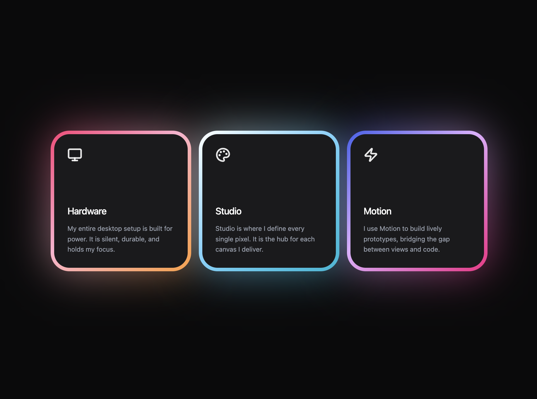
Features
Max Reed Portfolio
A preview-led features prompt for generating a polished AI-built interface.
by MotionSites View full prompt
.webp)
A preview-led about prompt for generating a polished AI-built interface.
Direct delivery
647 words · 96 lines**Prompt:**
Create an "About Me" section using React, Tailwind CSS, and **framer-motion**. The site uses **Google Font "Kanit"** (weights 300-900) and a dark background `#0C0C0C`.
**Section layout:**
- Full-width section, `min-h-screen`, flexbox column, centered both axes
- Padding: `px-5 sm:px-8 md:px-10 py-20`
- Background: `#0C0C0C` (inherited from page)
- `position: relative` -- the section has 4 decorative floating images placed absolutely in the corners
**4 decorative corner images (absolute positioned, z-0):**
1. **Top-left** -- Moon icon
- URL: `https://shrug-person-78902957.figma.site/_components/v2/ebb2b8f25d8e24d5f0a5ca8af4c950de81aa2fd7/moon_icon.11395d36.png`
- Position: `top-[4%] left-[1%] sm:left-[2%] md:left-[4%]`
- Size: `w-[120px] sm:w-[160px] md:w-[210px] h-auto`
- Fade-in animation: `delay: 0.1`, slides from left (`x: -80, y: 0`), `duration: 0.9`
2. **Bottom-left** -- 3D object
- URL: `https://shrug-person-78902957.figma.site/_components/v2/ebb2b8f25d8e24d5f0a5ca8af4c950de81aa2fd7/p59_1.4659672e.png`
- Position: `bottom-[8%] left-[3%] sm:left-[6%] md:left-[10%]`
- Size: `w-[100px] sm:w-[140px] md:w-[180px] h-auto`
- Fade-in animation: `delay: 0.25`, slides from left (`x: -80, y: 0`), `duration: 0.9`
3. **Top-right** -- Lego icon
- URL: `https://shrug-person-78902957.figma.site/_components/v2/ebb2b8f25d8e24d5f0a5ca8af4c950de81aa2fd7/lego_icon-1.703bb594.png`
- Position: `top-[4%] right-[1%] sm:right-[2%] md:right-[4%]`
- Size: `w-[120px] sm:w-[160px] md:w-[210px] h-auto`
- Fade-in animation: `delay: 0.15`, slides from right (`x: 80, y: 0`), `duration: 0.9`
4. **Bottom-right** -- 3D group
- URL: `https://shrug-person-78902957.figma.site/_components/v2/ebb2b8f25d8e24d5f0a5ca8af4c950de81aa2fd7/Group_134-1.2e04f3ce.png`
- Position: `bottom-[8%] right-[3%] sm:right-[6%] md:right-[10%]`
- Size: `w-[130px] sm:w-[170px] md:w-[220px] h-auto`
- Fade-in animation: `delay: 0.3`, slides from right (`x: 80, y: 0`), `duration: 0.9`
**Center content (relative z-10, max-w-4xl, centered):**
Vertical layout with `gap-16 sm:gap-20 md:gap-24`, containing two groups:
**Group 1 -- Heading + Animated Text** (gap `10 sm:14 md:16`):
- **Heading "About me":**
- `font-black uppercase leading-none tracking-tight text-center`
- Font size: `clamp(3rem, 12vw, 160px)`
- Uses a CSS class `hero-heading` which applies a gradient text fill:
```css
.hero-heading {
background: linear-gradient(180deg, #646973 0%, #BBCCD7 100%);
-webkit-background-clip: text;
-webkit-text-fill-color: transparent;
background-clip: text;
}
```
- Fade-in: `delay: 0, y: 40`
- **Animated paragraph** (scroll-driven character-by-character reveal):
- Text content: `"With more than five years of experience in design, i focus on branding, web design, and user experience, i truly enjoy working with businesses that aim to stand out and present their best image. Let's build something incredible together!"`
- Styling: `text-[#D7E2EA] font-medium text-center leading-relaxed max-w-[560px]`
- Font size: `clamp(1rem, 2vw, 1.35rem)`
- **Animation behavior** (uses framer-motion `useScroll` + `useTransform`):
- Each character is rendered as an individual `<span>` with `position: relative; display: inline-block`
- An invisible duplicate holds the space; the visible character is absolutely positioned on top
- Scroll tracking: `useScroll({ target: containerRef, offset: ['start 0.8', 'end 0.2'] })`
- Per-character opacity: calculate `charProgress = index / totalChars`, then `start = max(0, charProgress - 0.1)` and `end = min(1, charProgress + 0.05)`. Map `scrollYProgress` from `[start, end]` to opacity `[0.2, 1]`
- Spaces are rendered as `\u00A0` (non-breaking space)
- Characters start dim (opacity 0.2) and brighten to full opacity (1) as the user scrolls through the section, creating a progressive text reveal from left to right
**Group 2 -- Contact Button:**
- Fade-in: `delay: 0.3, y: 20`
- Pill-shaped button (rounded-full), text "Contact Me"
- Responsive padding: `px-8 py-3 sm:px-10 sm:py-3.5 md:px-12 md:py-4`
- Text: `text-white font-medium uppercase tracking-widest`, size `text-xs sm:text-sm md:text-base`
- Background gradient: `linear-gradient(123deg, #18011F 7%, #B600A8 37%, #7621B0 72%, #BE4C00 100%)`
- Box shadow: `0px 4px 4px rgba(181, 1, 167, 0.25), 4px 4px 12px #7721B1 inset`
- Outline: `2px solid #E3E3E3` with `outlineOffset: -3px`
- Hover: `opacity: 0.9`, Active: `opacity: 0.75`, transition 200ms
- Links to `#contact`
**FadeIn component (reusable, framer-motion):**
- Props: `delay`, `duration` (default 0.7), `x` (default 0), `y` (default 30), `className`, `style`, `as` (HTML element tag, default `div`)
- Uses `motion.create()` to make any HTML element animatable
- Variants: `hidden` state sets `opacity: 0` + the x/y offsets; `visible` animates to `opacity: 1, x: 0, y: 0`
- Easing: cubic bezier `[0.25, 0.1, 0.25, 1]`
- Viewport trigger: `{ once: true, margin: "50px", amount: 0 }`
**Font (loaded in HTML head):**
```html
<link rel="preconnect" href="https://fonts.googleapis.com" />
<link rel="preconnect" href="https://fonts.gstatic.com" crossorigin />
<link href="https://fonts.googleapis.com/css2?family=Kanit:wght@300;400;500;600;700;800;900&display=swap" rel="stylesheet" />
```
CSS base: `font-family: 'Kanit', sans-serif` on html/body.
---Keep exploring
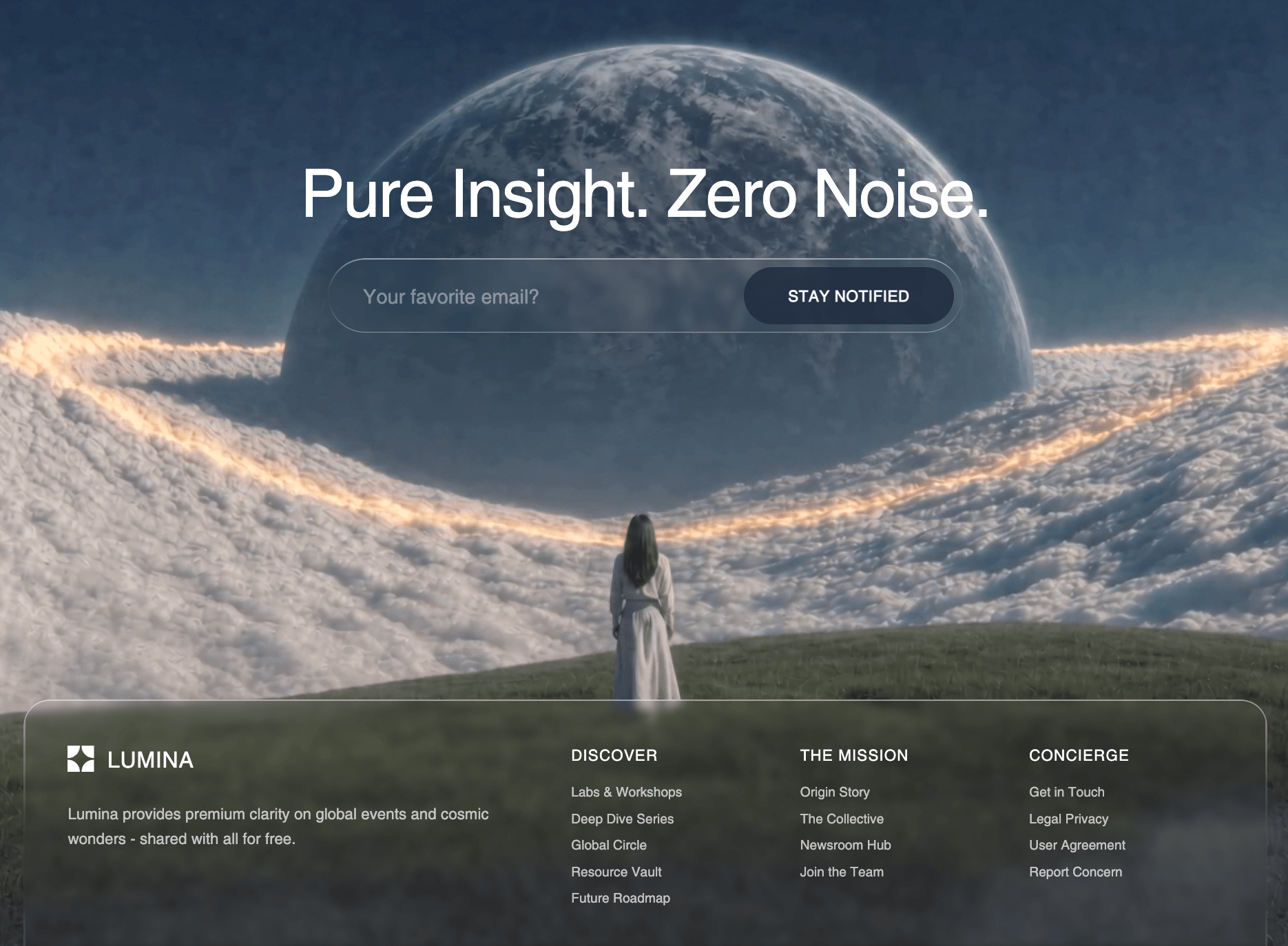
A preview-led features prompt for generating a polished AI-built interface.
A preview-led features section prompt for generating a polished AI-built interface.
A preview-led footer section prompt for generating a polished AI-built interface.