Landing Page
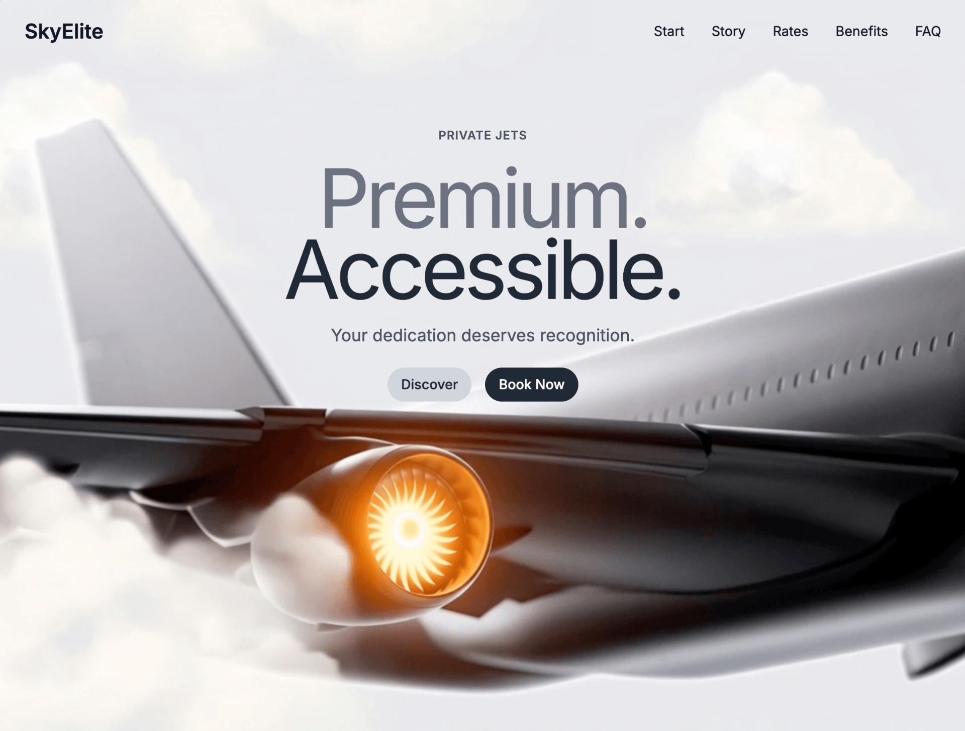
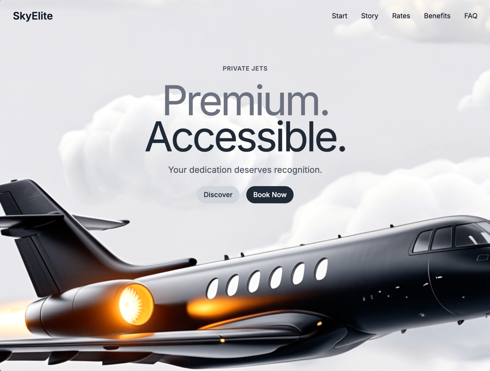
SkyElite Private Jets
A preview-led landing page prompt for generating a polished AI-built interface.
by MotionSites View full prompt

A preview-led landing page prompt for generating a polished AI-built interface.
Direct delivery
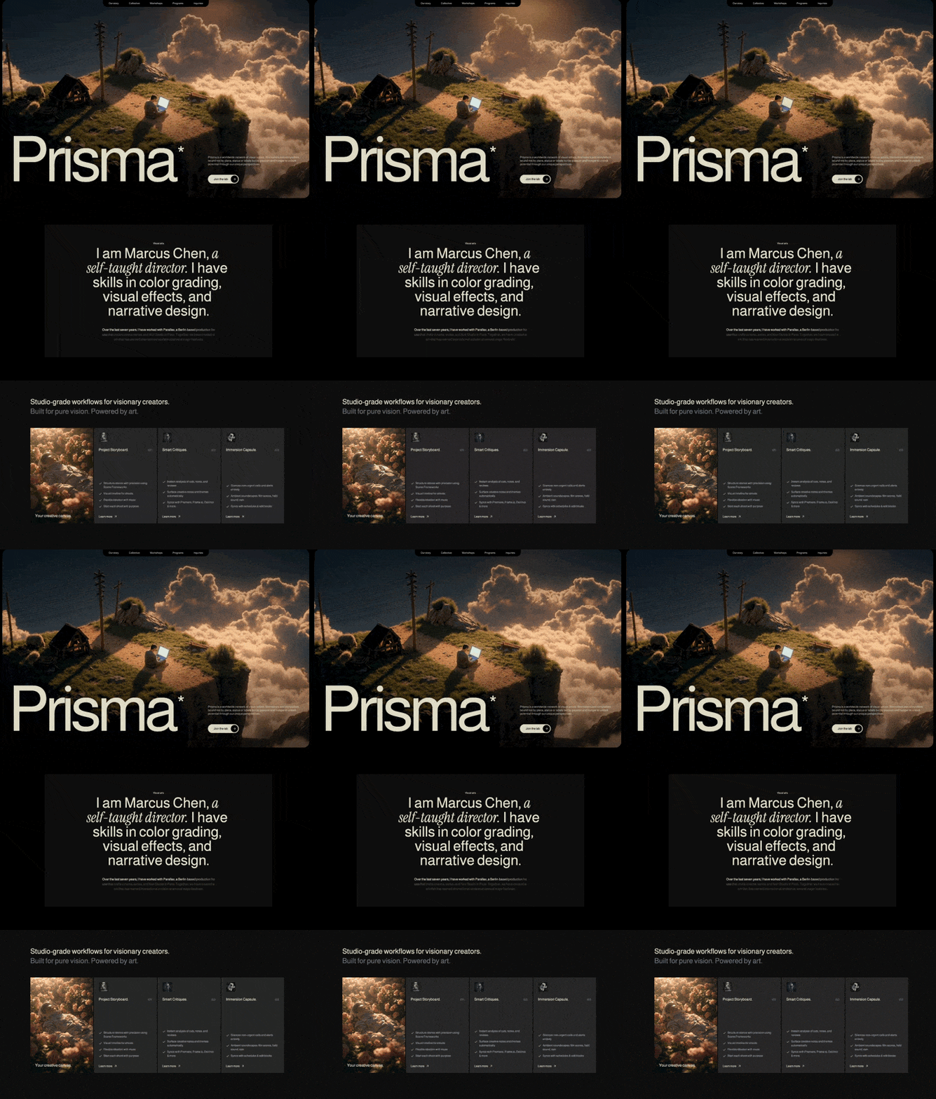
1034 words · 124 linesCreate a React + Vite + TypeScript + Tailwind CSS landing page for a creative studio called "Prisma". The page has 3 sections: Hero, About, and Features. Use framer-motion for animations and lucide-react for icons. The design is dark, moody, and cinematic with a warm cream color palette.
FONTS
Load two Google Fonts in index.html:
Almarai (weights: 300, 400, 700, 800) -- used as the global default font
Instrument Serif (italic only) -- used for italic accent text in the About section
In index.css, set the global font family:
* { font-family: 'Almarai', -apple-system, BlinkMacSystemFont, 'Segoe UI', 'Roboto', 'Oxygen', 'Ubuntu', 'Cantarell', sans-serif; }
In tailwind.config.js, extend:
colors.primary: #DEDBC8 (warm cream, used for all primary text and accents)
fontFamily.serif: ['"Instrument Serif"', 'serif']
COLOR SYSTEM
Background: black (#000000) globally, #101010 for the About card, #212121 for Features cards
Primary text color: #E1E0CC (applied via inline style, slightly different from Tailwind primary)
Tailwind primary: #DEDBC8 (used for utility classes like text-primary, text-primary/70)
Gray text: text-gray-400, text-gray-500
Navbar link color: rgba(225, 224, 204, 0.8) with hover: #E1E0CC
CUSTOM CSS UTILITIES (index.css)
Two SVG noise texture utilities:
.noise-overlay: fractal noise (baseFrequency: 0.85, numOctaves: 3) used as overlay on hero video
.bg-noise: fractal noise (baseFrequency: 0.9, numOctaves: 4) used as subtle background in Features section
Both use inline SVG data URIs with feTurbulence filter.
SECTION 1: HERO
Full viewport height (h-screen). The entire section has p-4 md:p-6 padding creating an inset effect. Inside is a container with rounded-2xl md:rounded-[2rem] and overflow-hidden.
Background video:
URL: https://d8j0ntlcm91z4.cloudfront.net/user_38xzZboKViGWJOttwIXH07lWA1P/hf_20260405_170732_8a9ccda6-5cff-4628-b164-059c500a2b41.mp4
autoPlay loop muted playsInline, object-cover, fills entire container
Noise overlay on top: .noise-overlay with opacity-[0.7] mix-blend-overlay pointer-events-none
Gradient overlay: bg-gradient-to-b from-black/30 via-transparent to-black/60
Navbar:
Absolutely positioned at top center
Black background pill that hangs from top edge: bg-black rounded-b-2xl md:rounded-b-3xl px-4 py-2 md:px-8
5 nav items: "Our story", "Collective", "Workshops", "Programs", "Inquiries"
Text size: text-[10px] sm:text-xs md:text-sm
Gap between items: gap-3 sm:gap-6 md:gap-12 lg:gap-14
Link color: rgba(225, 224, 204, 0.8), hover: #E1E0CC (inline styles)
Hero Content (bottom-aligned):
Absolutely positioned at bottom: absolute bottom-0 left-0 right-0
12-column grid: left 8 columns for heading, right 4 columns for text + button
Giant heading "Prisma" using WordsPullUp component:
Responsive sizes: text-[26vw] sm:text-[24vw] md:text-[22vw] lg:text-[20vw] xl:text-[19vw] 2xl:text-[20vw]
font-medium leading-[0.85] tracking-[-0.07em]
Color: #E1E0CC
Has a superscript asterisk (*) on the final "a" of "Prisma": positioned with absolute top-[0.65em] -right-[0.3em] text-[0.31em]
Pull-up animation: each word slides up from y:20 with staggered delay of 0.08s, triggered by useInView
Description paragraph (right column):
"Prisma is a worldwide network of visual artists, filmmakers and storytellers bound not by place, status or labels but by passion and hunger to unlock potential through our unique perspectives."
text-primary/70 text-xs sm:text-sm md:text-base, line-height: 1.2
Framer motion: fade up from y:20, delay 0.5s, custom ease [0.16, 1, 0.3, 1]
CTA Button "Join the lab":
Pill shape: bg-primary rounded-full
Black text, font-medium, text-sm sm:text-base
Right side has a black circle (bg-black rounded-full w-9 h-9 sm:w-10 sm:h-10) containing a white/cream ArrowRight icon
Hover: gap increases (hover:gap-3), circle scales up (group-hover:scale-110)
Framer motion: fade up from y:20, delay 0.7s, same custom ease
SECTION 2: ABOUT
bg-black, padded section with centered content
Inner card: bg-[#101010], centered text, max-w-6xl
Top: small label "Visual arts" in text-primary, text-[10px] sm:text-xs
Main heading uses WordsPullUpMultiStyle component with 3 segments:
"I am Marcus Chen," -- font-normal (Almarai)
"a self-taught director." -- italic font-serif (Instrument Serif italic)
"I have skills in color grading, visual effects, and narrative design." -- font-normal
Container: text-3xl sm:text-4xl md:text-5xl lg:text-6xl xl:text-7xl max-w-3xl mx-auto leading-[0.95] sm:leading-[0.9]
Each word animates in with pull-up effect (y:20 to y:0), staggered at 0.08s delay
Body paragraph below with scroll-linked character opacity animation:
Text: "Over the last seven years, I have worked with Parallax, a Berlin-based production house that crafts cinema, series, and Noir Studio in Paris. Together, we have created work that has earned international acclaim at several major festivals."
text-[#DEDBC8], text-xs sm:text-sm md:text-base
Each character is individually wrapped in an AnimatedLetter component
Uses useScroll with target offset ['start 0.8', 'end 0.2']
Each character's opacity transitions from 0.2 to 1 based on scroll position, creating a progressive text reveal effect
Character staggering: charProgress = index / totalChars, range [charProgress - 0.1, charProgress + 0.05]
SECTION 3: FEATURES
min-h-screen bg-black, with subtle .bg-noise overlay at opacity-[0.15]
Header text uses WordsPullUpMultiStyle:
Line 1: "Studio-grade workflows for visionary creators." in cream
Line 2: "Built for pure vision. Powered by art." in text-gray-500
Both: text-xl sm:text-2xl md:text-3xl lg:text-4xl font-normal
4-column card grid (lg:h-[480px], gap-3 sm:gap-2 md:gap-1):
Each card has staggered entrance animation: scale from 0.95 + fade in, triggered by useInView (once, margin "-100px"), staggered at 0.15s intervals with ease [0.22, 1, 0.36, 1].
Card 1 - Video card: Full video background (URL: https://d8j0ntlcm91z4.cloudfront.net/user_38xzZboKViGWJOttwIXH07lWA1P/hf_20260406_133058_0504132a-0cf3-4450-a370-8ea3b05c95d4.mp4), autoPlay loop muted playsInline, object-cover. Bottom text: "Your creative canvas." in #E1E0CC.
Card 2 - "Project Storyboard." (01): bg-[#212121], small image icon at top (https://images.higgs.ai/?default=1&output=webp&url=https%3A%2F%2Fd8j0ntlcm91z4.cloudfront.net%2Fuser_38xzZboKViGWJOttwIXH07lWA1P%2Fhf_20260405_171918_4a5edc79-d78f-4637-ac8b-53c43c220606.png&w=1280&q=85, 10x10 sm:12x12 rounded), title with number, 4 checklist items with green Check icons, "Learn more" link with rotated arrow (-45deg).
Card 3 - "Smart Critiques." (02): Same layout as Card 2. Icon: https://images.higgs.ai/?default=1&output=webp&url=https%3A%2F%2Fd8j0ntlcm91z4.cloudfront.net%2Fuser_38xzZboKViGWJOttwIXH07lWA1P%2Fhf_20260405_171741_ed9845ab-f5b2-4018-8ce7-07cc01823522.png&w=1280&q=85. 3 checklist items about AI analysis, creative notes, tool integrations.
Card 4 - "Immersion Capsule." (03): Same layout. Icon: https://images.higgs.ai/?default=1&output=webp&url=https%3A%2F%2Fd8j0ntlcm91z4.cloudfront.net%2Fuser_38xzZboKViGWJOttwIXH07lWA1P%2Fhf_20260405_171809_f56666dc-c099-4778-ad82-9ad4f209567b.png&w=1280&q=85. 3 checklist items about notification silencing, ambient soundscapes, schedule syncing.
All feature card checklist items use Check icon from lucide-react in text-primary color, with text-gray-400 description text. "Learn more" buttons use ArrowRight rotated -45deg.
SHARED ANIMATION COMPONENTS
WordsPullUp: Splits text by spaces, each word is a motion.span that slides up (y:20 to 0) with staggered delay. Uses useInView (once: true). Supports showAsterisk prop that adds a superscript * after the last character "a" of the final word.
WordsPullUpMultiStyle: Takes an array of {text, className} segments, splits all into individual words preserving per-word className. Same pull-up animation. Words are wrapped in inline-flex flex-wrap justify-center.
RESPONSIVE BREAKPOINTS
The page is fully responsive across mobile, tablet, and desktop. Cards in Features switch from 1-col (mobile) to 2-col (md) to 4-col (lg). Hero text scales from 26vw down to 19vw. Navbar items compress with smaller gaps on mobile. All padding, font sizes, and spacing use Tailwind responsive prefixes (sm/md/lg/xl/2xl).
TECH STACK
Vite + React 18 + TypeScript
Tailwind CSS 3
framer-motion (for all animations: pull-up text, fade-in, scroll-linked opacity, card entrances)
lucide-react (ArrowRight, Check icons)Keep exploring
A preview-led landing page prompt for generating a polished AI-built interface.
A preview-led landing page prompt for generating a polished AI-built interface.
A preview-led landing page prompt for generating a polished AI-built interface.