.webp)
Features
Max Reed Portfolio
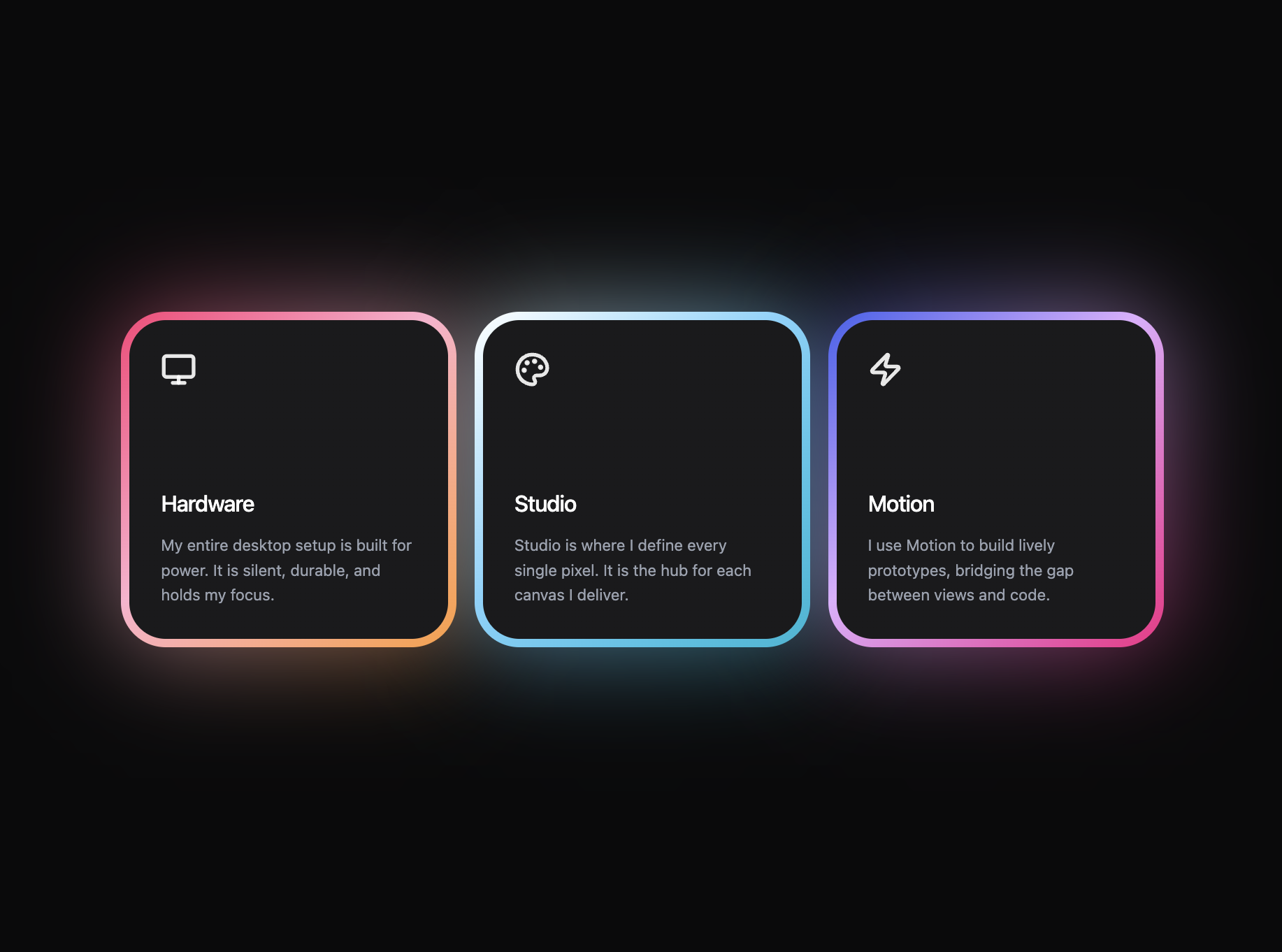
A preview-led features prompt for generating a polished AI-built interface.
by MotionSites View full prompt
.webp)
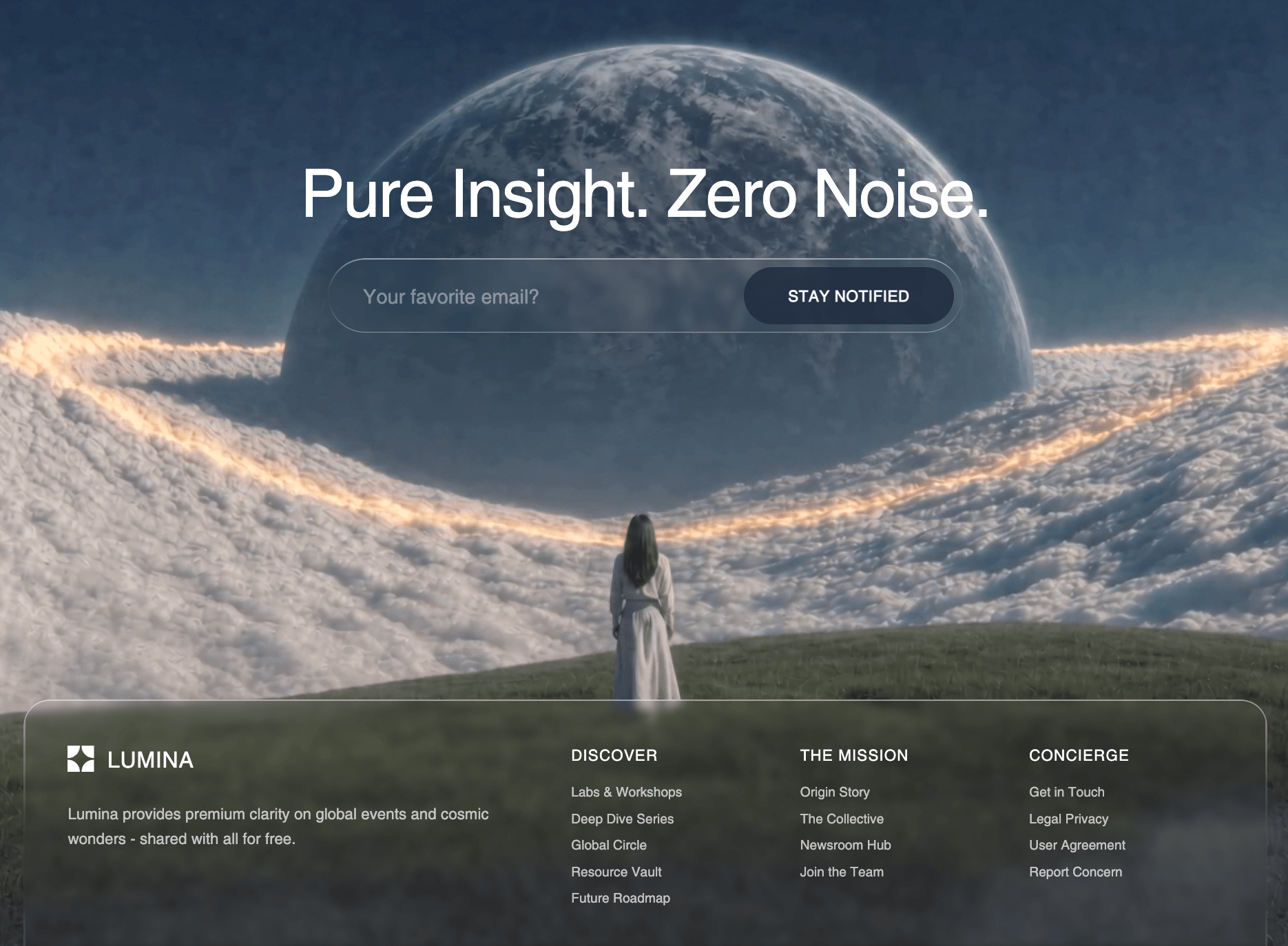
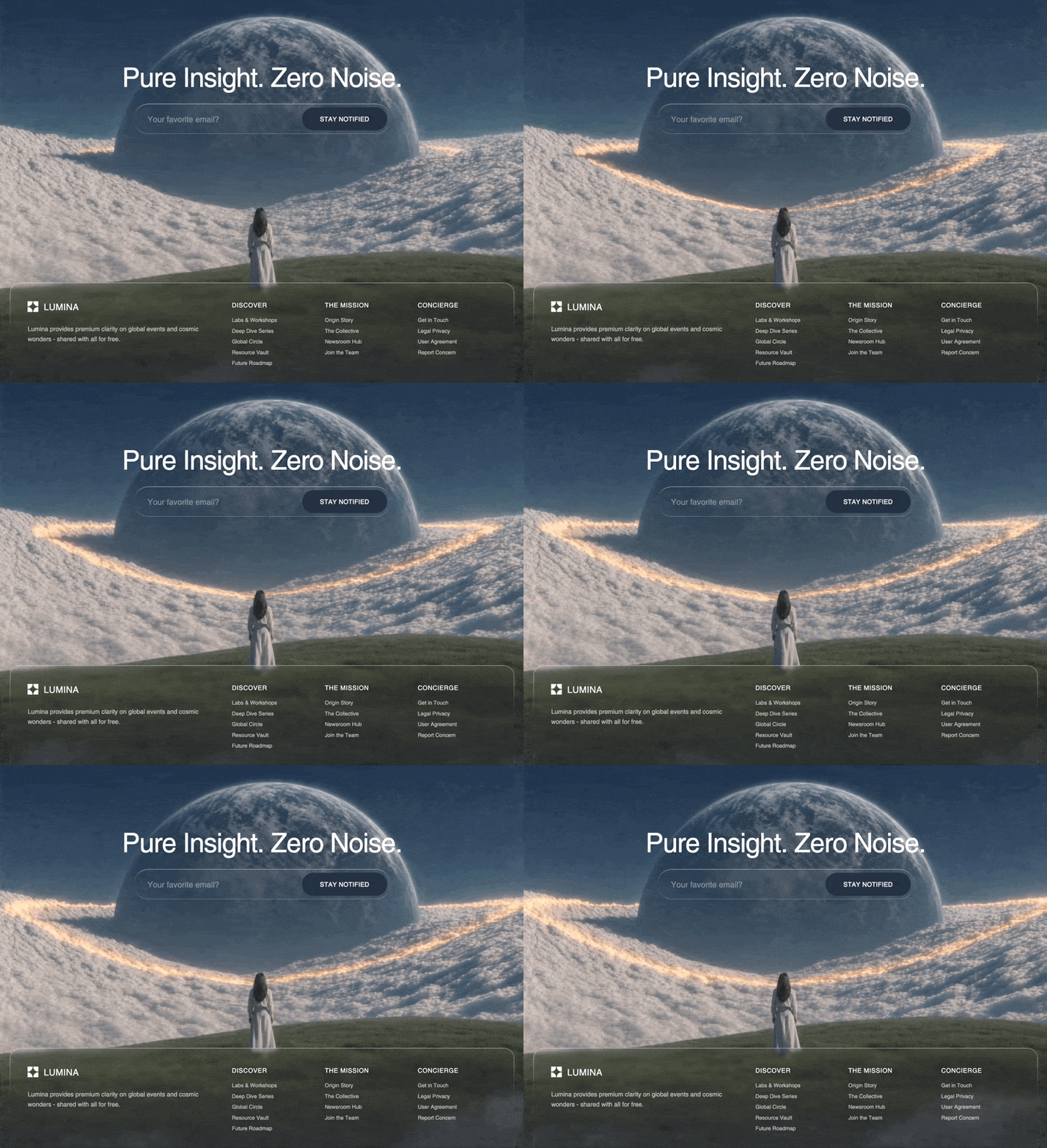
A preview-led cta prompt for generating a polished AI-built interface.
Direct delivery
1404 words · 186 linesBuild a pixel-faithful recreation of the landing CTA section. Use React 18 + Vite + TypeScript, TailwindCSS, `framer-motion`, `clsx` + `tailwind-merge` as `cn()`. Dark theme background (`#000000`), Inter font, Material Symbols Outlined for icons. Use the white-alpha "landing" palette in `tailwind.config.ts`:
```ts
landing: {
surface: "rgba(255, 255, 255, 0.10)",
"surface-hover": "rgba(255, 255, 255, 0.16)",
border: "rgba(255, 255, 255, 0.10)",
"border-strong": "rgba(255, 255, 255, 0.20)",
text: "rgba(255, 255, 255, 0.80)",
"text-muted": "rgba(255, 255, 255, 0.60)",
}
```
Add a global `.liquid-glass` utility (frosted translucent surface):
```css
.liquid-glass {
background: rgba(255,255,255,0.06);
border: 1px solid rgba(255,255,255,0.10);
backdrop-filter: blur(20px) saturate(140%);
-webkit-backdrop-filter: blur(20px) saturate(140%);
box-shadow: inset 0 1px 0 rgba(255,255,255,0.08), 0 10px 30px rgba(0,0,0,0.25);
}
```
Add keyframes in `index.css` for the inner Velorah hero animation:
```css
@keyframes fade-rise { from { opacity: 0; transform: translateY(14px); } to { opacity: 1; transform: translateY(0); } }
.animate-fade-rise { animation: fade-rise .8s ease-out both; }
.animate-fade-rise-delay { animation: fade-rise .8s ease-out .25s both; }
.animate-fade-rise-delay-2 { animation: fade-rise .8s ease-out .5s both; }
.scrollbar-hide::-webkit-scrollbar { display: none; }
.scrollbar-hide { scrollbar-width: none; }
```
Load fonts in `index.html`: Inter (400/500/600), Instrument Serif (400 + italic), Material Symbols Outlined.
---
## Assets
- Foreground "grass / horizon" PNG that overlays the bottom of the section — load directly from this URL (no local asset):
`https://res.cloudinary.com/dy5er7kv5/image/upload/q_auto/f_auto/v1780586778/cta-bg_mlwy5s.png`
- CloudFront video URL used **inside** the Velorah dashboard preview (exact):
`https://d8j0ntlcm91z4.cloudfront.net/user_38xzZboKViGWJOttwIXH07lWA1P/hf_20260314_131748_f2ca2a28-fed7-44c8-b9a9-bd9acdd5ec31.mp4`
---
## Helper components (must exist)
### `FadeUp` (`framer-motion`)
```tsx
<motion.div
initial={{ opacity: 0, y: y ?? 24 }}
whileInView={{ opacity: 1, y: 0 }}
viewport={{ once: true, amount: 0.3 }}
transition={{ duration: 0.6, delay, ease: [0.22, 1, 0.36, 1] }}
/>
```
### `MIcon` — Material Symbols Outlined span, supports `name`, `size`, `fill`, `weight`, `grade`, `opticalSize`, applied via `fontVariationSettings: "'FILL' x, 'wght' y, 'GRAD' z, 'opsz' s"`.
### `PrimaryButton` (landing primitive)
- White pill, black text, `rounded-full`, sizes `sm/md/lg` (default `lg`: `h-12 px-9 text-sm font-medium`).
- Class: `inline-flex items-center justify-center rounded-full bg-white/80 hover:bg-white text-black leading-none transition-colors`.
- Wraps children in an `AnimatedText` component that slides current text up and reveals duplicate from below on hover (200–300ms ease).
- Polymorphic via `as="a" | "button"`, default `a`.
### `ChatPanel` (left side of the dashboard mock)
- Vertical flex column inside `rounded-2xl border border-white/10`, background `rgba(8,8,10,0.6)` + `backdrop-filter: blur(24px)`.
- Header row: 28px circular `bg-white/5` with `MIcon name="auto_awesome" size={14}`, then two-line label: **"Vibe Design course"** (text-sm font-medium white) + **"Learn how to build website with AI"** (text-[11px] white/40).
- Messages scroll area (`scrollbar-hide`, `space-y-4`, px-4 py-5). Seed messages:
1. assistant — "Welcome to the Vibe Design course! I'll guide you through building stunning websites with AI. What would you like to learn first?"
2. user — "I want to learn how to build a hero section with a cinematic video background using AI."
3. assistant — "Great choice! In this course, you'll learn how to create full-screen looping videos, liquid glass nav bars, email signups, and manifesto buttons — all with AI assistance. Let's dive in!"
- Message bubbles: `max-w-[85%] rounded-2xl px-4 py-2.5 text-sm leading-relaxed`. User = `bg-white/15 text-white/90` (right-aligned). Assistant = `bg-white/5 text-white/70 border border-white/5` (left).
- Props: `initialScroll?: "top" | "bottom"` (CTA uses `"top"`), `animateMessagesIn?: boolean` (CTA passes `true`, each message wrapped in `FadeUp delay={i * 0.12} y={16}`).
- Input row: `.liquid-glass rounded-2xl` containing a 1-row autosize `<textarea>` (transparent, placeholder "Ask about the course...") + white square send button (`bg-white text-black rounded-xl p-2`) with `MIcon name="arrow_upward" size={16}`. Enter (no shift) sends. Pushing user msg also pushes a canned assistant reply.
### `VelorahHeroPreview` (right side of the dashboard mock)
```tsx
const VIDEO_SRC = "https://d8j0ntlcm91z4.cloudfront.net/user_38xzZboKViGWJOttwIXH07lWA1P/hf_20260314_131748_f2ca2a28-fed7-44c8-b9a9-bd9acdd5ec31.mp4";
```
- Wrapper: `relative w-full h-full overflow-hidden rounded-2xl`, inline `backgroundColor: "hsl(201 100% 13%)"` (deep teal as the video-loading color).
- `<video autoPlay loop muted playsInline preload="auto">` absolutely positioned, `object-cover`, `z-0`.
- Nav row (`relative z-10 flex items-center justify-between px-3 sm:px-4 md:px-6 py-2 sm:py-3 md:py-4`):
- Left brand: `Velorah®` with `font-family: 'Instrument Serif', serif`, `text-sm sm:text-base md:text-lg`, `tracking-tight`, `®` as `<sup className="text-[0.5em]">`.
- Center (hidden < md): `Home` (white) · `Studio` · `About` · `Journal` · `Reach Us` — `text-[9px] lg:text-[10px] text-white/60` with `hover:text-white` on the inactive items.
- Right: `.liquid-glass rounded-full px-2.5 sm:px-3 py-1 text-[9px] sm:text-[10px] text-white` reading **Begin Journey**.
- Hero block (`flex flex-col items-center text-center px-3 sm:px-4 pt-3 sm:pt-5 md:pt-7 pb-6`):
- `<h1>` Instrument Serif, `font-normal leading-[0.95] tracking-[-0.03em]`, `text-lg sm:text-2xl md:text-3xl lg:text-4xl max-w-[90%]`, class `animate-fade-rise`. Content: `Where <em class="not-italic text-white/55">dreams</em> rise <em class="not-italic text-white/55">through the silence.</em>`
- Paragraph `animate-fade-rise-delay text-white/60 text-[9px] sm:text-[11px] md:text-xs leading-relaxed max-w-[80%] sm:max-w-sm md:max-w-md mt-2 sm:mt-3 md:mt-4`: "We're designing tools for deep thinkers, bold creators, and quiet rebels. Amid the chaos, we build digital spaces for sharp focus and inspired work."
- Pill button `animate-fade-rise-delay-2 liquid-glass rounded-full px-4 sm:px-5 md:px-6 py-1.5 sm:py-2 md:py-2.5 text-[9px] sm:text-[10px] text-white mt-3 sm:mt-4 md:mt-5` reading **Begin Journey**.
### `CtaDashboardMock`
Frame around ChatPanel + VelorahHeroPreview:
```tsx
<div className="liquid-glass w-full max-w-[1100px] aspect-[3/4] sm:aspect-[16/10] lg:aspect-[16/9] rounded-2xl mx-auto overflow-hidden p-2 sm:p-3">
<div className="grid h-full grid-cols-1 sm:grid-cols-[minmax(220px,320px)_1fr] gap-2 sm:gap-3">
<div className="min-h-0 hidden sm:block"><ChatPanel initialScroll="top" animateMessagesIn /></div>
<div className="min-h-0"><VelorahHeroPreview /></div>
</div>
</div>
```
---
## `CtaSection` — exact layout & behavior
```tsx
const sectionRef = useRef<HTMLElement>(null);
const isMobile = useIsMobile(); // tailwind md breakpoint hook
const { scrollYProgress } = useScroll({ target: sectionRef, offset: ["start end", "end start"] });
const dashboardY = useTransform(scrollYProgress, [0, 1], ["120px", "-120px"]);
const grassY = useTransform(scrollYProgress, [0, 1], isMobile ? ["80px", "-40px"] : ["200px", "-200px"]);
```
Markup:
```tsx
<section
ref={sectionRef}
id="cta"
className="relative w-full"
style={{ background: "linear-gradient(to bottom, transparent 0%, #14191E 100%)" }}
>
<div className="relative mx-auto max-w-[1080px] px-4 sm:px-6 pt-24 sm:pt-32 md:pt-40 pb-[440px] sm:pb-[520px] md:pb-[440px]">
<div className="grid grid-cols-1 lg:grid-cols-2 gap-12 lg:gap-8 items-start">
{/* Left column */}
<div className="relative z-20 max-w-[400px]">
<FadeUp delay={1}>
<h2 className="text-3xl sm:text-4xl font-normal tracking-[-0.02em] leading-[1.05] text-foreground">
Learn how can one go from 0 to $11.5k with AI in 60 days.
</h2>
</FadeUp>
<FadeUp delay={0.1}>
<p className="mt-6 text-landing-text text-base sm:text-lg leading-[1.5] max-w-[380px]">
Learn to turn your ideas into stunning websites with AI — the same skills agencies charge $5,000 for. Join the UI Rocket training and start building like a pro today.
</p>
</FadeUp>
<FadeUp delay={0.2} className="mt-10">
<PrimaryButton as="button">Start for free</PrimaryButton>
</FadeUp>
</div>
</div>
</div>
{/* Dashboard pinned to right edge, behind grass, parallax Y */}
<motion.div
style={{ y: dashboardY }}
className="absolute top-[440px] sm:top-[460px] md:top-[500px] lg:top-20 left-4 right-4 sm:left-auto sm:-right-[8%] md:-right-[10%] lg:-right-[12%] z-10 sm:w-[85%] md:w-[80%] lg:w-[68%]"
>
<CtaDashboardMock />
</motion.div>
{/* Foreground grass — in front of dashboard, parallax Y */}
<motion.img
src="https://res.cloudinary.com/dy5er7kv5/image/upload/q_auto/f_auto/v1780586778/cta-bg_mlwy5s.png"
alt=""
aria-hidden
style={{ y: grassY }}
className="pointer-events-none select-none absolute left-0 right-0 bottom-[-40px] sm:bottom-[-80px] lg:bottom-[-140px] w-full z-30 object-cover"
/>
</section>
```
### Behavior summary
- Section fades from transparent → `#14191E` vertically.
- On scroll, the dashboard translates from `+120px` → `-120px` (parallax up). The grass image translates `+200px` → `-200px` desktop, `+80px` → `-40px` mobile, on top of the dashboard (`z-30` over `z-10`).
- Left column stays static, on top of the grass (`z-20` left text container would otherwise be covered — keep grass at `z-30` to overlap the dashboard while the heading visually sits left of it).
- Headline `Learn how can one go from 0 to $11.5k with AI in 60 days.` enters with a delayed FadeUp; paragraph + button stagger in afterward.
- Mobile (< sm): dashboard stacks below the heading (`top-[440px]`), chat panel hides (`hidden sm:block`), only the Velorah preview shows.
- Button is `PrimaryButton as="button"` reading **Start for free**; hover triggers the AnimatedText slide.
---
## Acceptance checklist
- [ ] Section bg: `transparent → #14191E` linear gradient bottom.
- [ ] Inter font globally; Instrument Serif used in Velorah brand + headline; Material Symbols Outlined for icons.
- [ ] Headline copy is exactly: `Learn how can one go from 0 to $11.5k with AI in 60 days.`
- [ ] Subtext copy is exactly the paragraph above; button label exactly `Start for free`.
- [ ] `CtaDashboardMock` uses `.liquid-glass` frame, aspect `3/4 → 16/10 → 16/9`, ChatPanel left (hidden on mobile) + Velorah right.
- [ ] Velorah `<video>` uses the exact CloudFront URL, `autoPlay loop muted playsInline preload="auto"`, fallback bg `hsl(201 100% 13%)`.
- [ ] Velorah inner copy/animation classes match (`animate-fade-rise`, `-delay`, `-delay-2`).
- [ ] `useScroll` + `useTransform` parallax: dashboard `120 → -120`, grass `200 → -200` (desktop) / `80 → -40` (mobile).
- [ ] Grass image loaded from Cloudinary URL (`https://res.cloudinary.com/dy5er7kv5/image/upload/q_auto/f_auto/v1780586778/cta-bg_mlwy5s.png`) sits at `z-30` over dashboard (`z-10`), pointer-events-none, full width.
- [ ] FadeUp entrance order: heading (delay 1) → paragraph (0.1) → button (0.2).
- [ ] PrimaryButton: white pill, black text, AnimatedText hover slide.Keep exploring
A preview-led features prompt for generating a polished AI-built interface.
A preview-led features section prompt for generating a polished AI-built interface.
A preview-led footer section prompt for generating a polished AI-built interface.