.webp)
Features
Max Reed Portfolio
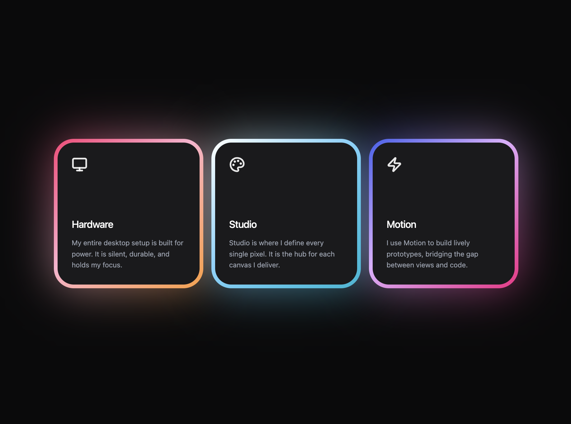
A preview-led features prompt for generating a polished AI-built interface.
by MotionSites View full prompt
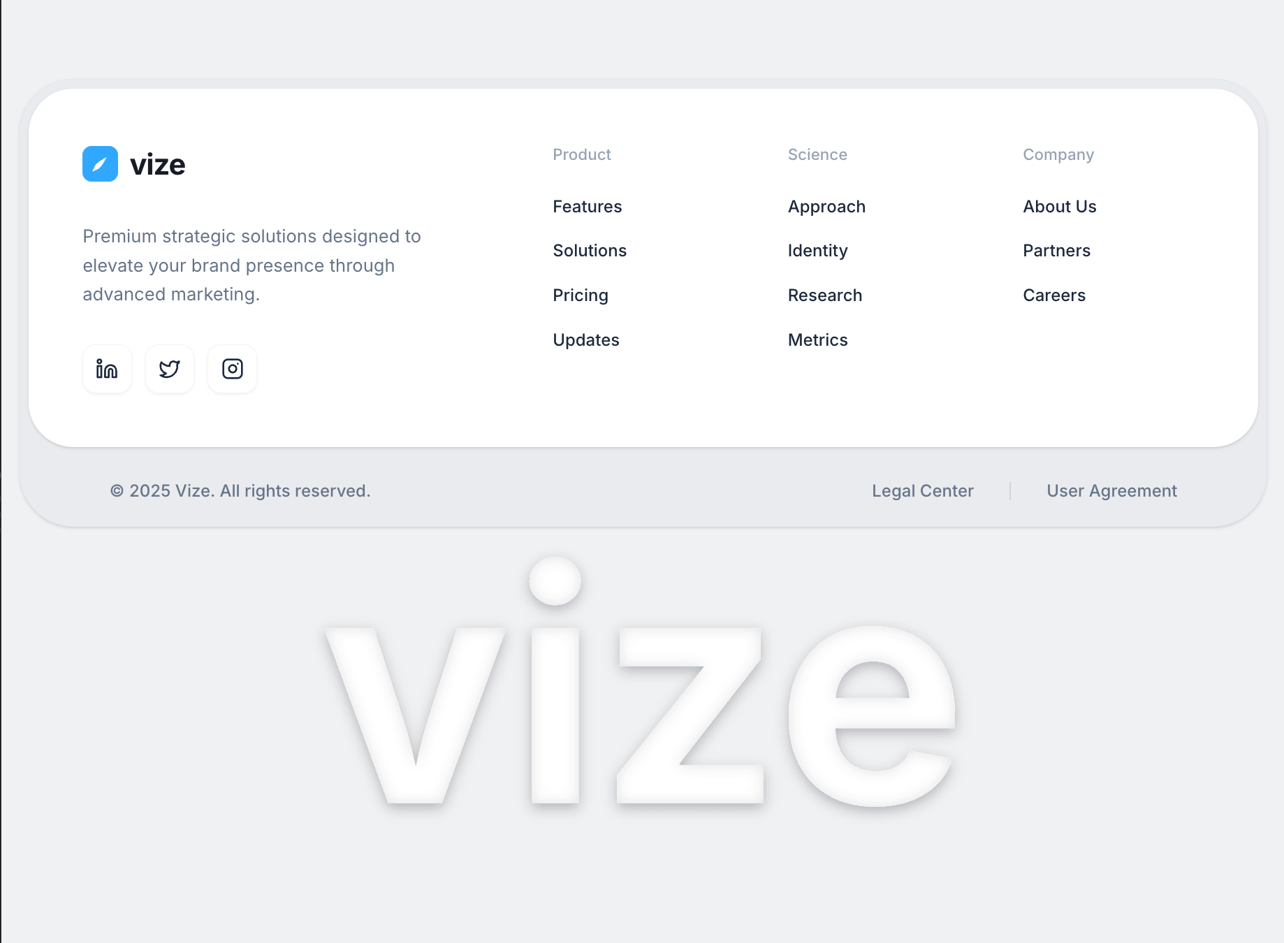
A preview-led footer section prompt for generating a polished AI-built interface.
Direct delivery
809 words · 150 linesBuild a highly polished, responsive Footer component for a React application using Vite, Tailwind CSS, `lucide-react` for icons, and `motion/react` for animations.
The design relies on a premium "layered card" aesthetic, precise typography, and a massive background-blended text element utilizing advanced, handcrafted SVG filters.
### 1. Dependencies
Ensure the project has:
`npm install lucide-react motion`
### 2. Global CSS (`src/index.css`)
Use the exact following CSS to define the Inter font, the Tailwind layer, and advanced `glass-card` and `liquid-glass` utilities:
```css
@import url('https://fonts.googleapis.com/css2?family=Inter:wght@300;400;500;600;700&display=swap');
@import "tailwindcss";
@theme {
--font-sans: "Inter", ui-sans-serif, system-ui, sans-serif;
}
@layer utilities {
.glass-card {
background: rgba(255, 255, 255, 0.4);
backdrop-filter: blur(20px);
border: 1px solid rgba(255, 255, 255, 0.5);
box-shadow: 0 8px 32px 0 rgba(31, 38, 135, 0.05);
}
.text-glass {
background: linear-gradient(135deg, rgba(255, 255, 255, 0.3) 0%, rgba(255, 255, 255, 0.1) 100%);
backdrop-filter: blur(10px);
-webkit-backdrop-filter: blur(10px);
border: 1px solid rgba(255, 255, 255, 0.2);
-webkit-background-clip: text;
background-clip: text;
color: transparent;
}
.liquid-glass {
background: rgba(255, 255, 255, 0.01);
background-blend-mode: luminosity;
backdrop-filter: blur(4px);
-webkit-backdrop-filter: blur(4px);
border: none;
box-shadow: inset 0 1px 1px rgba(255, 255, 255, 0.1);
position: relative;
overflow: hidden;
}
.liquid-glass::before {
content: '';
position: absolute;
inset: 0;
border-radius: inherit;
padding: 1.4px;
background: linear-gradient(180deg,
rgba(255,255,255,0.45) 0%, rgba(255,255,255,0.15) 20%,
rgba(255,255,255,0) 40%, rgba(255,255,255,0) 60%,
rgba(255,255,255,0.15) 80%, rgba(255,255,255,0.45) 100%);
-webkit-mask: linear-gradient(#fff 0 0) content-box, linear-gradient(#fff 0 0);
-webkit-mask-composite: xor;
mask-composite: exclude;
pointer-events: none;
}
}
body {
@apply bg-[#F9F9FB] text-[#141414] font-sans antialiased;
}
3. Application Layout (src/App.tsx)
Render the layout wrapper mimicking a full-screen application view exactly like this:
code
Tsx
import Footer from './components/Footer';
export default function App() {
return (
<div className="min-h-screen md:h-screen bg-[#F0F1F3] flex flex-col items-center justify-start md:justify-center overflow-y-auto md:overflow-hidden pt-8 md:pt-0 p-4">
<Footer />
</div>
);
}
4. The Footer Component (src/components/Footer.tsx)
Create this file and structure it strictly with the following inner components and specific Tailwind dimensions/hex codes:
Component 1: LogoIcon
Render a square icon box.
Classes: w-8 h-8 bg-[#31A8FF] rounded-[8px] flex items-center justify-center
SVG Code: <svg width="18" height="18" viewBox="0 0 24 24" fill="none" xmlns="http://www.w3.org/2000/svg"> <path d="M4 20C4 20 4 14 10 10C16 6 20 4 20 4C20 4 18 8 14 14C10 20 4 20 4 20Z" fill="white" /> <path d="M4 20L10 14" stroke="white" strokeWidth="2" strokeLinecap="round" /> </svg>
Component 2: FooterCard
A massive layered card layout holding the footer directories.
Wrappers:
Main Container: w-full max-w-6xl mx-auto
Outer Gray Body: bg-[#E9EBEE] rounded-[48px] border border-slate-200 shadow-sm overflow-hidden
Inner White Box: bg-white rounded-[40px] m-2 shadow-sm
Content Grid Space (Inside White Box): p-8 md:p-10 lg:p-12 grid grid-cols-1 md:grid-cols-2 lg:grid-cols-5 gap-12
Grid Columns Layout:
Brand Info (lg:col-span-2 space-y-8):
A row (flex items-center gap-2.5) with <LogoIcon /> and <span className="text-[26px] font-bold tracking-tight text-[#0F172A]">vize</span>
Description: <p className="text-[#64748B] leading-relaxed text-[16px] font-normal max-w-[320px]">Premium strategic solutions designed to elevate your brand presence through advanced marketing.</p>
Socials Group: Map an array of Linkedin, Twitter, Instagram (imported from lucide-react). Make them buttons with classes: w-[44px] h-[44px] flex items-center justify-center rounded-xl border border-slate-100 bg-white shadow-[0_1px_2px_rgba(0,0,0,0.05)] hover:bg-slate-50 transition-all active:scale-95 group. Inside each put the Icon component with className="w-5 h-5 text-slate-800".
Product Column (space-y-6): Header <h4 className="text-[14px] font-medium text-[#94A3B8]">Product</h4>. Links (href="#" target): Features, Solutions, Pricing, Updates. Styling for links: text-[15px] font-medium text-[#1E293B] hover:text-[#31A8FF] transition-colors. Keep in a <ul> with space-y-4.
Science Column (space-y-6): Header Science. Links: Approach, Identity, Research, Metrics. Same link styling.
Company Column (space-y-6): Header Company. Links: About Us, Partners, Careers. Same link styling.
Bottom Legal Bar (Inside Gray Outer Wrap, OUTSIDE of White Box):
Container: px-6 sm:px-12 md:px-16 lg:px-20 py-5 flex flex-col md:flex-row justify-between items-center gap-6 text-[15px]
Left side: <p className="text-[#64748B] font-medium">© 2025 Vize. All rights reserved.</p>
Right side: Flex row (gap-8 text-[#64748B] font-medium items-center) featuring:
<a href="#" className="hover:text-[#1E293B] transition-colors">Legal Center</a>
Vertical Separator: <div className="w-[1px] h-4 bg-slate-300" />
<a href="#" className="hover:text-[#1E293B] transition-colors">User Agreement</a>
Component 3: GlassText
This must be perfectly implemented to work. It uses an absolute hidden SVG defining a filter, paired with Framer Motion.
Container: relative w-full flex items-center justify-center select-none pt-0.
Invisible SVG: <svg className="absolute w-0 h-0" aria-hidden="true" focusable="false">
Filter setup within SVG:
code
Xml
<defs>
<filter id="glass-effect" x="-50%" y="-50%" width="200%" height="200%">
<feDropShadow dx="0" dy="4" stdDeviation="6" floodColor="#000000" floodOpacity="0.25" result="outer-shadow"/>
<feComponentTransfer in="SourceAlpha" result="alpha"><feFuncA type="linear" slope="1" /></feComponentTransfer>
<feOffset in="alpha" dx="0" dy="4" result="offset-white" />
<feGaussianBlur in="offset-white" stdDeviation="4" result="blur-white" />
<feComposite in="alpha" in2="blur-white" operator="out" result="inner-white-mask" />
<feFlood floodColor="#ffffff" floodOpacity="0.25" result="white-fill" />
<feComposite in="white-fill" in2="inner-white-mask" operator="in" result="inner-white-final" />
<feGaussianBlur in="alpha" stdDeviation="6" result="blur-black" />
<feComposite in="alpha" in2="blur-black" operator="out" result="inner-black-mask" />
<feFlood floodColor="#000000" floodOpacity="0.25" result="black-fill" />
<feComposite in="black-fill" in2="inner-black-mask" operator="in" result="inner-black-final" />
<feMerge>
<feMergeNode in="outer-shadow" />
<feMergeNode in="SourceGraphic" />
<feMergeNode in="inner-white-final" />
<feMergeNode in="inner-black-final" />
</feMerge>
</filter>
</defs>
Motion Element placed underneath the SVG code:
<motion.div initial={{ opacity: 0, scale: 0.98 }} whileInView={{ opacity: 1, scale: 1 }} transition={{ duration: 1.8, ease: [0.16, 1, 0.3, 1] }} className="relative">
Text Element logic: <h1 className="text-[min(25vw,400px)] font-bold tracking-normal leading-none select-none text-white px-4" style={{ filter: 'url(#glass-effect)' }}>vize</h1>
Final Default Export for Footer.tsx
code
Tsx
export default function Footer() {
return (
<footer className="w-full flex flex-col items-center gap-0">
<FooterCard />
<GlassText />
</footer>
);
}Keep exploring
A preview-led features prompt for generating a polished AI-built interface.
A preview-led features section prompt for generating a polished AI-built interface.
A preview-led footer section prompt for generating a polished AI-built interface.