.webp)
Hero
Bold Studio
A preview-led hero prompt for generating a polished AI-built interface.
by MotionSites View full prompt

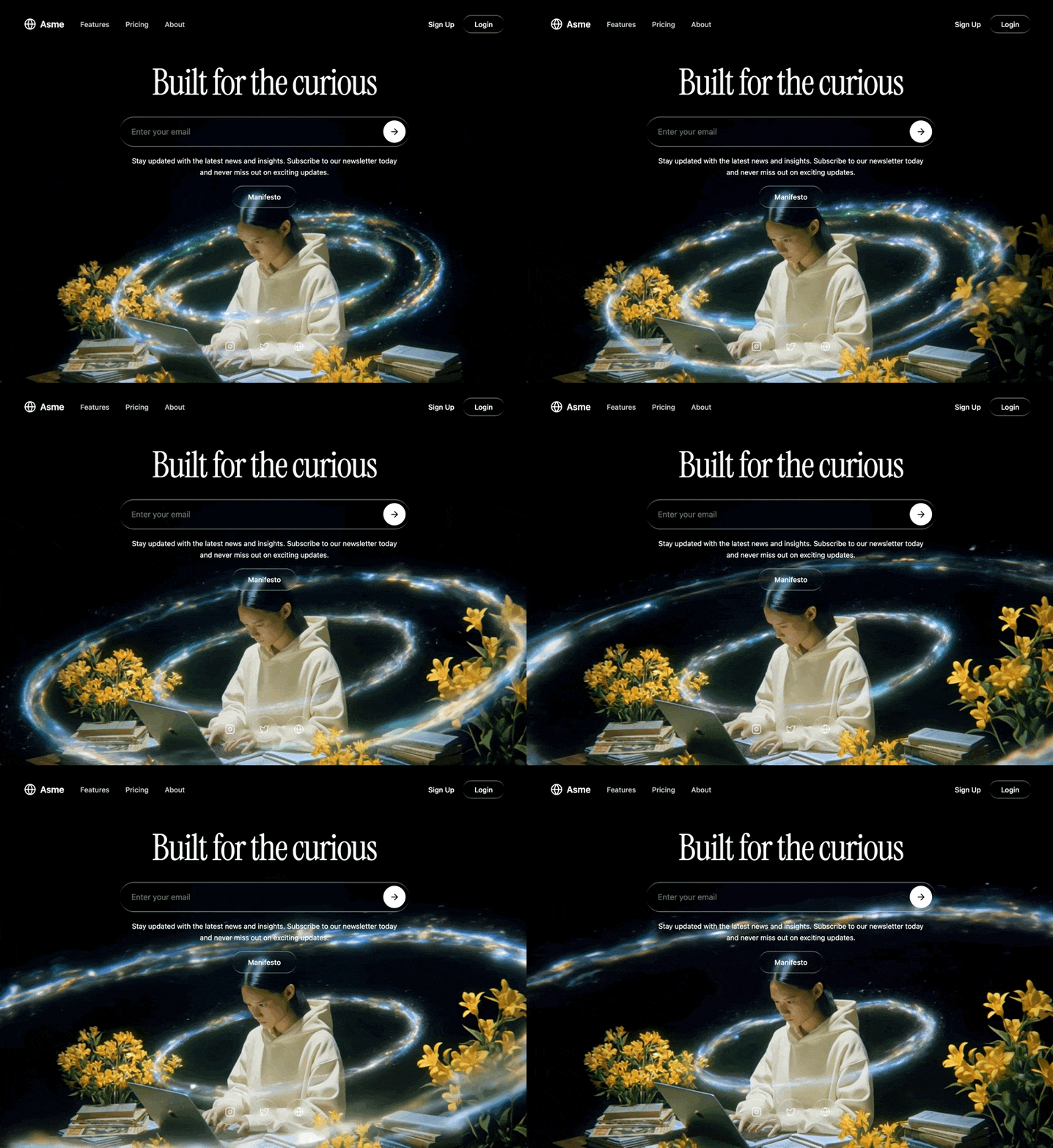
A preview-led hero section prompt for generating a polished AI-built interface.
Direct delivery
543 words · 49 linesBuild a single-page hero section with a full-screen looping background video, liquid glass UI elements, and a dark cinematic aesthetic. Use React, TypeScript, Tailwind CSS, and Lucide React icons. Here are the exact specifications:
Background Video:
Full-screen muted autoplaying video covering the entire viewport, positioned absolutely with object-cover
Video source URL: https://d8j0ntlcm91z4.cloudfront.net/user_38xzZboKViGWJOttwIXH07lWA1P/hf_20260328_115001_bcdaa3b4-03de-47e7-ad63-ae3e392c32d4.mp4
The video is shifted down by 17% (translate-y-[17%]) so the top portion of the video is cropped -- the interesting content is in the lower portion of the frame
The video loops seamlessly with a custom JavaScript fade system (no CSS transitions): 500ms requestAnimationFrame-based fade-in on load/loop start, 500ms fade-out when 0.55 seconds remain before the video ends. A fadingOutRef boolean prevents re-triggering the fade-out from repeated timeUpdate events. On ended, opacity is set to 0, then after 100ms the video resets to currentTime = 0, plays, and fades back in. Each new fade cancels any running animation frame to prevent competing animations. Fades resume from the current opacity rather than snapping.
The outer container is min-h-screen bg-black with overflow-hidden
Font:
Import Google Font "Instrument Serif" (both regular and italic) via CSS @import url('https://fonts.googleapis.com/css2?family=Instrument+Serif:ital@0;1&display=swap')
The heading uses fontFamily: "'Instrument Serif', serif" applied via inline style
Liquid Glass CSS (.liquid-glass class):
background: rgba(255, 255, 255, 0.01) with background-blend-mode: luminosity
backdrop-filter: blur(4px) and -webkit-backdrop-filter: blur(4px)
border: none
box-shadow: inset 0 1px 1px rgba(255, 255, 255, 0.1)
position: relative; overflow: hidden
A ::before pseudo-element creates the glass border effect:
position: absolute; inset: 0; border-radius: inherit; padding: 1.4px
background: linear-gradient(180deg, rgba(255,255,255,0.45) 0%, rgba(255,255,255,0.15) 20%, rgba(255,255,255,0) 40%, rgba(255,255,255,0) 60%, rgba(255,255,255,0.15) 80%, rgba(255,255,255,0.45) 100%)
Mask trick for border-only rendering: -webkit-mask: linear-gradient(#fff 0 0) content-box, linear-gradient(#fff 0 0); -webkit-mask-composite: xor; mask-composite: exclude
pointer-events: none
Layout (all inside one full-screen flex column):
Navigation bar (relative z-20, padding pl-6 pr-6 py-6):
Inner container: rounded-full px-6 py-3 flex items-center justify-between max-w-5xl mx-auto
Left side: Logo area with a Globe icon (size 24) and text "Asme" in white, font-semibold text-lg, with gap-2
Next to the logo (with gap-8): three nav links ("Features", "Pricing", "About") -- hidden on mobile, shown on md: -- styled text-white/80 hover:text-white transition-colors text-sm font-medium
Right side (gap-4): "Sign Up" as plain white text button, "Login" as a liquid-glass rounded-full px-6 py-2 button
Hero content area (relative z-10 flex-1 flex flex-col items-center justify-center px-6 py-12 text-center -translate-y-[20%]):
Heading: "Built for the curious" -- text-5xl md:text-6xl lg:text-7xl text-white mb-8 tracking-tight whitespace-nowrap with Instrument Serif font
Below the heading, a max-w-xl w-full space-y-4 container:
Email input bar: liquid-glass rounded-full pl-6 pr-2 py-2 flex items-center gap-3. Inside: a transparent email input (placeholder: "Enter your email", text-white placeholder:text-white/40 text-base) and a white circular submit button (bg-white rounded-full p-3 text-black) containing an ArrowRight icon (size 20)
Subtitle text: text-white text-sm leading-relaxed px-4 -- "Stay updated with the latest news and insights. Subscribe to our newsletter today and never miss out on exciting updates."
Manifesto button: centered, liquid-glass rounded-full px-8 py-3 text-white text-sm font-medium hover:bg-white/5 transition-colors
Social icons footer (relative z-10 flex justify-center gap-4 pb-12):
Three circular icon buttons, each liquid-glass rounded-full p-4 text-white/80 hover:text-white hover:bg-white/5 transition-all
Icons: Instagram, Twitter, Globe (all size 20) from lucide-react
Each has an aria-label
Tech stack: Vite + React 18 + TypeScript, Tailwind CSS 3, lucide-react for all icons. Default Tailwind config with no extensions. No other UI libraries.Keep exploring
A preview-led hero prompt for generating a polished AI-built interface.
A preview-led hero prompt for generating a polished AI-built interface.
A preview-led hero section prompt for generating a polished AI-built interface.

.webp)