
.webp)
Hero
Bold Studio
A preview-led hero prompt for generating a polished AI-built interface.
by MotionSites View full prompt
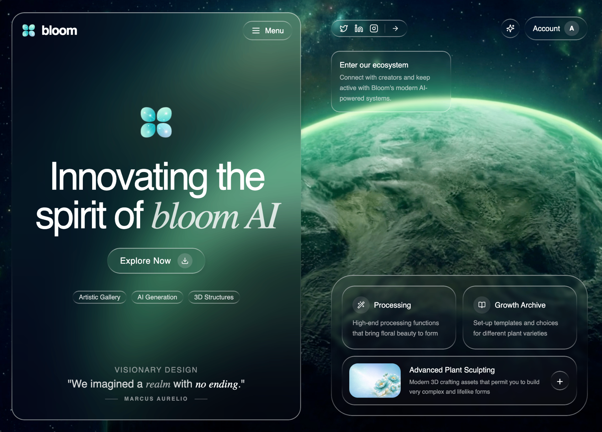
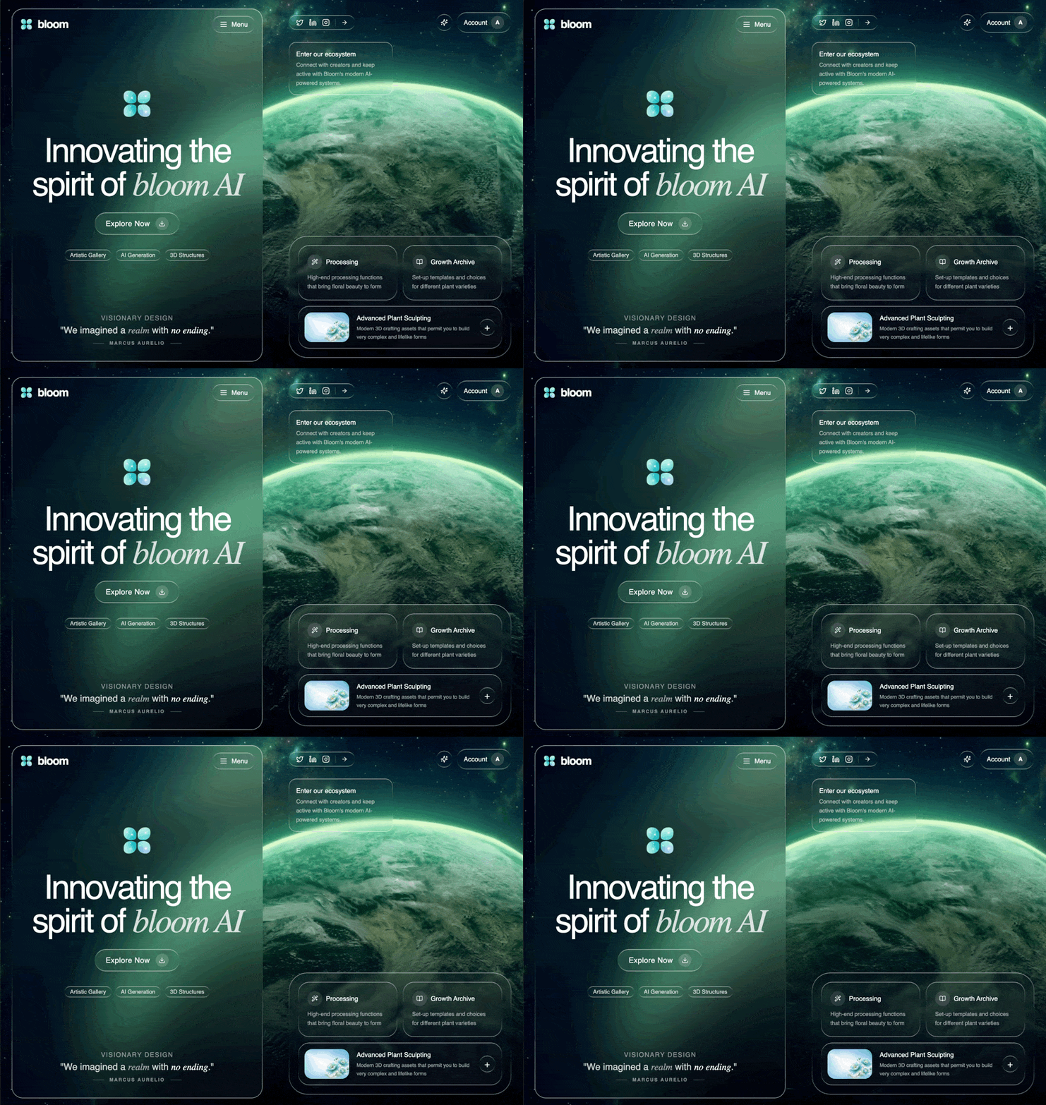
A preview-led hero section prompt for generating a polished AI-built interface.
Direct delivery
469 words · 63 linesCreate a full-screen hero landing page for "Bloom" — an AI-powered plant/floral design platform. The design uses a liquid glass morphism aesthetic over a looping video background. Background Full-screen autoplaying, looping, muted video background: https://d8j0ntlcm91z4.cloudfront.net/user_38xzZboKViGWJOttwIXH07lWA1P/hf_20260315_073750_51473149-4350-4920-ae24-c8214286f323.mp4 Video covers entire viewport with object-cover, sits at z-0. All content floats above at z-10. Fonts Display/Body: Poppins (Google Fonts) — used for headings and body text Serif accent: Source Serif 4 (Google Fonts) — used only for italic/emphasis text inside headings (e.g., <em>, <i>, .italic inside h1-h3) Headings use font-weight: 500 Color Palette Strict grayscale only — all CSS variables are 0 0% X% HSL values Text is text-white, text-white/80, text-white/60, text-white/50 for hierarchy No colored accents whatsoever Liquid Glass CSS (two tiers) Define under @layer components: .liquid-glass (light) background: rgba(255,255,255,0.01); background-blend-mode: luminosity; backdrop-filter: blur(4px); border: none; box-shadow: inset 0 1px 1px rgba(255,255,255,0.1); position: relative; overflow: hidden; ::before pseudo-element: gradient border using linear-gradient(180deg, rgba(255,255,255,0.45) 0%, rgba(255,255,255,0.15) 20%, transparent 40%, transparent 60%, rgba(255,255,255,0.15) 80%, rgba(255,255,255,0.45) 100%) with padding: 1.4px, masked via -webkit-mask-composite: xor; mask-composite: exclude; .liquid-glass-strong (heavy, for CTA/panels) Same structure but backdrop-filter: blur(50px), box-shadow: 4px 4px 4px rgba(0,0,0,0.05), inset 0 1px 1px rgba(255,255,255,0.15), and ::before uses 0.5/0.2 alpha instead of 0.45/0.15. Layout — Two-Panel Split Flex row, min-h-screen. Left panel w-[52%], right panel w-[48%] (hidden on mobile lg:flex). Left Panel Has a liquid-glass-strong overlay (absolute inset-4 lg:inset-6 rounded-3xl) Nav: Logo image (/logo.png, 32×32) + "bloom" text (semibold, 2xl, tracking-tighter, white) on left. "Menu" button with Menu icon on right, liquid-glass pill. Hero center (flex-1, centered): Logo image again (80×80) h1: "Innovating the / spirit of bloom AI" — text-6xl lg:text-7xl, tracking-[-0.05em], white. The italic part uses font-serif text-white/80 CTA button: "Explore Now" with Download icon in a w-7 h-7 rounded-full bg-white/15 circle. Button is liquid-glass-strong, rounded-full, hover:scale-105 active:scale-95 Three pills: "Artistic Gallery", "AI Generation", "3D Structures" — liquid-glass, rounded-full, text-xs text-white/80 Bottom quote: "VISIONARY DESIGN" label (text-xs tracking-widest uppercase text-white/50) Quote: "We imagined a realm with no ending." — mixed font-display/font-serif italic spans Author: "MARCUS AURELIO" with horizontal lines on each side Right Panel (desktop only) Top bar: Social icons (Twitter, LinkedIn, Instagram) in a liquid-glass pill with ArrowRight. Account button with Sparkles icon button, both liquid-glass. Community card: Small liquid-glass card (w-56), "Enter our ecosystem" title + description Bottom feature section (mt-auto): Outer liquid-glass container with rounded-[2.5rem] Two side-by-side cards: "Processing" (Wand2 icon) and "Growth Archive" (BookOpen icon), each liquid-glass rounded-3xl Bottom card: flower image thumbnail (from @/assets/hero-flowers.png, 96×64), "Advanced Plant Sculpting" title + description, and a "+" button. All liquid-glass. Icons All from lucide-react: Sparkles, Download, Wand2, BookOpen, ArrowRight, Twitter, Linkedin, Instagram, Menu Key Details All interactive elements: hover:scale-105 transition-transform Social icon links: text-white hover:text-white/80 transition-colors Icon containers: w-8 h-8 rounded-full bg-white/10 flex items-center justify-center No border classes anywhere — glass effect handles all borders via ::before border-radius token: --radius: 1rem
Keep exploring
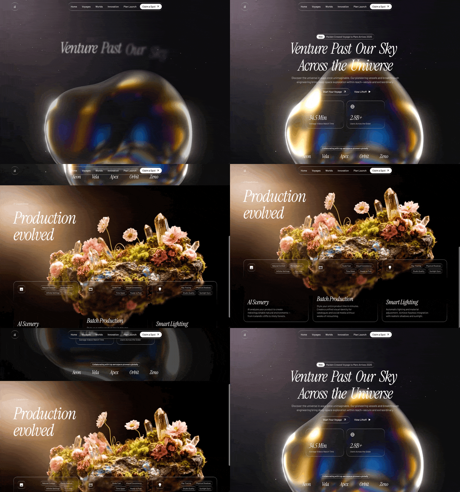
A preview-led hero prompt for generating a polished AI-built interface.
A preview-led hero prompt for generating a polished AI-built interface.
A preview-led hero section prompt for generating a polished AI-built interface.

.webp)

%20%E2%80%94%20used%20for%20headings%20and%20body%20text%0ASerif%20accent%3A%20Source%20Serif%204%20(Google%20Fonts)%20%E2%80%94%20used%20only%20for%20italic%2Femphasis%20text%20inside%20headings%20(e.g.%2C%20%3Cem%3E%2C%20%3Ci%3E%2C%20.italic%20inside%20h1-h3)%0AHeadings%20use%20font-weight%3A%20500%0A%0AColor%20Palette%0AStrict%20grayscale%20only%20%E2%80%94%20all%20CSS%20variables%20are%200%200%25%20X%25%20HSL%20values%0AText%20is%20text-white%2C%20text-white%2F80%2C%20text-white%2F60%2C%20text-white%2F50%20for%20hierarchy%0ANo%20colored%20accents%20whatsoever%0A%0ALiquid%20Glass%20CSS%20(two%20tiers)%0ADefine%20under%20%40layer%20components%3A%0A%0A.liquid-glass%20(light)%0Abackground%3A%20rgba(255%2C255%2C255%2C0.01)%3B%0Abackground-blend-mode%3A%20luminosity%3B%0Abackdrop-filter%3A%20blur(4px)%3B%0Aborder%3A%20none%3B%0Abox-shadow%3A%20inset%200%201px%201px%20rgba(255%2C255%2C255%2C0.1)%3B%0Aposition%3A%20relative%3B%20overflow%3A%20hidden%3B%0A%3A%3Abefore%20pseudo-element%3A%20gradient%20border%20using%20linear-gradient(180deg%2C%20rgba(255%2C255%2C255%2C0.45)%200%25%2C%20rgba(255%2C255%2C255%2C0.15)%2020%25%2C%20transparent%2040%25%2C%20transparent%2060%25%2C%20rgba(255%2C255%2C255%2C0.15)%2080%25%2C%20rgba(255%2C255%2C255%2C0.45)%20100%25)%20with%20padding%3A%201.4px%2C%20masked%20via%20-webkit-mask-composite%3A%20xor%3B%20mask-composite%3A%20exclude%3B%0A%0A.liquid-glass-strong%20(heavy%2C%20for%20CTA%2Fpanels)%0ASame%20structure%20but%20backdrop-filter%3A%20blur(50px)%2C%20box-shadow%3A%204px%204px%204px%20rgba(0%2C0%2C0%2C0.05)%2C%20inset%200%201px%201px%20rgba(255%2C255%2C255%2C0.15)%2C%20and%20%3A%3Abefore%20uses%200.5%2F0.2%20alpha%20instead%20of%200.45%2F0.15.%0A%0ALayout%20%E2%80%94%20Two-Panel%20Split%0AFlex%20row%2C%20min-h-screen.%20Left%20panel%20w-%5B52%25%5D%2C%20right%20panel%20w-%5B48%25%5D%20(hidden%20on%20mobile%20lg%3Aflex).%0A%0ALeft%20Panel%0AHas%20a%20liquid-glass-strong%20overlay%20(absolute%20inset-4%20lg%3Ainset-6%20rounded-3xl)%0ANav%3A%20Logo%20image%20(%2Flogo.png%2C%2032%C3%9732)%20%2B%20%22bloom%22%20text%20(semibold%2C%202xl%2C%20tracking-tighter%2C%20white)%20on%20left.%20%22Menu%22%20button%20with%20Menu%20icon%20on%20right%2C%20liquid-glass%20pill.%0AHero%20center%20(flex-1%2C%20centered)%3A%0ALogo%20image%20again%20(80%C3%9780)%0Ah1%3A%20%22Innovating%20the%20%2F%20spirit%20of%20bloom%20AI%22%20%E2%80%94%20text-6xl%20lg%3Atext-7xl%2C%20tracking-%5B-0.05em%5D%2C%20white.%20The%20italic%20part%20uses%20font-serif%20text-white%2F80%0ACTA%20button%3A%20%22Explore%20Now%22%20with%20Download%20icon%20in%20a%20w-7%20h-7%20rounded-full%20bg-white%2F15%20circle.%20Button%20is%20liquid-glass-strong%2C%20rounded-full%2C%20hover%3Ascale-105%20active%3Ascale-95%0AThree%20pills%3A%20%22Artistic%20Gallery%22%2C%20%22AI%20Generation%22%2C%20%223D%20Structures%22%20%E2%80%94%20liquid-glass%2C%20rounded-full%2C%20text-xs%20text-white%2F80%0ABottom%20quote%3A%0A%22VISIONARY%20DESIGN%22%20label%20(text-xs%20tracking-widest%20uppercase%20text-white%2F50)%0AQuote%3A%20%22We%20imagined%20a%20realm%20with%20no%20ending.%22%20%E2%80%94%20mixed%20font-display%2Ffont-serif%20italic%20spans%0AAuthor%3A%20%22MARCUS%20AURELIO%22%20with%20horizontal%20lines%20on%20each%20side%0A%0ARight%20Panel%20(desktop%20only)%0ATop%20bar%3A%20Social%20icons%20(Twitter%2C%20LinkedIn%2C%20Instagram)%20in%20a%20liquid-glass%20pill%20with%20ArrowRight.%20Account%20button%20with%20Sparkles%20icon%20button%2C%20both%20liquid-glass.%0ACommunity%20card%3A%20Small%20liquid-glass%20card%20(w-56)%2C%20%22Enter%20our%20ecosystem%22%20title%20%2B%20description%0ABottom%20feature%20section%20(mt-auto)%3A%20Outer%20liquid-glass%20container%20with%20rounded-%5B2.5rem%5D%0ATwo%20side-by-side%20cards%3A%20%22Processing%22%20(Wand2%20icon)%20and%20%22Growth%20Archive%22%20(BookOpen%20icon)%2C%20each%20liquid-glass%20rounded-3xl%0ABottom%20card%3A%20flower%20image%20thumbnail%20(from%20%40%2Fassets%2Fhero-flowers.png%2C%2096%C3%9764)%2C%20%22Advanced%20Plant%20Sculpting%22%20title%20%2B%20description%2C%20and%20a%20%22%2B%22%20button.%20All%20liquid-glass.%0A%0AIcons%0AAll%20from%20lucide-react%3A%20Sparkles%2C%20Download%2C%20Wand2%2C%20BookOpen%2C%20ArrowRight%2C%20Twitter%2C%20Linkedin%2C%20Instagram%2C%20Menu%0A%0AKey%20Details%0AAll%20interactive%20elements%3A%20hover%3Ascale-105%20transition-transform%0ASocial%20icon%20links%3A%20text-white%20hover%3Atext-white%2F80%20transition-colors%0AIcon%20containers%3A%20w-8%20h-8%20rounded-full%20bg-white%2F10%20flex%20items-center%20justify-center%0ANo%20border%20classes%20anywhere%20%E2%80%94%20glass%20effect%20handles%20all%20borders%20via%20%3A%3Abefore%0Aborder-radius%20token%3A%20--radius%3A%201rem&model=Seedance%202.5%20Pro)