SaaS
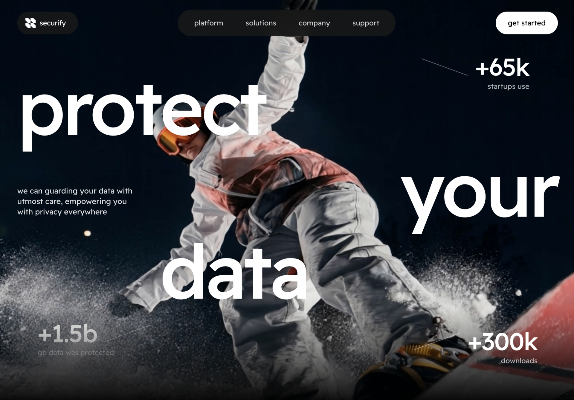
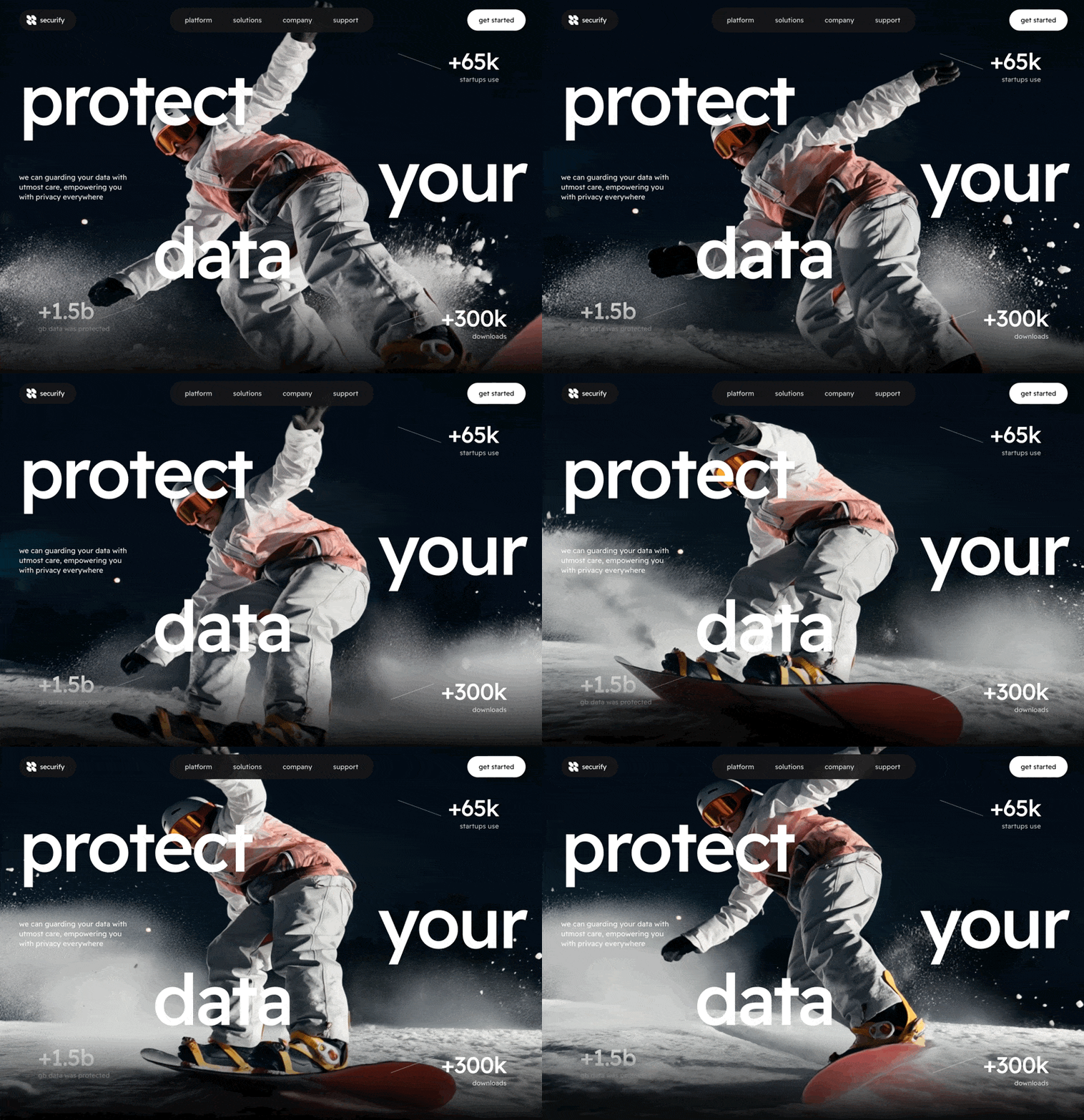
Securify Data Security
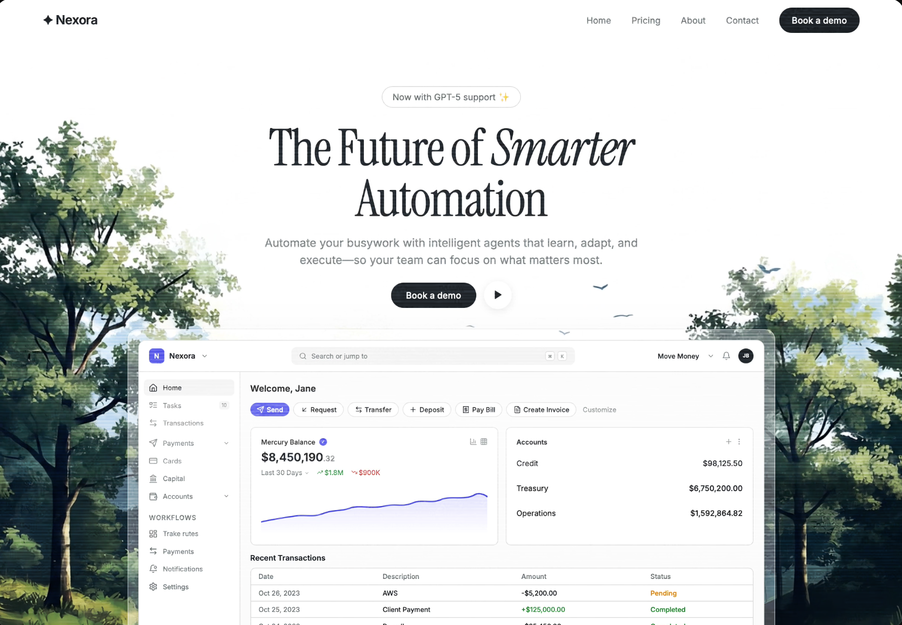
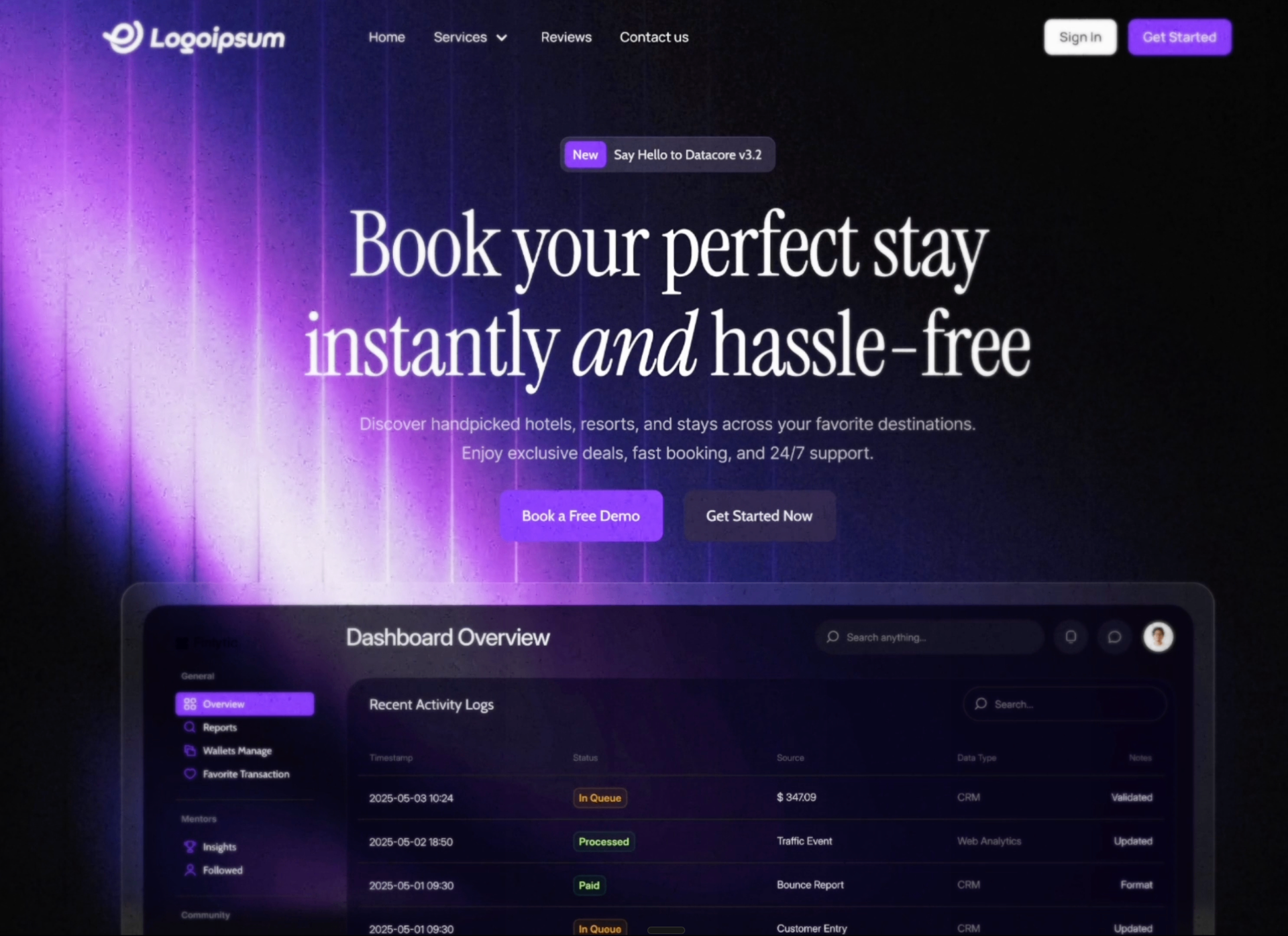
A preview-led saas prompt for generating a polished AI-built interface.
by MotionSites View full prompt
A preview-led saas prompt for generating a polished AI-built interface.
Direct delivery
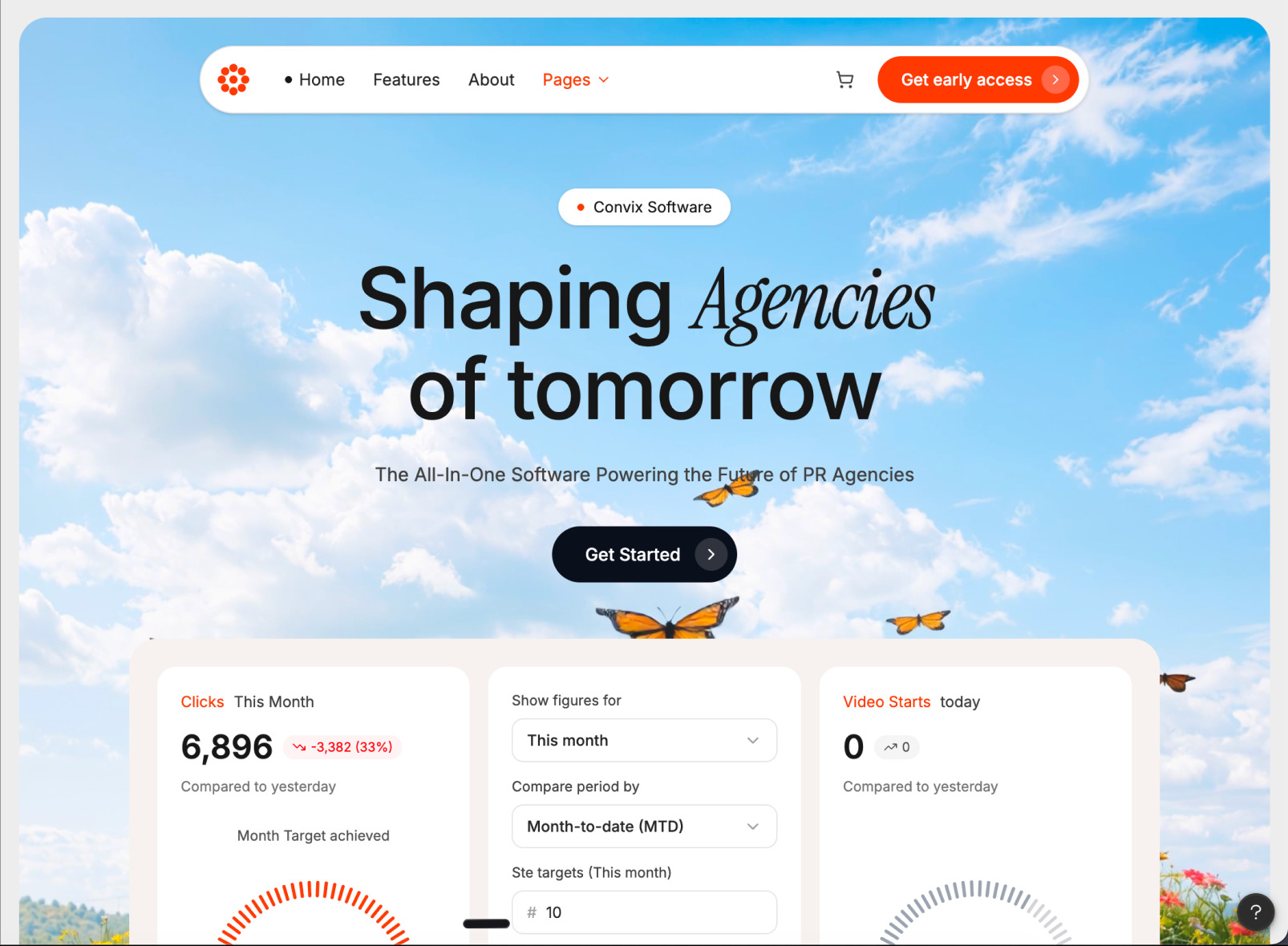
707 words · 82 linesBuild a fully responsive, full-viewport hero section for a PR-agency SaaS called "Convix Software" with these exact specs:
Page Frame
Outer wrapper: min-h-screen w-full bg-[#ededed] p-3 sm:p-4, font-family Inter
Hero container (clips everything inside): relative w-full h-[calc(100vh-24px)] sm:h-[calc(100vh-32px)] overflow-hidden bg-[#d9d9d9] rounded-2xl sm:rounded-3xl
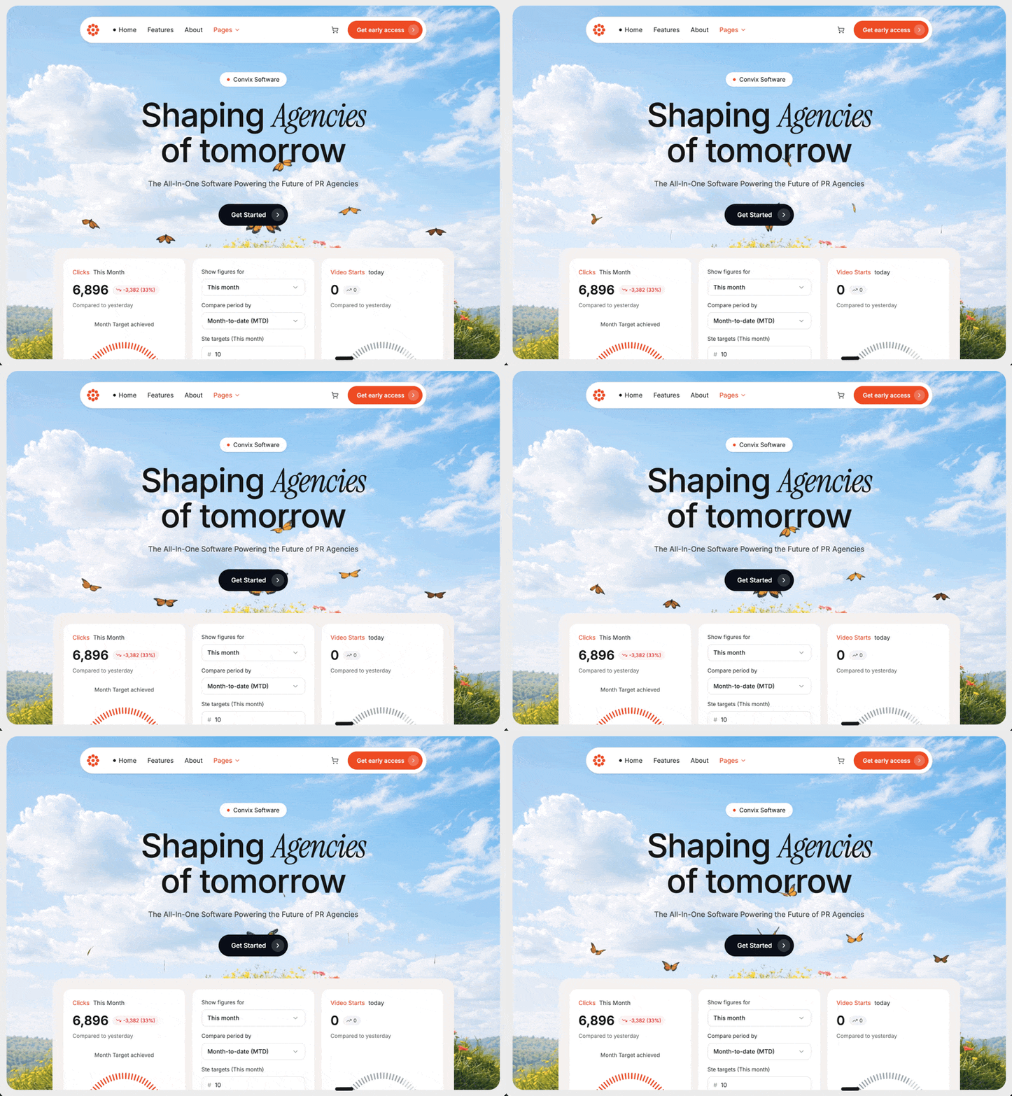
Background Video
URL: https://d8j0ntlcm91z4.cloudfront.net/user_38xzZboKViGWJOttwIXH07lWA1P/hf_20260424_064411_9e9d7f84-9277-41f4-ab10-59172d89e6be.mp4
Absolutely positioned, inset-0 w-full h-full object-cover pointer-events-none
Attributes: autoPlay, loop, muted, playsInline, preload="auto", disableRemotePlayback, webkit-playsinline="true", x5-playsinline="true"
Poster fallback: https://images.unsplash.com/photo-1557683316-973673baf926?w=1600&q=60
Above the video: absolute inset-0 bg-white/10 overlay
Foreground content wrapper: relative z-10
Fonts (/src/styles/fonts.css)
Import from Google Fonts:
Inter weights 400, 500, 600, 700
Instrument Serif regular + italic
Navbar (floating pill, responsive with hamburger)
Wrapper: flex justify-center pt-4 sm:pt-6 px-3 sm:px-4
Pill: bg-white rounded-full shadow-sm border border-neutral-200 pl-2 pr-2 py-2 w-full max-w-[760px] relative
Logo (left, shrink-0): orange #ef4d23 8-petal flower SVG — 8 circles at radius 10 around center (16,16) plus center circle, all r=3.5, viewBox 32×32, rendered w-7 h-7 sm:w-8 sm:h-8
Desktop links (hidden md:flex, gap-6, 14px): "Home" (with 1.5px black dot), "Features", "About", "Pages" (#ef4d23 + ChevronDown 3.5)
Right cluster (ml-auto): ShoppingCart icon (hidden on mobile), then orange #ef4d23 rounded-full button "Get early access" (desktop) / "Early access" (mobile) with white/20 inner circle holding ChevronRight
Mobile-only Menu (lucide) hamburger button (md:hidden)
When open: dropdown panel absolute top-full left-2 right-2 mt-2 bg-white rounded-2xl shadow-lg border border-neutral-200 p-3 z-20 listing the same nav items vertically
useState open toggles the menu
Hero Content (centered)
flex flex-col items-center px-4 pt-10 sm:pt-16 pb-8 sm:pb-12 text-center
Badge: inline-flex items-center gap-2 bg-white rounded-full px-4 py-1.5 shadow-sm, 13px — orange dot + "Convix Software"
Headline <h1> with inline style fontSize: clamp(36px, 8vw, 72px); lineHeight: 1.05; fontWeight: 500; letterSpacing: -0.02em, mt-5 sm:mt-6 max-w-4xl:
"Shaping " + <span style={{fontFamily:"'Instrument Serif', serif", fontStyle:"italic", fontWeight:400}}>Agencies</span> + <br> + "of tomorrow"
Subtitle <p> mt-4 sm:mt-6 text-neutral-700 px-2, fontSize: clamp(13px, 3.5vw, 16px): "The All-In-One Software Powering the Future of PR Agencies"
CTA button mt-6 sm:mt-8 inline-flex items-center gap-3 bg-[#0b0f1a] text-white rounded-full pl-6 sm:pl-7 pr-2 py-2 sm:py-2.5, 14px: "Get Started" + w-6 h-6 sm:w-7 sm:h-7 rounded-full bg-white/15 containing ChevronRight (4×4)
Dashboard Preview
Wrapper: bg-[#f5f2ee] rounded-3xl p-4 sm:p-6 w-full max-w-[880px] mx-auto
Grid: grid grid-cols-1 sm:grid-cols-2 lg:grid-cols-3 gap-3 sm:gap-4
Outer container around it: px-3 sm:px-4
Card 1 — Clicks (white, rounded-2xl, p-5)
Header: orange "Clicks" + neutral "This Month" (13px)
Big number "6,896" (28px, weight 600) + red pill bg-red-50 text-red-600 rounded-full px-2 py-0.5 with TrendingDown icon "-3,382 (33%)" (11px)
Small caption "Compared to yesterday"
Centered "Month Target achieved" label
Gauge at 92% in #ef4d23, with end labels "389K" / "425K"
Toggle pill bottom: bg-neutral-100 rounded-full p-1 flex — "Impressions" active (white card + shadow) / "Clicks" inactive
Card 2 — Form (white, rounded-2xl, p-5, flex flex-col gap-3)
Two label+dropdown groups (label 12px neutral-700, button bordered rounded-lg px-3 py-2 with ChevronDown):
"Show figures for" → "This month"
"Compare period by" → "Month-to-date (MTD)"
Two label+input groups with # prefix:
"Ste targets (This month)" → 10
"Ste targets (This year)" → 100
Footer: orange #ef4d23 "Save" button (rounded-lg px-5 py-2), underlined "Cancel", X icon pushed to right (ml-auto)
Card 3 — Video Starts (white, rounded-2xl, p-5)
Header: orange "Video Starts" + "today"
Big "0" + neutral pill with TrendingUp + "0"
"Compared to yesterday"
Gauge at 68% in #9ca3af (no end labels)
Toggle pill: "Video Clicks" active / "Video Starts"
Gauge Component (reusable)
Props: value, color="#ef4d23", showLabels, min, max
SVG viewBox 0 0 200 120, max-width 260px
40 tick marks spanning a 180° arc (start at angle π, sweep to 2π); active count = round(value/100 * 40)
Each tick: <line> from radius (r-10) to r=80 around center (100,100), strokeWidth=2.5, strokeLinecap="round", active uses color, inactive #d4d4d8
Center text: <text x=100 y=105 textAnchor="middle">{value}%</text>, fontSize 22, fontWeight 600
If showLabels: small flex row below SVG, 11px neutral-500, justify-between, showing min and max
Colors
Primary orange: #ef4d23
Dark CTA: #0b0f1a
Page bg: #ededed; hero bg: #d9d9d9; dashboard tray: #f5f2ee
Icons (lucide-react)
ChevronDown, ChevronRight, ShoppingCart, Menu, TrendingDown, TrendingUp, X
File Structure
src/app/App.tsx
src/app/components/Navbar.tsx
src/app/components/DashboardPreview.tsx
src/app/components/Gauge.tsx
src/styles/fonts.css
Behavior
No custom animations; only the native looping muted background video
Entire hero (video + content + dashboard) is clipped together by the rounded container, so the dashboard cards bleed off the bottom edge
Fully responsive: navbar collapses to hamburger under md, headline/CTA scale via clamp(), dashboard grid steps from 1 → 2 → 3 columnsKeep exploring
A preview-led saas prompt for generating a polished AI-built interface.
A preview-led saas prompt for generating a polished AI-built interface.
A preview-led saas prompt for generating a polished AI-built interface.