.webp)
Hero
Bold Studio
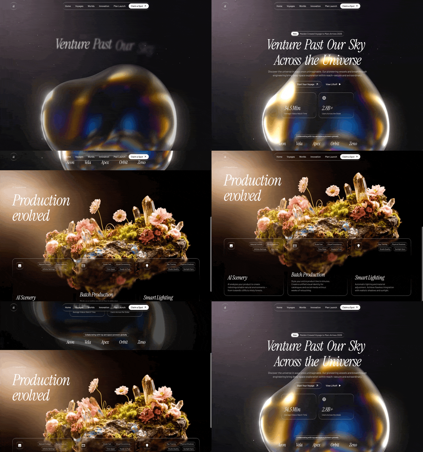
A preview-led hero prompt for generating a polished AI-built interface.
by MotionSites View full prompt
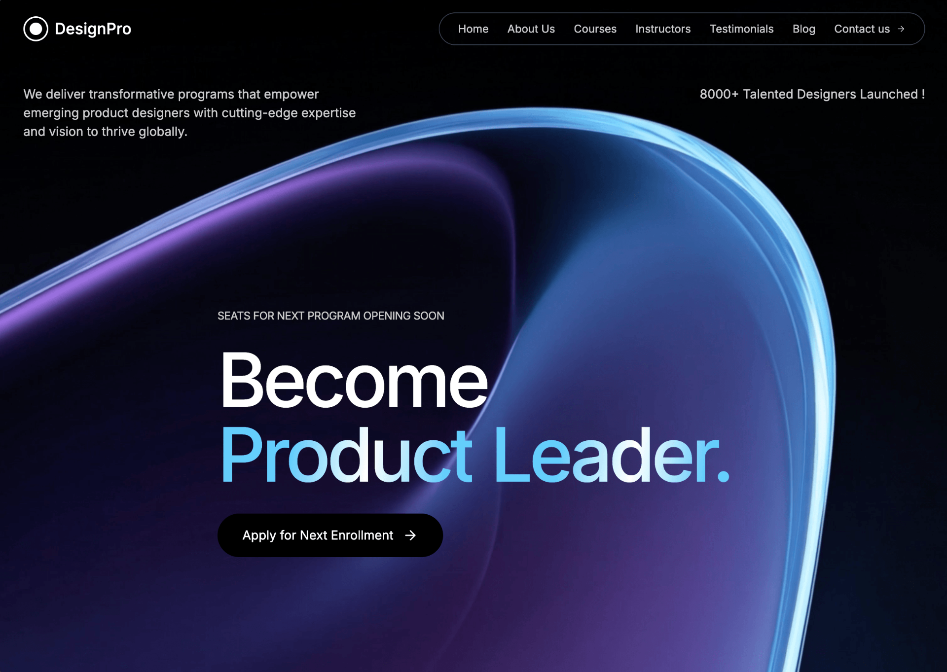
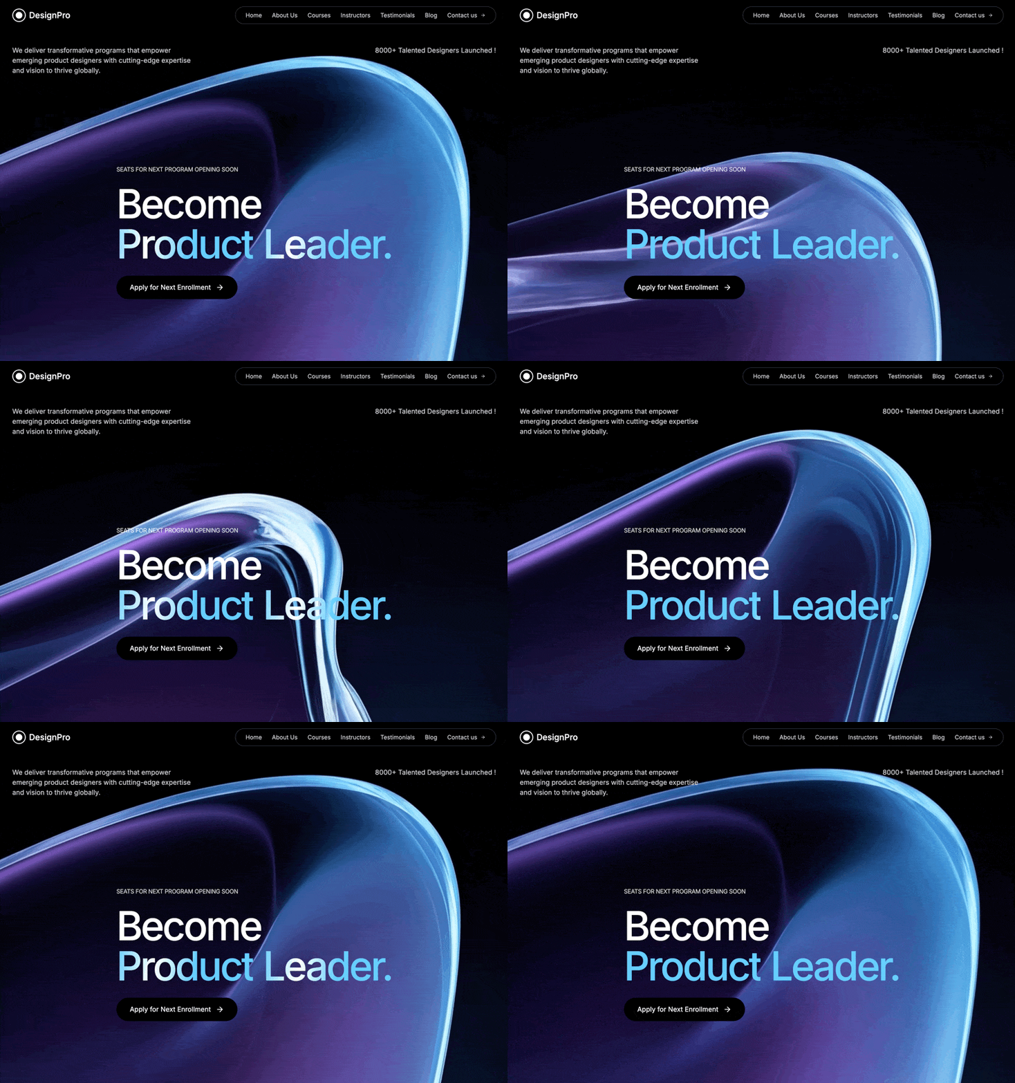
A preview-led hero section prompt for generating a polished AI-built interface.
Direct delivery
398 words · 125 linesCreate a full-screen hero section for a product design education platform called "DesignPro" with the following exact specifications: Background: Full-screen looping video background using this exact CloudFront URL: https://d8j0ntlcm91z4.cloudfront.net/user_38xzZboKViGWJOttwIXH07lWA1P/hf_20260328_105406_16f4600d-7a92-4292-b96e-b19156c7830a.mp4 Video should autoplay, loop, be muted, and play inline Background color: black (#000000) Navigation Bar: Logo: Circular design with a white border (2px), containing a smaller filled white circle inside, followed by "DesignPro" text Navigation links in a rounded pill container with gray-700 border: Home, About Us, Courses, Instructors, Testimonials, Blog, Contact us (with arrow icon) All nav links: white/80 opacity, hover to full white Font size: text-sm Mobile: Show hamburger menu icon on screens smaller than lg Max width: 7xl container with proper padding Content Layout: Top Section (below nav): Two-column layout on large screens, stacked on mobile Left column: "We deliver transformative programs that empower emerging product designers with cutting-edge expertise and vision to thrive globally." Right column (right-aligned on lg+): "8000+ Talented Designers Launched !" Both paragraphs: white/80 opacity, text-sm on mobile, text-base on desktop Hero Section (center): Small uppercase text above heading: "Seats for Next Program Opening Soon" (white/80 opacity, text-xs on mobile, text-sm on desktop, tight tracking) Main heading with these exact specifications: Line 1: "Become" in white, font-medium Line 2: "Product Leader." with animated shiny gradient effect Font sizes: text-5xl (mobile) scaling up to text-9xl (xl screens) Line height: 0.85 Letter spacing: tracking-tighter ShinyText Component: Use framer-motion for animation Base color: #64CEFB (light blue) Shine color: #ffffff (white) Animation speed: 3 seconds Gradient spread: 100 degrees Gradient should sweep across text continuously from left to right Use CSS gradient with backgroundClip: text and transparent text fill CTA Button: Text: "Apply for Next Enrollment" with arrow icon (from lucide-react) Black background, hover: gray-900 Rounded-full shape Padding: px-6 md:px-8, py-3 md:py-4 Arrow should translate right on hover Group hover animation on arrow icon Typography: Font family: Inter (sans-serif) All text colors: white/80 opacity for body text, full white for headings and hover states Technical Stack: React + TypeScript Vite Tailwind CSS Framer Motion for animations Lucide React for icons Responsive Breakpoints: Mobile-first design sm: 640px md: 768px lg: 1024px xl: 1280px Key CSS Details: Container max-width: max-w-7xl with centered margins Section height: h-screen Video: absolute positioning, inset-0, object-cover Content: relative z-10 positioning to appear above video Smooth transitions on all interactive elements Create the complete implementation including the ShinyText component with proper framer-motion animation logic.
Keep exploring
A preview-led hero prompt for generating a polished AI-built interface.
A preview-led hero prompt for generating a polished AI-built interface.
A preview-led hero section prompt for generating a polished AI-built interface.

.webp)