
.webp)
Hero
Bold Studio
A preview-led hero prompt for generating a polished AI-built interface.
by MotionSites View full prompt
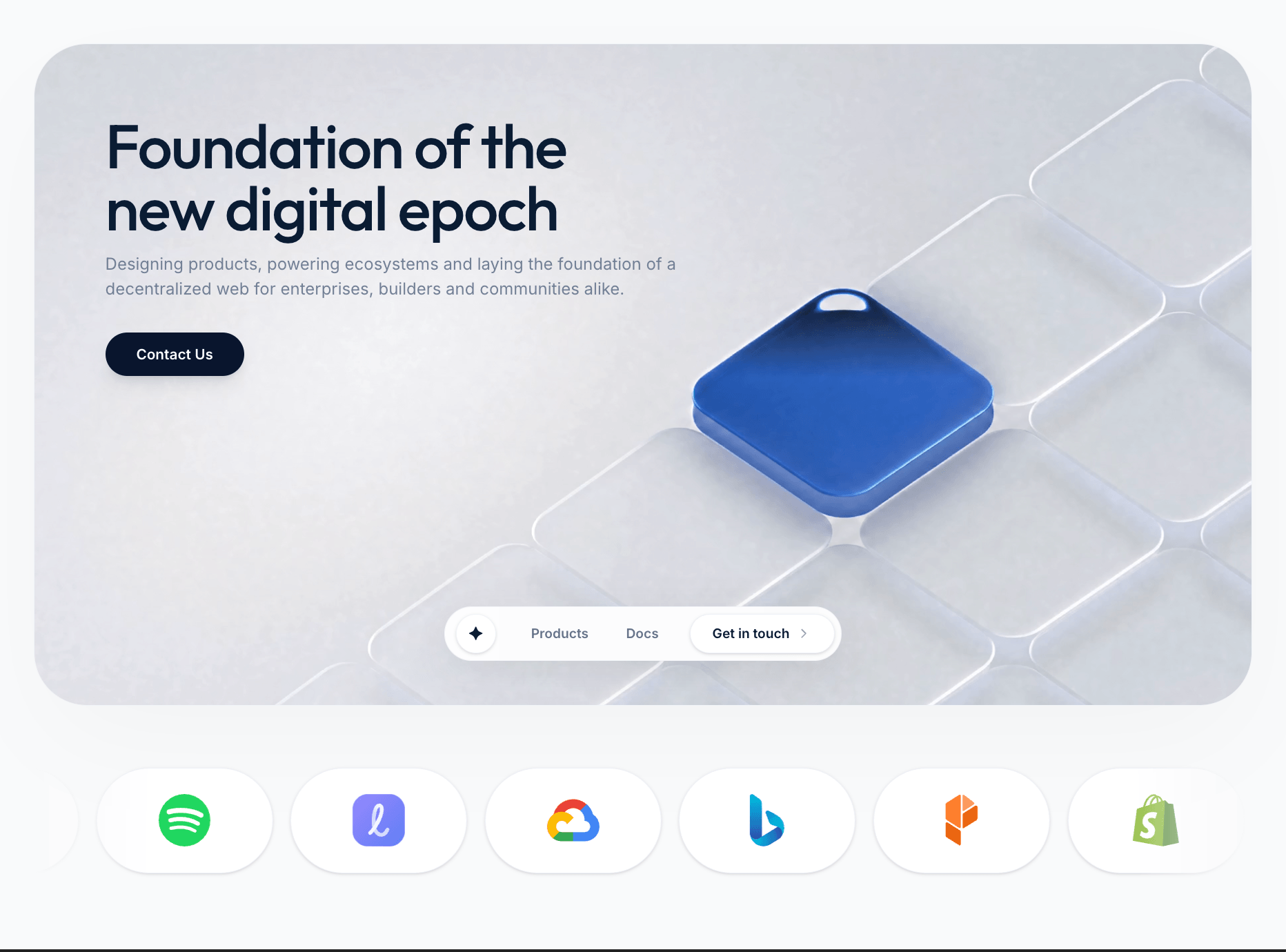
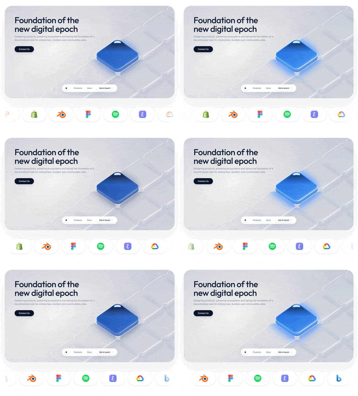
A preview-led hero section prompt for generating a polished AI-built interface.
Direct delivery
565 words · 39 linesBuild a modern, high-performance landing page section using React, TypeScript, Tailwind CSS v4, and Motion. The application should match the following exact specifications:
1. Dependencies & Setup
Libraries: Install lucide-react, motion, clsx, and tailwind-merge.
Fonts & CSS: In index.css, import the Inter and Outfit fonts from Google Fonts: @import url('https://fonts.googleapis.com/css2?family=Inter:wght@400;500;600;700&family=Outfit:wght@400;500;600&display=swap');
Configure the Tailwind theme in your CSS to use Inter as --font-sans and Outfit as --font-display.
The global body background should be #f9fafb.
2. Main Hero Container & Video Background
Create a hero section container with these exact classes: relative w-full max-w-[1400px] mx-auto rounded-[48px] bg-white border border-slate-200/50 shadow-[0_40px_100px_-20px_rgba(0,0,0,0.03)] overflow-hidden h-[600px] flex flex-col.
Inside, add an absolutely positioned underlying layer (absolute inset-0 pointer-events-none z-0 overflow-hidden select-none) for the background video.
The video tag must point to exactly this URL: https://d8j0ntlcm91z4.cloudfront.net/user_38xzZboKViGWJOttwIXH07lWA1P/hf_20260505_101331_74f9b798-3f00-4e86-8a01-377aa16ffeaa.mp4. It must include autoPlay, loop, muted, and playsInline attributes, with the classes: w-full h-full object-cover scale-105 transition-transform duration-1000. No overlays.
3. Hero Text Content
Create a content wrapper positioned relative (z-20 flex-1 px-8 md:px-16 pt-12 md:pt-16 flex flex-col items-start).
Use motion.div from motion/react to animate the text layer in (fade in, slide up slightly).
Headline: "Foundation of the<br />new digital epoch". Should use the font-display font, sizes text-[42px] md:text-[56px], medium weight, tight tracking, color #0a1b33.
Subheadline: "Designing products, powering ecosystems and laying the foundation of a decentralized web for enterprises, builders and communities alike." Should use font-sans, sizes text-[14px] md:text-[15px], color #64748b.
Contact Button: Text "Contact Us", using a dark background (bg-[#0a152d]), white text, rounded-full, with hover scale animations via motion.button.
4. Floating Bottom Navbar
Create an absolutely positioned navbar wrapper at the bottom center of the hero: absolute bottom-10 left-1/2 -translate-x-1/2 z-30.
The nav element should use motion.nav to fade in and slide up (delayed after the text). It must have the classes: flex items-center bg-white/90 backdrop-blur-2xl px-1.5 py-1.5 rounded-full shadow-[0_12px_40px_rgba(0,0,0,0.08)] border border-slate-200/40.
Nav Elements:
A small circular logo placeholder on the left (w-9 h-9 bg-white border-slate-100 shadow-sm) containing the star character "✦".
Two standard text buttons: "Products" and "Docs" (text-[12px] font-semibold text-slate-500 hover:text-[#0a1b33]).
A "Get in touch" button on the right containing the text and a small ChevronRight (from lucide-react). Styled identically to the marquee cards: bg-white px-5 py-2 rounded-full text-[12px] font-semibold text-[#0a1b33] border border-slate-200/60 shadow-sm hover:border-slate-300 transition-all.
5. Seamless Marquee Logo Scroller Component
Below the hero container (mt-10), add a custom highly-performant Marquee Scroller component.
The scroller must use a pure CSS @keyframes animation (transform: translateX(0) to translateX(-50%)) for infinite scrolling, pausing on hover. It needs a left/right masking gradient (maskImage linear-gradient fading to transparent on the edges). No title or description text above the scroller.
The Logos List: Supply an array of 8 objects with src URLs from svgl.app, alt names, and hex gradient objects:
Procure (procure.svg, blue gradient)
Shopify (shopify.svg, yellow gradient)
Blender (blender.svg, blue gradient)
Figma (figma.svg, purple gradient)
Spotify (spotify.svg, pink/red gradient)
Lottielab (lottielab.svg, yellow/green)
Google Cloud (google-cloud.svg, light blue)
Bing (bing.svg, cyan/teal)
Render the list twice inline to ensure a seamless loop.
Card Design: Make each logo's container card exactly match the "Get in touch" navbar button's styling. The container classes must be exactly: group relative h-24 w-40 shrink-0 flex items-center justify-center rounded-full bg-white border border-slate-200/60 shadow-sm hover:border-slate-300 transition-all overflow-hidden.
Inside the card, add an absolute div using the specific gradient colors, scaled at 1.5 and 0 opacity, which drops to scale 1 and opacity 100 on group-hover.
The image tag should invert/turn black on hover (group-hover:brightness-0 group-hover:invert).Keep exploring
A preview-led hero prompt for generating a polished AI-built interface.
A preview-led hero prompt for generating a polished AI-built interface.
A preview-led hero section prompt for generating a polished AI-built interface.

.webp)

%3B%0AConfigure%20the%20Tailwind%20theme%20in%20your%20CSS%20to%20use%20Inter%20as%20--font-sans%20and%20Outfit%20as%20--font-display.%0AThe%20global%20body%20background%20should%20be%20%23f9fafb.%0A2.%20Main%20Hero%20Container%20%26%20Video%20Background%0ACreate%20a%20hero%20section%20container%20with%20these%20exact%20classes%3A%20relative%20w-full%20max-w-%5B1400px%5D%20mx-auto%20rounded-%5B48px%5D%20bg-white%20border%20border-slate-200%2F50%20shadow-%5B0_40px_100px_-20px_rgba(0%2C0%2C0%2C0.03)%5D%20overflow-hidden%20h-%5B600px%5D%20flex%20flex-col.%0AInside%2C%20add%20an%20absolutely%20positioned%20underlying%20layer%20(absolute%20inset-0%20pointer-events-none%20z-0%20overflow-hidden%20select-none)%20for%20the%20background%20video.%0AThe%20video%20tag%20must%20point%20to%20exactly%20this%20URL%3A%20https%3A%2F%2Fd8j0ntlcm91z4.cloudfront.net%2Fuser_38xzZboKViGWJOttwIXH07lWA1P%2Fhf_20260505_101331_74f9b798-3f00-4e86-8a01-377aa16ffeaa.mp4.%20It%20must%20include%20autoPlay%2C%20loop%2C%20muted%2C%20and%20playsInline%20attributes%2C%20with%20the%20classes%3A%20w-full%20h-full%20object-cover%20scale-105%20transition-transform%20duration-1000.%20No%20overlays.%0A3.%20Hero%20Text%20Content%0ACreate%20a%20content%20wrapper%20positioned%20relative%20(z-20%20flex-1%20px-8%20md%3Apx-16%20pt-12%20md%3Apt-16%20flex%20flex-col%20items-start).%0AUse%20motion.div%20from%20motion%2Freact%20to%20animate%20the%20text%20layer%20in%20(fade%20in%2C%20slide%20up%20slightly).%0AHeadline%3A%20%22Foundation%20of%20the%3Cbr%20%2F%3Enew%20digital%20epoch%22.%20Should%20use%20the%20font-display%20font%2C%20sizes%20text-%5B42px%5D%20md%3Atext-%5B56px%5D%2C%20medium%20weight%2C%20tight%20tracking%2C%20color%20%230a1b33.%0ASubheadline%3A%20%22Designing%20products%2C%20powering%20ecosystems%20and%20laying%20the%20foundation%20of%20a%20decentralized%20web%20for%20enterprises%2C%20builders%20and%20communities%20alike.%22%20Should%20use%20font-sans%2C%20sizes%20text-%5B14px%5D%20md%3Atext-%5B15px%5D%2C%20color%20%2364748b.%0AContact%20Button%3A%20Text%20%22Contact%20Us%22%2C%20using%20a%20dark%20background%20(bg-%5B%230a152d%5D)%2C%20white%20text%2C%20rounded-full%2C%20with%20hover%20scale%20animations%20via%20motion.button.%0A4.%20Floating%20Bottom%20Navbar%0ACreate%20an%20absolutely%20positioned%20navbar%20wrapper%20at%20the%20bottom%20center%20of%20the%20hero%3A%20absolute%20bottom-10%20left-1%2F2%20-translate-x-1%2F2%20z-30.%0AThe%20nav%20element%20should%20use%20motion.nav%20to%20fade%20in%20and%20slide%20up%20(delayed%20after%20the%20text).%20It%20must%20have%20the%20classes%3A%20flex%20items-center%20bg-white%2F90%20backdrop-blur-2xl%20px-1.5%20py-1.5%20rounded-full%20shadow-%5B0_12px_40px_rgba(0%2C0%2C0%2C0.08)%5D%20border%20border-slate-200%2F40.%0ANav%20Elements%3A%0AA%20small%20circular%20logo%20placeholder%20on%20the%20left%20(w-9%20h-9%20bg-white%20border-slate-100%20shadow-sm)%20containing%20the%20star%20character%20%22%E2%9C%A6%22.%0ATwo%20standard%20text%20buttons%3A%20%22Products%22%20and%20%22Docs%22%20(text-%5B12px%5D%20font-semibold%20text-slate-500%20hover%3Atext-%5B%230a1b33%5D).%0AA%20%22Get%20in%20touch%22%20button%20on%20the%20right%20containing%20the%20text%20and%20a%20small%20ChevronRight%20(from%20lucide-react).%20Styled%20identically%20to%20the%20marquee%20cards%3A%20bg-white%20px-5%20py-2%20rounded-full%20text-%5B12px%5D%20font-semibold%20text-%5B%230a1b33%5D%20border%20border-slate-200%2F60%20shadow-sm%20hover%3Aborder-slate-300%20transition-all.%0A5.%20Seamless%20Marquee%20Logo%20Scroller%20Component%0ABelow%20the%20hero%20container%20(mt-10)%2C%20add%20a%20custom%20highly-performant%20Marquee%20Scroller%20component.%0AThe%20scroller%20must%20use%20a%20pure%20CSS%20%40keyframes%20animation%20(transform%3A%20translateX(0)%20to%20translateX(-50%25))%20for%20infinite%20scrolling%2C%20pausing%20on%20hover.%20It%20needs%20a%20left%2Fright%20masking%20gradient%20(maskImage%20linear-gradient%20fading%20to%20transparent%20on%20the%20edges).%20No%20title%20or%20description%20text%20above%20the%20scroller.%0AThe%20Logos%20List%3A%20Supply%20an%20array%20of%208%20objects%20with%20src%20URLs%20from%20svgl.app%2C%20alt%20names%2C%20and%20hex%20gradient%20objects%3A%0AProcure%20(procure.svg%2C%20blue%20gradient)%0AShopify%20(shopify.svg%2C%20yellow%20gradient)%0ABlender%20(blender.svg%2C%20blue%20gradient)%0AFigma%20(figma.svg%2C%20purple%20gradient)%0ASpotify%20(spotify.svg%2C%20pink%2Fred%20gradient)%0ALottielab%20(lottielab.svg%2C%20yellow%2Fgreen)%0AGoogle%20Cloud%20(google-cloud.svg%2C%20light%20blue)%0ABing%20(bing.svg%2C%20cyan%2Fteal)%0ARender%20the%20list%20twice%20inline%20to%20ensure%20a%20seamless%20loop.%0ACard%20Design%3A%20Make%20each%20logo's%20container%20card%20exactly%20match%20the%20%22Get%20in%20touch%22%20navbar%20button's%20styling.%20The%20container%20classes%20must%20be%20exactly%3A%20group%20relative%20h-24%20w-40%20shrink-0%20flex%20items-center%20justify-center%20rounded-full%20bg-white%20border%20border-slate-200%2F60%20shadow-sm%20hover%3Aborder-slate-300%20transition-all%20overflow-hidden.%0AInside%20the%20card%2C%20add%20an%20absolute%20div%20using%20the%20specific%20gradient%20colors%2C%20scaled%20at%201.5%20and%200%20opacity%2C%20which%20drops%20to%20scale%201%20and%20opacity%20100%20on%20group-hover.%0AThe%20image%20tag%20should%20invert%2Fturn%20black%20on%20hover%20(group-hover%3Abrightness-0%20group-hover%3Ainvert).&model=Seedance%202.5%20Pro)