.webp)
Hero
Bold Studio
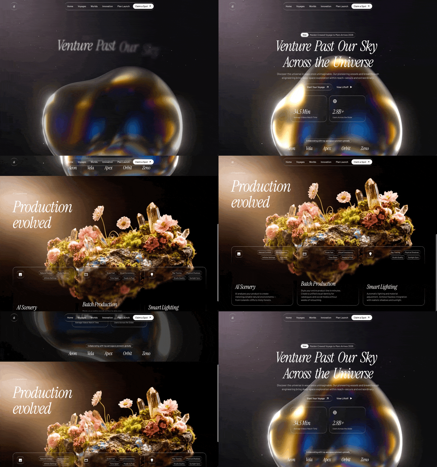
A preview-led hero prompt for generating a polished AI-built interface.
by MotionSites View full prompt
A preview-led hero section prompt for generating a polished AI-built interface.
Direct delivery
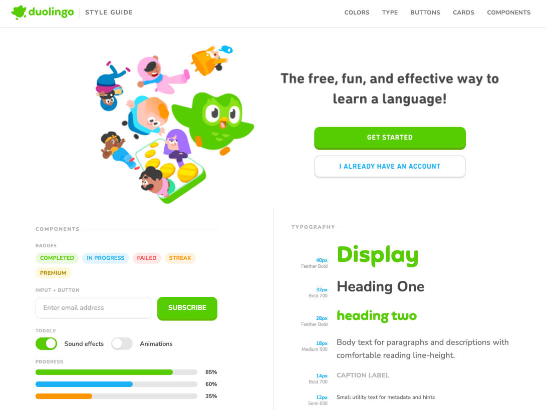
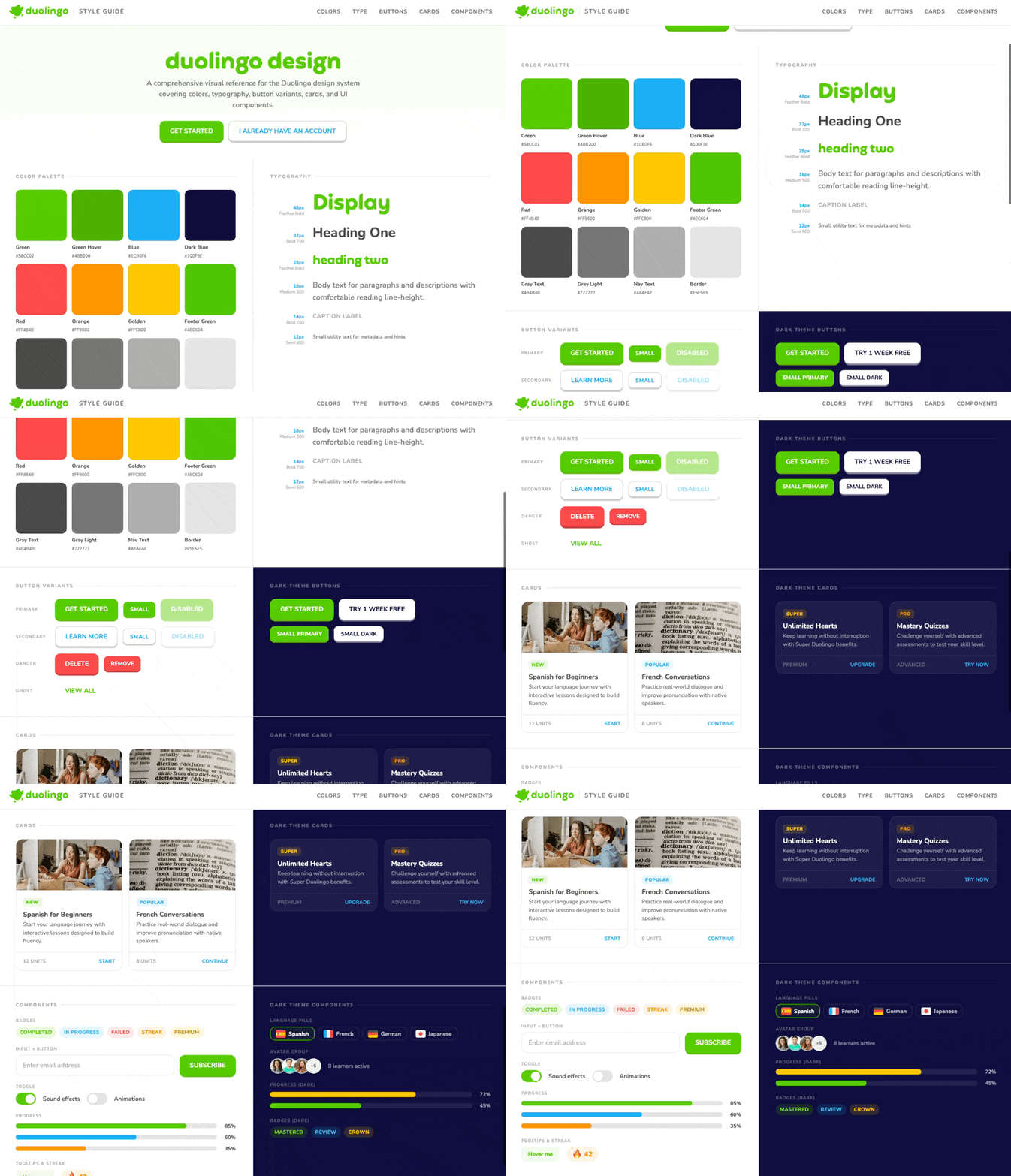
1453 words · 184 linesFonts Primary font: 'Nunito' from Google Fonts (weights: 400, 500, 600, 700, 800, 900) Display/heading font: 'Feather Bold' from https://db.onlinewebfonts.com/c/14936bb7a4b6575fd2eee80a3ab52cc2?family=Feather+Bold Font stack fallback: 'Nunito', 'DIN Round Pro', -apple-system, BlinkMacSystemFont, sans-serif Color Variables (CSS custom properties) --green: rgb(88, 204, 2) --green-hover: rgb(75, 178, 0) --green-shadow: #61B800 --dark-blue: rgb(16, 15, 62) --blue: rgb(28, 176, 246) --gray-text: rgb(75, 75, 75) --gray-light: rgb(119, 119, 119) --border-color: rgb(229, 229, 229) --nav-text: rgb(175, 175, 175) --footer-green: #4EC604 --red: #FF4B4B --orange: #FF9600 --golden: #FFC800 Structure & Layout Fixed Navbar (64px height, white background, bottom border) Left side: Duolingo logo image (https://d35aaqx5ub95lt.cloudfront.net/images/splash/f92d5f2f7d56636846861c458c0d0b6c.svg, 140x33px), followed by a 1px vertical divider (24px tall), then "STYLE GUIDE" label (11px, uppercase, letter-spacing 1.5px, gray) Right side: Horizontal nav links - "Colors", "Type", "Buttons", "Cards", "Components" (13px, bold, uppercase, 0.5px letter-spacing, gray, with green hover/active states and subtle green background on hover) Max-width: 1440px, centered Hero Section (centered, green-to-white gradient background) Headline: "duolingo design" in Feather Bold font, 52px, green color (#58CC02), lowercase Description: "A comprehensive visual reference for the Duolingo design system covering colors, typography, button variants, cards, and UI components." -- 17px, gray-light color, max-width 520px, 1.5 line-height Two buttons below: Primary "GET STARTED" button (green, white text, 12px border-radius, 4px green box-shadow for 3D effect, uppercase bold) and Secondary "I ALREADY HAVE AN ACCOUNT" button (transparent with 2px gray border, blue text, 4px gray box-shadow for 3D effect) Both buttons: 48px height, 24px horizontal padding, 15px font-size, 700 weight, uppercase Buttons have active state: box-shadow removed, translateY(4px) Padding: 56px top, 40px sides, 40px bottom Main Grid (2-column grid, no gap, max-width 1440px) Each panel has 36px vertical and 40px horizontal padding, bottom border and right border (border-color). Even panels have no right border. Each panel has a section label: 11px, 800 weight, uppercase, 2px letter-spacing, gray (nav-text), with a 1px line extending to the right via ::after pseudo-element. Panels in order (left-to-right, top-to-bottom): Panel 1: Color Palette (light) Grid of 12 color swatches, grid-template-columns: repeat(auto-fill, minmax(100px, 1fr)), 12px gap. Each swatch: Square (aspect-ratio: 1), 12px border-radius, 1px border rgba(0,0,0,0.06) Hover: scale(1.05) with box-shadow 0 8px 24px rgba(0,0,0,0.12) Below swatch: name (12px, bold, gray-text) and hex value (10px, gray-light, semi-bold) Colors in order: Green -- rgb(88, 204, 2) -- #58CC02 Green Hover -- rgb(75, 178, 0) -- #4BB200 Blue -- rgb(28, 176, 246) -- #1CB0F6 Dark Blue -- rgb(16, 15, 62) -- #100F3E Red -- #FF4B4B Orange -- #FF9600 Golden -- #FFC800 Footer Green -- #4EC604 Gray Text -- rgb(75, 75, 75) -- #4B4B4B Gray Light -- rgb(119, 119, 119) -- #777777 Nav Text -- rgb(175, 175, 175) -- #AFAFAF Border -- rgb(229, 229, 229) -- #E5E5E5 Panel 2: Typography (light) Vertical stack with 20px gap. Each row is a flex row (baseline-aligned, 20px gap) with a meta column (80px wide, right-aligned) showing size in blue (11px bold) and weight label below (10px, nav-text color), then the sample text. Rows: 48px / Feather Bold -- "Display" -- green color, Feather Bold font 32px / Bold 700 -- "Heading One" -- gray-text color 28px / Feather Bold -- "heading two" (lowercase) -- green color, Feather Bold font 18px / Medium 500 -- "Body text for paragraphs and descriptions with comfortable reading line-height." -- gray-light color, 1.6 line-height 14px / Bold 700 -- "CAPTION LABEL" -- uppercase, nav-text color, 0.5px letter-spacing 12px / Semi 600 -- "Small utility text for metadata and hints" -- gray-light color Panel 3: Button Variants (light) Vertical stack with 16px gap. Each row has an 80px label (10px, bold, uppercase, 1px letter-spacing, nav-text) then buttons with 12px gap, flex-wrap. Rows: "Primary" -- 3 buttons: "GET STARTED" (green bg, white text, 4px green shadow), "SMALL" (same but 36px height, 13px font, 16px padding, 10px radius, 3px shadow), "DISABLED" (same as primary but opacity 0.45, pointer-events none) "Secondary" -- 3 buttons: "LEARN MORE" (transparent, 2px #CFCFCF border, blue text, 4px #CFCFCF shadow), "SMALL" (same sizing as small primary), "DISABLED" (opacity 0.45) "Danger" -- 2 buttons: "DELETE" (#FF4B4B bg, white text, 4px #CC3C3C shadow), "REMOVE" (small variant) "Ghost" -- 1 button: "VIEW ALL" (no bg/border/shadow, green text, green bg on hover at 0.08 opacity) Panel 4: Dark Theme Buttons (dark-blue background) Section label and ::after line use white at 35% and 10% opacity respectively. Two rows: "GET STARTED" primary + "TRY 1 WEEK FREE" (white bg, dark-blue text, 4px #88879F shadow, hover bg #c8f040) Small variants of both Panel 5: Cards (light) 2-column grid, 16px gap. Each card: white bg, 2px border (border-color), 16px border-radius. Hover: translateY(-4px), box-shadow 0 12px 32px rgba(0,0,0,0.08). Card 1: Image: https://images.pexels.com/photos/4145354/pexels-photo-4145354.jpeg?auto=compress&cs=tinysrgb&w=400&h=200&fit=crop (120px height, cover) Tag: "NEW" (green text, green bg at 10% opacity, 11px, 800 weight, uppercase, 6px radius, 3px/8px padding) Title: "Spanish for Beginners" (16px, bold, gray-text) Description: "Start your language journey with interactive lessons designed to build fluency." (13px, gray-light, 1.5 line-height) Footer (12px top border, 12px/16px padding): left "12 UNITS" (12px bold uppercase nav-text), right "START" (12px bold uppercase blue, hover opacity 0.7) Card 2: Image: https://images.pexels.com/photos/267669/pexels-photo-267669.jpeg?auto=compress&cs=tinysrgb&w=400&h=200&fit=crop Tag: "POPULAR" (blue text, blue bg at 10% opacity) Title: "French Conversations" Description: "Practice real-world dialogue and improve pronunciation with native speakers." Footer: "8 UNITS" / "CONTINUE" Panel 6: Dark Theme Cards (dark-blue background) 2-column grid, same structure but no images. Cards have bg rgba(255,255,255,0.06), border rgba(255,255,255,0.08). Titles are white, descriptions are white at 50% opacity, footer border is white at 8% opacity, footer text is white at 30% opacity. Card 1: Tag: "SUPER" (golden #FFC800 text, golden bg at 15% opacity) Title: "Unlimited Hearts" Desc: "Keep learning without interruption with Super Duolingo benefits." Footer: "PREMIUM" / "UPGRADE" Card 2: Tag: "PRO" (orange #FF9600 text, orange bg at 15% opacity) Title: "Mastery Quizzes" Desc: "Challenge yourself with advanced assessments to test your skill level." Footer: "ADVANCED" / "TRY NOW" Panel 7: Components (light) Vertical stack with 20px gap. Each group has a label (10px bold uppercase, 1px letter-spacing, nav-text). Badges: Flex row, 8px gap. Pill-shaped badges (4px/10px padding, 20px radius, 12px bold uppercase): "COMPLETED" (green text, green bg 12%) "IN PROGRESS" (blue text, blue bg 12%) "FAILED" (red text, red bg 12%) "STREAK" (orange text, orange bg 12%) "PREMIUM" (golden-brown #b8920f text, golden bg 15%) Input + Button: Flex row, 12px gap. Input (flex:1, 48px height, 16px padding, 2px border border-color, 12px radius, 15px font, 600 weight, focus border turns blue, placeholder is nav-text color 500 weight) + Primary "SUBSCRIBE" button. Toggle: Flex row with two toggle switches. Each toggle is 48x28px. Track is border-color bg, 14px radius. Thumb is 22x22px white circle, 3px from edges, with 1px 3px rgba(0,0,0,0.15) shadow. Checked state: track turns green, thumb translates 20px right. Labels "Sound effects" and "Animations" (14px, 600 weight). First toggle is checked by default. Progress: 3 progress bars in a column, 10px gap. Each row: flex, 12px gap, bar (flex:1, 12px height, border-color bg, 6px radius, overflow hidden), fill (6px radius, 0.6s ease width transition), value (12px bold, 32px wide, right-aligned). 85% green fill 60% blue fill 35% orange fill Tooltips & Streak: Flex row, 16px gap, center-aligned. Tooltip trigger: "Hover me" (13px, bold, green text, green bg 8%, 8px/16px padding, 8px radius). On hover shows tooltip bubble above (dark-blue bg, white 12px 600-weight text, 6px/12px padding, 8px radius, 5px triangle arrow pointing down via ::after border trick). Streak counter: Inline-flex, 6px gap, 6px/14px padding, orange bg 10%, 20px radius. Fire emoji (18px) + "42" (16px, 800 weight, orange). Panel 8: Dark Theme Components (dark-blue background) Labels use white at 30% opacity. Language Pills: Flex row, 8px gap. Each pill: inline-flex, 6px gap, 6px/12px padding, 2px border, 12px radius, cursor pointer, hover turns border green with subtle green bg. "Spanish" (ACTIVE -- green border, green bg 8%, white text) with flag https://d35aaqx5ub95lt.cloudfront.net/vendor/59a90a2cedd48b751a8fd22014768fd7.svg "French" (inactive -- white border 12%, white text 70%) with flag https://d35aaqx5ub95lt.cloudfront.net/vendor/482fda142ee4abd728ebf4ccce5d3307.svg "German" with flag https://d35aaqx5ub95lt.cloudfront.net/vendor/c71db846ffab7e0a74bc6971e34ad82e.svg "Japanese" with flag https://d35aaqx5ub95lt.cloudfront.net/vendor/edea4fa18ff3e7d8c0282de3f102aaed.svg Flag images: 24x18px, object-fit contain. Pill text: 13px, bold. Avatar Group: Flex row with overlapping circular avatars (36px, 50% radius, 2px white border, -8px margin-left except first). Images: https://images.pexels.com/photos/774909/pexels-photo-774909.jpeg?auto=compress&cs=tinysrgb&w=80&h=80&fit=crop https://images.pexels.com/photos/1222271/pexels-photo-1222271.jpeg?auto=compress&cs=tinysrgb&w=80&h=80&fit=crop https://images.pexels.com/photos/733872/pexels-photo-733872.jpeg?auto=compress&cs=tinysrgb&w=80&h=80&fit=crop Count badge "+5" (same 36px circle, #f0f0f0 bg, 11px 800 weight, gray-light) Text next to group: "8 learners active" (13px, 600 weight, white 50% opacity) Progress (Dark): 2 bars, track bg is white 8%, values are white 60%: 72% golden fill 45% green fill Badges (Dark): "MASTERED" (green bg 15%, #7ADB2E text) "REVIEW" (blue bg 15%, #4DC4F8 text) "CROWN" (golden bg 15%, #FFC800 text) Responsive Breakpoints 900px and below: Grid becomes single column, no right borders Hero h1: 36px Nav links hidden Cards grid becomes single column Hero buttons stack vertically, max-width 280px 600px and below: Hero padding: 40px 20px 32px Hero h1: 28px Panel padding: 28px 20px Color grid: 3 columns Type meta column: hidden Display type: 32px Button labels: hidden Input row: column direction
Keep exploring
A preview-led hero prompt for generating a polished AI-built interface.
A preview-led hero prompt for generating a polished AI-built interface.
A preview-led hero section prompt for generating a polished AI-built interface.

.webp)