Portfolio
3D Jack Portfolio
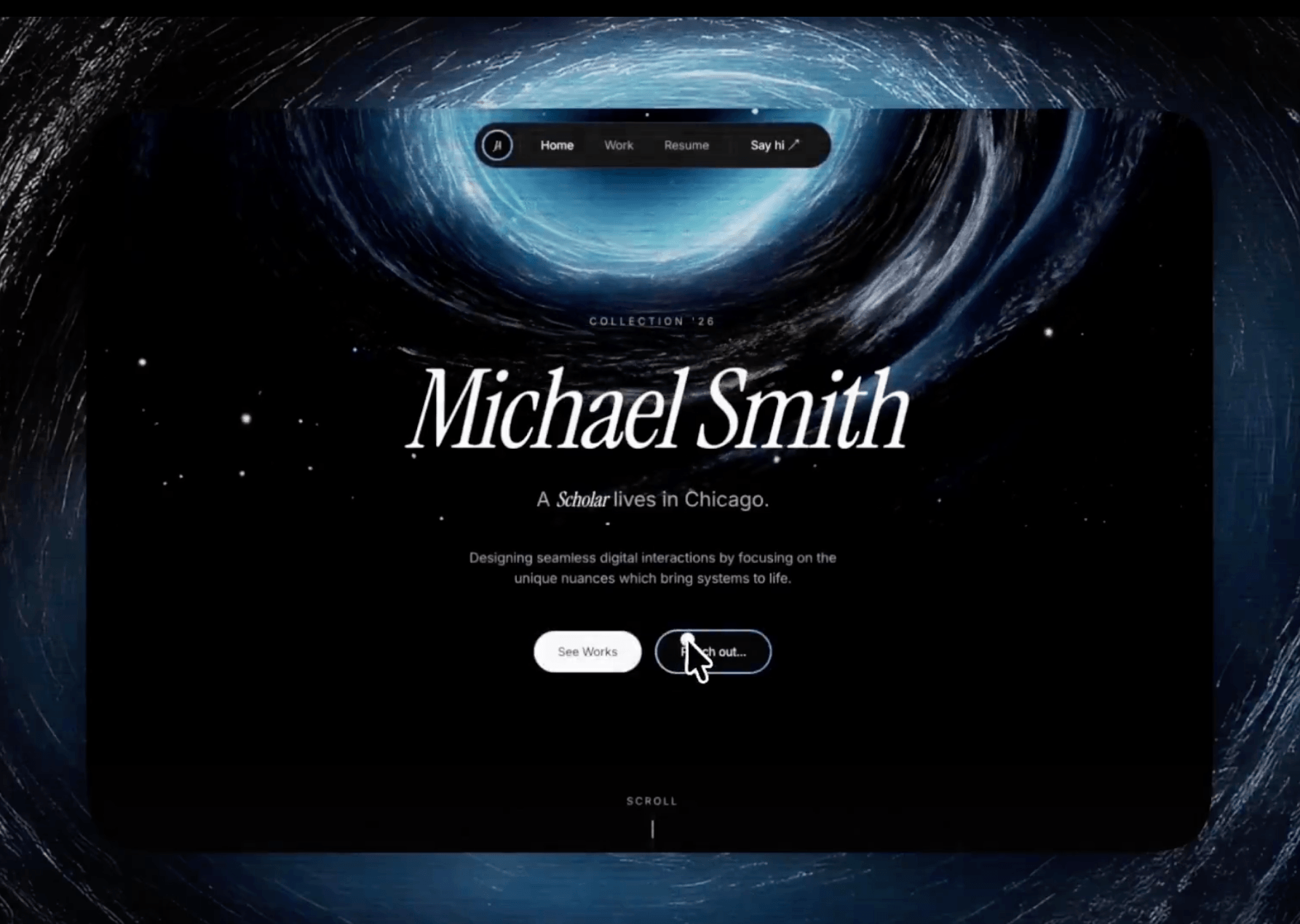
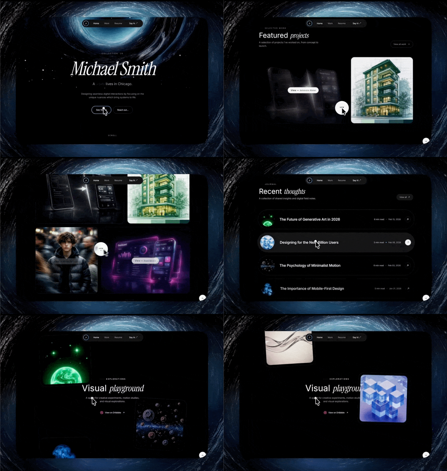
A preview-led portfolio prompt for generating a polished AI-built interface.
by MotionSites View full prompt
.webp)
A preview-led agency prompt for generating a polished AI-built interface.
Direct delivery
1183 words · 111 linesBuild a React + Vite + Tailwind CSS landing page for "Axion Studio" - a design agency site. Use the `shaders` package (npm: `shaders`) for the hero background, `lucide-react` for icons. The page has 3 sections. Match every detail exactly:
---
## SECTION 1: HERO (Full viewport height)
**Background:** Light gray `#EFEFEF` with a full-screen animated shader overlay (positioned absolute, inset-0, z-10, pointer-events-none). The shader stack uses components from `shaders/react`:
- `Swirl` - colorA: `#ffffff`, colorB: `#f0f0f0`, detail: 1.7
- `ChromaFlow` - baseColor: `#ffffff`, downColor/leftColor/rightColor/upColor: `#ff5f03`, momentum: 13, radius: 3.5
- `FlutedGlass` - aberration: 0.61, angle: 31, frequency: 8, highlight: 0.12, highlightSoftness: 0, lightAngle: -90, refraction: 4, shape: "rounded", softness: 1, speed: 0.15
- `FilmGrain` - strength: 0.05
**Navigation (z-20, relative):** A pill-shaped white navbar (`bg-white rounded-full`) with 5px padding, inside a max-w-[1440px] container with p-2 sm:p-3.
- LEFT: Dark circle logo (w-9 h-9 sm:w-10 sm:h-10, bg-gray-900, rounded-full) with white text "AX" (10px/11px, font-bold, tracking-tight). Next to it (hidden on mobile, shown md+): nav links "Projects", "Studio", "Journal", "Connect" - 14px, text-gray-900, hover:text-gray-500, transition-colors duration-300, gap-6.
- RIGHT (hidden on mobile, shown md+):
- Text "Taking on projects for Q1 2026" (13px, text-gray-600, hidden below lg)
- Clock icon (lucide, size 14) + live London time "{HH:MM} in London" (13px, text-gray-600)
- CTA button: bg-gray-900, text-white, 13px font-medium, rounded-full, pl-5 pr-2 py-2. Text "Book a strategy call" with a HOVER TEXT ROLL animation: the text is duplicated inside a flex-col container with overflow-hidden h-[20px], on group-hover it translates -50% vertically (duration-500, ease cubic-bezier(0.25,0.1,0.25,1)). Arrow icon in a white circle (w-6 h-6) that rotates -45deg on hover (same easing).
- MOBILE: A "Menu"/"Close" toggle button (md:hidden), bg-gray-900, rounded-full, with Menu/X icons from lucide-react.
**Mobile Menu Overlay:** Fixed inset-0, z-50. Black/60 backdrop. A white bottom sheet (rounded-2xl, mx-3 mb-3) that slides up (translate-y-full to translate-y-0, duration-500, ease cubic-bezier(0.32,0.72,0,1)). Contains: time badge, nav links (28px/32px font-medium), and a "Start a project" button with arrow.
**Hero Content (z-20):** Positioned at the bottom of the viewport using flexbox (flex-1 spacer above). Max-w-[1440px], px-5 sm:px-8 lg:px-12, pb-14 sm:pb-16 lg:pb-20.
- Small label: "Axion Studio" (13px/14px, text-gray-900, tracking-wide, mb-5 sm:mb-8)
- Headline h1: "We craft digital experiences / for brands ready to dominate / their category online." - clamp(1.75rem,7vw,4.2rem) on mobile, clamp(2.5rem,5vw,4.2rem) on sm+. font-medium, leading-[1.08], tracking-[-0.03em], text-gray-900. Line breaks hidden on mobile (uses `<br className="hidden sm:block" />` with `<span className="sm:hidden"> </span>` fallback spaces).
- CTA row (mt-8 sm:mt-12, flex-col sm:flex-row, gap-4 sm:gap-5):
- Orange button: bg-[#F26522], hover:bg-[#e05a1a], text-white, 13px/14px, rounded-full, pl-5 sm:pl-6 pr-2 py-2. Same text-roll hover animation for "Start a project". White circle (w-7 h-7 sm:w-8 sm:h-8) with orange ArrowRight that rotates -45deg on hover.
- Partner badge: White pill with subtle shadow (0_2px_8px_rgba(0,0,0,0.08)), hover shadow (0_4px_16px_rgba(0,0,0,0.12)), rounded-[4px]. Contains an inline SVG icon (the starburst/compass shape below, w-5 h-5 sm:w-6 sm:h-6, fill-current text-[#E8704E]), text "Certified Partner" (13px/14px font-medium), and a dark badge "Featured" (10px/11px, bg-gray-900, text-white, px-1.5 sm:px-2 py-0.5, rounded).
**SVG Icon for partner badge:**
```svg
<svg xmlns="http://www.w3.org/2000/svg" viewBox="0 0 100 100"><path d="m19.6 66.5 19.7-11 .3-1-.3-.5h-1l-3.3-.2-11.2-.3L14 53l-9.5-.5-2.4-.5L0 49l.2-1.5 2-1.3 2.9.2 6.3.5 9.5.6 6.9.4L38 49.1h1.6l.2-.7-.5-.4-.4-.4L29 41l-10.6-7-5.6-4.1-3-2-1.5-2-.6-4.2 2.7-3 3.7.3.9.2 3.7 2.9 8 6.1L37 36l1.5 1.2.6-.4.1-.3-.7-1.1L33 25l-6-10.4-2.7-4.3-.7-2.6c-.3-1-.4-2-.4-3l3-4.2L28 0l4.2.6L33.8 2l2.6 6 4.1 9.3L47 29.9l2 3.8 1 3.4.3 1h.7v-.5l.5-7.2 1-8.7 1-11.2.3-3.2 1.6-3.8 3-2L61 2.6l2 2.9-.3 1.8-1.1 7.7L59 27.1l-1.5 8.2h.9l1-1.1 4.1-5.4 6.9-8.6 3-3.5L77 13l2.3-1.8h4.3l3.1 4.7-1.4 4.9-4.4 5.6-3.7 4.7-5.3 7.1-3.2 5.7.3.4h.7l12-2.6 6.4-1.1 7.6-1.3 3.5 1.6.4 1.6-1.4 3.4-8.2 2-9.6 2-14.3 3.3-.2.1.2.3 6.4.6 2.8.2h6.8l12.6 1 3.3 2 1.9 2.7-.3 2-5.1 2.6-6.8-1.6-16-3.8-5.4-1.3h-.8v.4l4.6 4.5 8.3 7.5L89 80.1l.5 2.4-1.3 2-1.4-.2-9.2-7-3.6-3-8-6.8h-.5v.7l1.8 2.7 9.8 14.7.5 4.5-.7 1.4-2.6 1-2.7-.6-5.8-8-6-9-4.7-8.2-.5.4-2.9 30.2-1.3 1.5-3 1.2-2.5-2-1.4-3 1.4-6.2 1.6-8 1.3-6.4 1.2-7.9.7-2.6v-.2H49L43 72l-9 12.3-7.2 7.6-1.7.7-3-1.5.3-2.8L24 86l10-12.8 6-7.9 4-4.6-.1-.5h-.3L17.2 77.4l-4.7.6-2-2 .2-3 1-1 8-5.5Z"/></svg>
```
---
## SECTION 2: ABOUT (White background)
`bg-white`, pt-16 sm:pt-20 lg:pt-32, pb-12 sm:pb-16 lg:pb-24, overflow-hidden. Max-w-[1440px] container.
**Badge row:** px-5 sm:px-8 lg:px-12, flex items-center gap-3, mb-6 sm:mb-8.
- Numbered circle: w-6 h-6 sm:w-7 sm:h-7, rounded-full, bg-gray-900, text-white, 11px/12px font-semibold. Shows "1".
- Pill label: "Introducing Axion" - 12px/13px, font-medium, border border-gray-200, rounded-full, px-3 sm:px-4 py-1 sm:py-1.5.
**Heading h2:** "Strategy-led creatives, delivering / results in digital and beyond." - clamp(1.5rem,4vw,3.2rem), font-medium, leading-[1.12], tracking-[-0.02em], text-gray-900, mb-12 sm:mb-16 lg:mb-28.
**Content area (responsive):**
- MOBILE/TABLET (lg:hidden): Stacked - paragraph + button, then images.
- Paragraph: "Through research, creative thinking and iteration we help growing brands realize their digital full potential." - 15px/17px, leading-[1.6], font-medium, text-gray-900.
- Button: "About our studio" - orange (#F26522), same text-roll animation, white arrow circle rotates -45deg.
- Two images: flex-col sm:flex-row, gap-4 sm:gap-5. First: sm:w-[45%] aspect-[438/346]. Second: sm:w-[55%] aspect-[900/600]. Both rounded-xl sm:rounded-2xl, object-cover.
- DESKTOP (hidden lg:grid): `grid-cols-[26%_1fr_48%] items-end gap-6 xl:gap-8`.
- Left column (self-end): Small image, aspect-[438/346], rounded-2xl.
- Center column (self-start, flex justify-end): Paragraph (16px/18px, leading-[1.65], whitespace-nowrap, with `<br/>` between lines) + orange button.
- Right column (self-end): Large image, aspect-[3/2], rounded-2xl.
**Image URLs:**
- Small image: `https://images.higgs.ai/?default=1&output=webp&url=https%3A%2F%2Fd8j0ntlcm91z4.cloudfront.net%2Fuser_38xzZboKViGWJOttwIXH07lWA1P%2Fhf_20260516_090123_74be96d4-9c1b-40cf-932a-96f4f4babed3.png&w=1280&q=85`
- Large image: `https://images.higgs.ai/?default=1&output=webp&url=https%3A%2F%2Fd8j0ntlcm91z4.cloudfront.net%2Fuser_38xzZboKViGWJOttwIXH07lWA1P%2Fhf_20260516_090133_c157d30b-a99a-4477-bec1-a446149ec3f2.png&w=1280&q=85`
---
## SECTION 3: CASE STUDIES (Light gray background)
`bg-[#F5F5F5]`, pt-16 sm:pt-20 lg:pt-28, pb-16 sm:pb-20 lg:pb-28. Max-w-[1440px] container.
**Badge row:** Same pattern as Section 2, but number is "2", label is "Featured client work", border-gray-300.
**Heading h2:** "Our projects" - same clamp sizing as hero headline (clamp(1.75rem,7vw,4.2rem) / clamp(2.5rem,5vw,4.2rem)), font-medium, leading-[1.08], tracking-[-0.03em], mb-10 sm:mb-14 lg:mb-16.
**Cards Grid:** `grid grid-cols-1 md:grid-cols-2 gap-5 sm:gap-6 lg:gap-7`, px-5 sm:px-8 lg:px-12.
**Card 1 (Narrativ):**
- Video container: aspect-[329/246], rounded-2xl, overflow-hidden, bg-[#1a1d2e], group, cursor-pointer.
- Video: `src="https://d8j0ntlcm91z4.cloudfront.net/user_38xzZboKViGWJOttwIXH07lWA1P/hf_20260516_122702_390f5305-8719-41d5-ae80-d23ab3796c28.mp4"`, autoPlay, muted, loop, playsInline, w-full h-full object-cover.
- Hover button (absolute bottom-4 left-4): A white circle (h-9 w-9) that expands to w-[148px] on group-hover (transition-all duration-300 ease-in-out). Contains "Learn more" text (13px, font-medium, opacity-0 to opacity-100 on hover with delay-100) and a link/chain SVG icon (14x14, -rotate-45 to rotate-0 on hover). The SVG is the lucide "link" icon drawn manually with two arc paths.
- Description: "Winner of Site of the Month 2025 - an interactive 3D showcase driving record engagement" - 13px/14px, text-gray-600, mt-4, leading-relaxed.
- Title: "Narrativ" - 14px/15px, font-semibold, text-gray-900, mt-1.
**Card 2 (Luminar):**
- Video container: aspect-square, rounded-2xl, overflow-hidden, bg-[#6b6b6b], group, cursor-pointer.
- Video: `src="https://d8j0ntlcm91z4.cloudfront.net/user_38xzZboKViGWJOttwIXH07lWA1P/hf_20260516_123323_f909c2b8-ff6c-4edf-882b-8ebcdbe389b5.mp4"`, autoPlay, muted, loop, playsInline, w-full h-full object-cover.
- Hover button (absolute bottom-4 left-4): A DARK circle (bg-gray-900, h-9 w-9) that expands to w-[168px] on group-hover. Contains "View case study" text (13px, font-medium, text-white) and a white ArrowRight icon (size 14) that transitions from -rotate-45 to rotate-0 on hover.
- Description: "Transforming a dated platform into a conversion-focused brand experience" - 13px/14px, text-gray-600, mt-4, leading-relaxed.
- Title: "Luminar" - 14px/15px, font-semibold, text-gray-900, mt-1.
---
## GLOBAL STYLES (index.css):
Standard Tailwind directives plus two utility classes (not actively used in current layout but defined):
- `.liquid-glass`: rgba(255,255,255,0.01) bg, backdrop-filter blur(4px), inset box-shadow, pseudo-element gradient border using mask-composite.
- `.liquid-glass-strong`: Same but blur(50px), no pseudo-element.
---
## TECHNICAL DETAILS:
- **Framework:** React 18 + TypeScript + Vite
- **Styling:** Tailwind CSS 3.4 (default config, no custom theme extensions)
- **Packages:** `shaders` (for Shader, ChromaFlow, FilmGrain, FlutedGlass, Swirl from `shaders/react`), `lucide-react` (ArrowRight, Clock, Menu, X)
- **Font:** System default (no custom font loaded)
- **All animations use:** `duration-500 ease-[cubic-bezier(0.25,0.1,0.25,1)]` unless noted otherwise
- **Max content width:** 1440px, centered with mx-auto
- **Responsive breakpoints:** Default Tailwind (sm: 640px, md: 768px, lg: 1024px, xl: 1280px)
- **Live clock:** Updates every second, shows London timezone in HH:MM formatKeep exploring
A preview-led portfolio prompt for generating a polished AI-built interface.
A preview-led agency prompt for generating a polished AI-built interface.
A preview-led portfolio prompt for generating a polished AI-built interface.