Landing Page
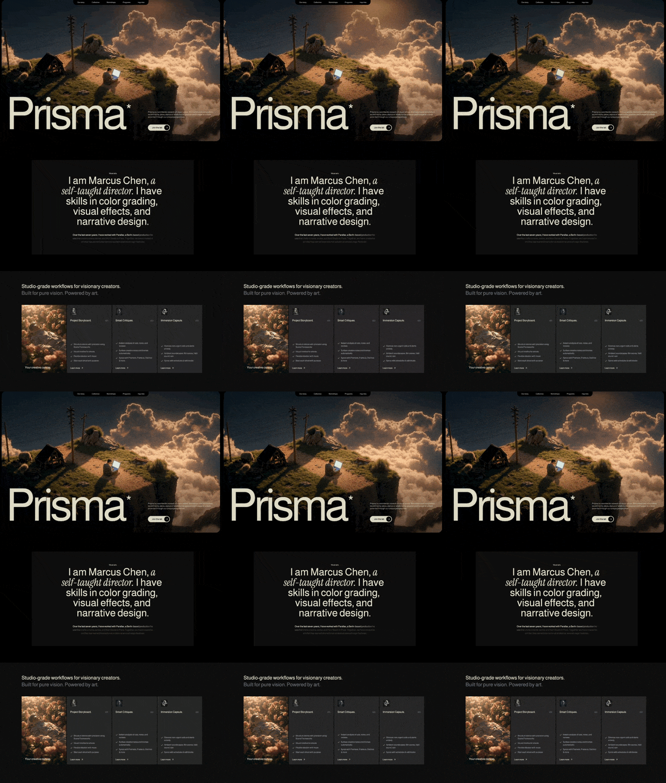
Prisma Creative Studio
A preview-led landing page prompt for generating a polished AI-built interface.
by MotionSites View full prompt
A preview-led landing page prompt for generating a polished AI-built interface.
Direct delivery
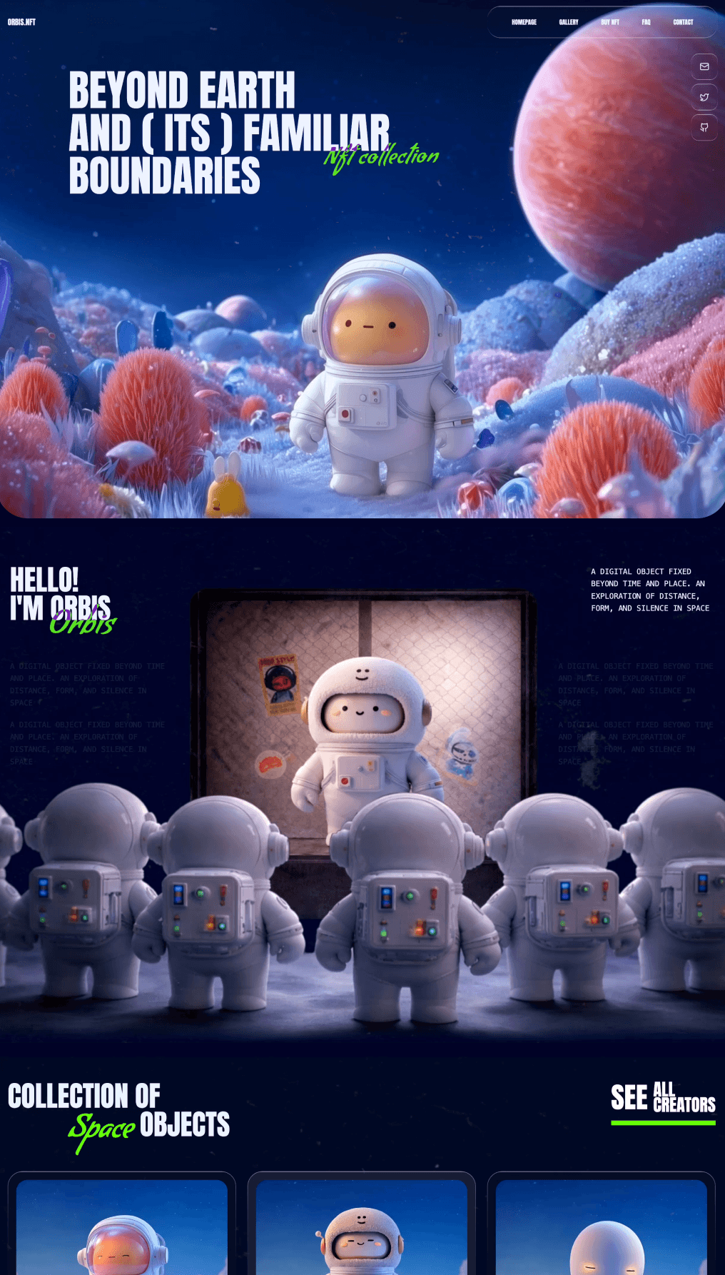
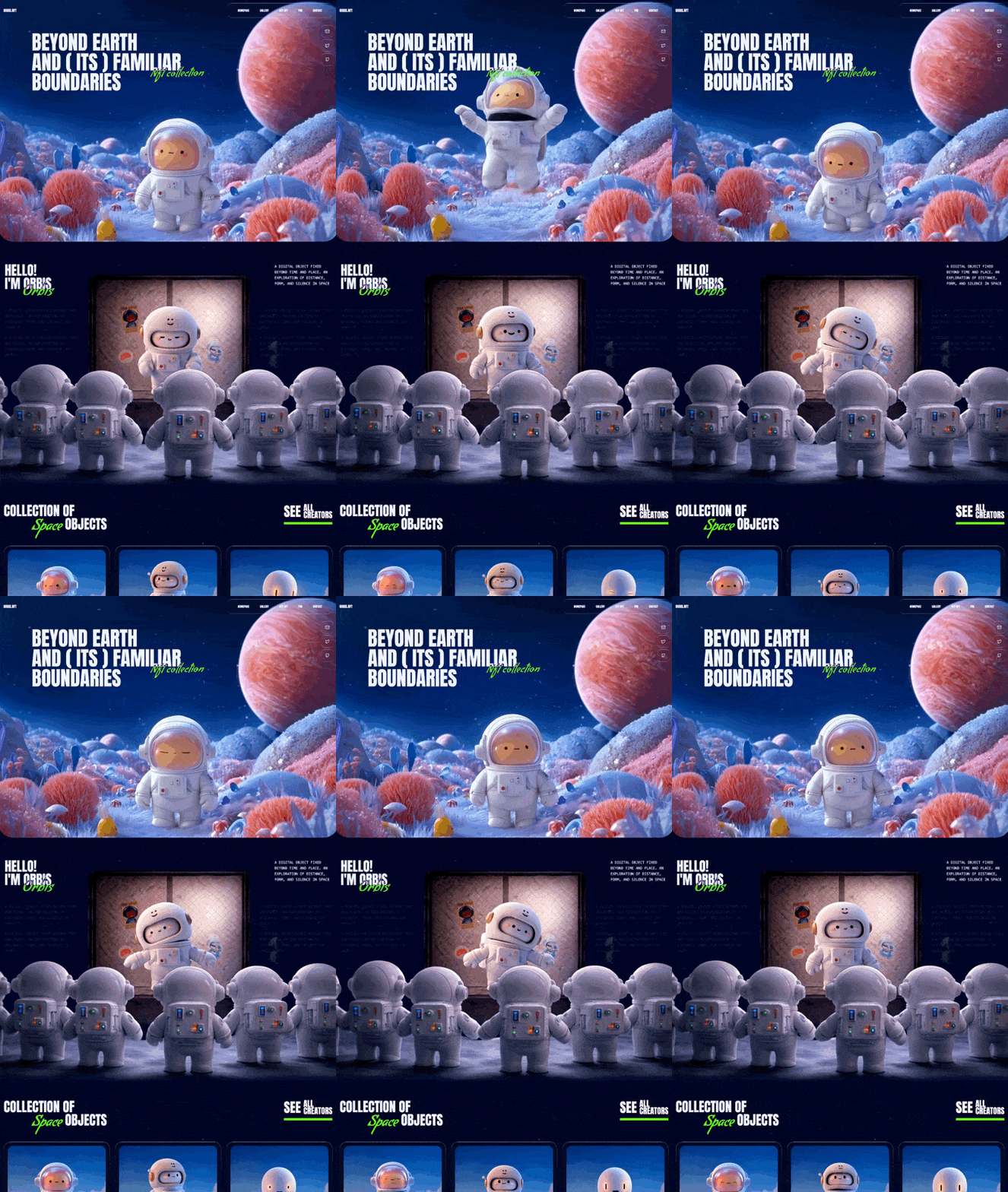
986 words · 201 linesCreate an NFT landing page called "Orbis.Nft" with 4 sections, using a dark space theme. The page uses video backgrounds served from CloudFront, a liquid glass UI effect, and a specific color/font system. Recreate it exactly as described below.
FONTS (Google Fonts)
Anton - Used for all headings and navigation text (aliased as font-grotesk in Tailwind)
Condiment - A cursive script used for accent/overlay text (aliased as font-condiment in Tailwind)
System monospace font (font-mono) - Used for body/description paragraphs
Load via Google Fonts in index.html:
https://fonts.googleapis.com/css2?family=Anton&family=Condiment&display=swap
COLOR SYSTEM (Tailwind config)
Background: #010828 (deep dark navy blue)
cream: #EFF4FF (off-white, used for all text)
neon: #6FFF00 (bright green, used for accent cursive text and underline bars)
LIQUID GLASS CSS EFFECT
Applied via a .liquid-glass class. This is used on the navbar, social icon buttons, NFT cards, and card overlays:
.liquid-glass {
background: rgba(255, 255, 255, 0.01);
background-blend-mode: luminosity;
backdrop-filter: blur(4px);
-webkit-backdrop-filter: blur(4px);
border: none;
box-shadow: inset 0 1px 1px rgba(255, 255, 255, 0.1);
position: relative;
overflow: hidden;
}
.liquid-glass::before {
content: '';
position: absolute;
inset: 0;
border-radius: inherit;
padding: 1.4px;
background: linear-gradient(180deg,
rgba(255,255,255,0.45) 0%, rgba(255,255,255,0.15) 20%,
rgba(255,255,255,0) 40%, rgba(255,255,255,0) 60%,
rgba(255,255,255,0.15) 80%, rgba(255,255,255,0.45) 100%);
-webkit-mask: linear-gradient(#fff 0 0) content-box, linear-gradient(#fff 0 0);
-webkit-mask-composite: xor;
mask-composite: exclude;
pointer-events: none;
}
TEXTURE OVERLAY
A full-screen fixed texture overlay sits on top of everything (z-50, pointer-events-none). It uses a /texture.png image with mix-blend-mode: lighten at opacity: 0.6, covering the entire viewport with background-size: cover.
SECTION 1: HERO (Full viewport)
Background: Full-bleed looping muted autoplaying video covering the entire section with object-cover
Video URL: https://d8j0ntlcm91z4.cloudfront.net/user_38xzZboKViGWJOttwIXH07lWA1P/hf_20260331_045634_e1c98c76-1265-4f5c-882a-4276f2080894.mp4
Container: max-w-[1831px] centered with responsive horizontal padding
Section has rounded-b-[32px] bottom corners, clipping the video
Header:
Left: "Orbis.Nft" logo text in Anton, 16px, uppercase
Center: Navigation bar with liquid-glass effect, rounded-[28px], px-[52px] py-[24px]. Contains 5 links: Homepage, Gallery, Buy NFT, FAQ, Contact. Each link is Anton 13px uppercase. Links have hover:text-neon transition. Nav is hidden on mobile (hidden lg:block).
Hero Content:
Large heading in Anton font, responsive sizing: 40px mobile / 60px sm / 75px md / 90px lg. Uppercase. leading-[1.05] mobile, leading-[1] tablet+. Max width 780px on desktop, offset with lg:ml-32.
Text reads:
Beyond earth
and ( its ) familiar boundaries
Overlaid cursive accent text "Nft collection" in Condiment font (24px-48px responsive), positioned absolute to the right side of the heading, slightly rotated (-rotate-1), in neon green (text-neon), with mix-blend-exclusion and opacity-90.
Social Icons (Desktop):
3 square buttons (56x56px) stacked vertically in top-right corner, each with liquid-glass and rounded-[1rem]. Icons: Mail, Twitter, Github from lucide-react (20x20px). hover:bg-white/10 transition.
Social Icons (Mobile):
Same 3 buttons but centered horizontally below the heading, shown only below lg breakpoint.
SECTION 2: ABOUT / INTRO (Full viewport)
Background: Full-bleed looping muted autoplaying video with object-cover
Video URL: https://d8j0ntlcm91z4.cloudfront.net/user_38xzZboKViGWJOttwIXH07lWA1P/hf_20260331_151551_992053d1-3d3e-4b8c-abac-45f22158f411.mp4
Container: Same max-w-[1831px] centered, with generous vertical padding (64px-96px responsive)
Top Row (flex row on desktop, column on mobile):
Left: Heading in Anton, responsive 32px-60px, uppercase:
Hello!
I'm orbis
With an overlaid "Orbis" in Condiment cursive, neon green, mix-blend-exclusion, 36px-68px responsive, positioned absolute at bottom-right of heading, slightly rotated.
Right: Short paragraph in monospace 14px-16px, uppercase, cream color, max-width 266px: "A digital object fixed beyond time and place. An exploration of distance, form, and silence in space"
Bottom Row (flex row, space-between):
Two columns (left and right), each containing 2 identical paragraphs. Same monospace text as above but at opacity-10 (nearly invisible, decorative). Right column hidden below lg. On mobile, text uses text-[#010828] (dark) so it's effectively invisible against the video.
SECTION 3: NFT COLLECTION GRID
Background: Solid #010828 (no video)
Container: Same max-w-[1831px] centered
Header Row:
Left: Heading in Anton, 32px-60px responsive, uppercase:
Collection of
[indented] Space objects
Where "Space" is in Condiment cursive neon green, and "objects" is in Anton. The second line is indented with ml-12 / ml-24 / ml-32 responsive.
Right: A "SEE ALL CREATORS" button. "SEE" is large (32px-60px), "ALL" and "CREATORS" are stacked smaller (20px-36px) next to it. Below the text is a neon green bar (bg-neon, height 6px-10px responsive, full width of button).
NFT Card Grid:
3-column grid on desktop (lg:grid-cols-3), 2 on tablet, 1 on mobile. Gap 24px.
Each card: liquid-glass container with rounded-[32px], padding 18px, hover:bg-white/10 transition.
Inside each card: a square video container (pb-[100%] aspect ratio trick) with rounded-[24px] overflow hidden.
Video URLs:
https://d8j0ntlcm91z4.cloudfront.net/user_38xzZboKViGWJOttwIXH07lWA1P/hf_20260331_053923_22c0a6a5-313c-474c-85ff-3b50d25e944a.mp4 (Score: 8.7/10)
https://d8j0ntlcm91z4.cloudfront.net/user_38xzZboKViGWJOttwIXH07lWA1P/hf_20260331_054411_511c1b7a-fb2f-42ef-bf6c-32c0b1a06e79.mp4 (Score: 9/10)
https://d8j0ntlcm91z4.cloudfront.net/user_38xzZboKViGWJOttwIXH07lWA1P/hf_20260331_055427_ac7035b5-9f3b-4289-86fc-941b2432317d.mp4 (Score: 8.2/10)
Each card has an overlay bar at the bottom: a liquid-glass bar with rounded-[20px], px-5 py-4, showing "RARITY SCORE:" label (11px, cream/70% opacity) and score value (16px). On the right side of the bar is a circular purple gradient button (48x48px, bg-gradient-to-br from-[#b724ff] to-[#7c3aed]) with a right-arrow chevron SVG inside, with shadow-lg shadow-purple-500/50 and hover:scale-110 transition.
SECTION 4: CTA / FINAL SECTION
Background: Full-width video (NOT object-cover, instead w-full h-auto block so it displays at native aspect ratio)
Video URL: https://d8j0ntlcm91z4.cloudfront.net/user_38xzZboKViGWJOttwIXH07lWA1P/hf_20260331_055729_72d66327-b59e-4ae9-bb70-de6ccb5ecdb0.mp4
Text Content (positioned absolute over the video):
Right-aligned block, offset with lg:pr-[20%] lg:pl-[15%]
Small "Go beyond" text in Condiment cursive, neon green, mix-blend-exclusion, positioned absolute at top-left of the heading block. Sizes: 17px-68px responsive.
Heading in Anton, responsive 16px-60px, uppercase:
JOIN US.
REVEAL WHAT'S HIDDEN.
DEFINE WHAT'S NEXT.
FOLLOW THE SIGNAL.
"JOIN US." has extra bottom margin (mb-4 to mb-12 responsive) before the remaining lines.
Social Icons (Bottom-left, absolute positioned):
Positioned at left-[8%], bottom-[12%] to bottom-[20%] with responsive breakpoints.
A vertical liquid-glass container with rounded-[0.5rem] to rounded-[1.25rem] responsive, containing 3 stacked icon buttons (Mail, Twitter, Github).
Buttons have responsive widths using viewport units and rem values (e.g., w-[14vw] sm:w-[14.375rem] md:w-[10.78125rem] lg:w-[16.77rem]) and similar responsive heights.
Buttons are separated by border-b border-white/10 dividers (except the last one).
KEY TECHNICAL DETAILS
Framework: React + TypeScript + Vite + Tailwind CSS
Icons: lucide-react (Mail, Twitter, Github)
No additional packages needed beyond what Vite + React + Tailwind provides
All videos: autoPlay loop muted playsInline attributes
Responsive: Mobile-first with sm:, md:, lg: breakpoints throughout
Max content width: 1831px across all sections
All text is uppercase except the Condiment cursive accents which are normal-caseKeep exploring
A preview-led landing page prompt for generating a polished AI-built interface.
A preview-led landing page prompt for generating a polished AI-built interface.
A preview-led landing page prompt for generating a polished AI-built interface.