.webp)
Hero
Bold Studio
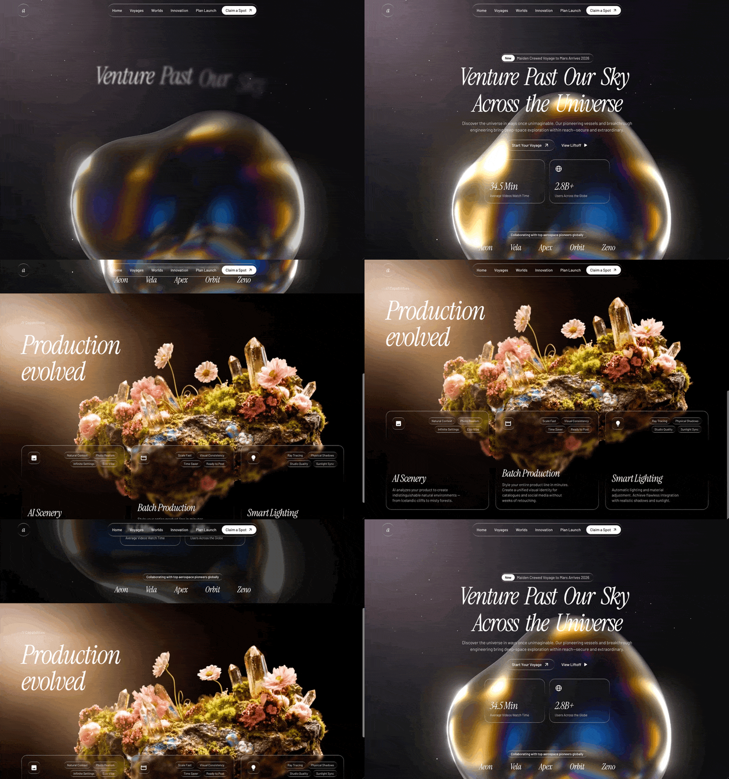
A preview-led hero prompt for generating a polished AI-built interface.
by MotionSites View full prompt
.webp)
A preview-led hero prompt for generating a polished AI-built interface.
Direct delivery
780 words · 135 linesBuild a password manager landing page hero section using React, TypeScript, Tailwind CSS, Framer Motion, and Lucide React icons. Here is every specification:
---
### Fonts
- **Heading font:** "Helvetica Now Display Bold" -- load via this stylesheet in `index.html`:
```
<link href="https://db.onlinewebfonts.com/c/04e6981992c0e2e7642af2074ebe3901?family=Helvetica+Now+Display+Bold" rel="stylesheet">
```
- **Body font:** "Inter" (weights 300-900) -- load via Google Fonts in `index.css`:
```
@import url('https://fonts.googleapis.com/css2?family=Inter:wght@300;400;500;600;700;800;900&display=swap');
```
### CSS Variables (defined in `:root` in `index.css`)
```
--font-heading: 'Helvetica Now Display Bold', sans-serif;
--font-body: 'Inter', sans-serif;
--color-text: #192837;
--color-accent: #7342E2;
--color-login-bg: #F2F2EE;
```
Global reset: `* { box-sizing: border-box; }`, body uses `var(--font-body)`, `var(--color-text)`, margin/padding 0.
---
### Background
Full-viewport looping background video, absolutely positioned, covering the entire page with `object-cover`. URL:
```
https://d8j0ntlcm91z4.cloudfront.net/user_38xzZboKViGWJOttwIXH07lWA1P/hf_20260606_131516_eca35265-ea66-4fbd-8d52-22aae6e1a503.mp4
```
Attributes: `autoPlay`, `muted`, `loop`, `playsInline`. Classes: `absolute inset-0 z-0 w-full h-full object-cover`.
---
### Logo (inline SVG component)
A custom geometric SVG logo, 32x32, viewBox `0 0 256 256`, fill `#192837`:
```
M 64 128 L 64.5 128 L 32 95 L 0 64 L 0 0 L 64 0 L 128 64 L 128 64.5 L 161 32 L 192 0 L 256 0 L 256 64 L 192 128 L 128 128 L 128 192 L 96 223 L 63.5 256 L 0 256 L 0 192 Z M 256 192 L 224 223 L 191.5 256 L 128 256 L 128 192 L 192 128 L 256 128 Z
```
---
### Navbar
- Max-width `1280px`, centered with `margin: 0 auto`.
- Padding: `px-5 sm:px-8 py-4 sm:py-5`.
- `relative z-10`, flexbox with `justify-between`, `items-center`.
- **Left:** Logo component.
- **Center (desktop, hidden on mobile `md:flex`):** 5 nav links -- "Vault", "Plans", "Install", "News", "Help". Each is `text-sm font-medium`, color `var(--color-text)`, `transition-opacity hover:opacity-70`, gap-8.
- **Right (desktop, hidden on mobile `md:flex`):** Two pill buttons with `gap-3`:
- "Start For Free": background `#7342E2`, white text, `text-sm font-semibold px-5 py-2.5 rounded-full`, hover shadow, active scale-95.
- "Sign In": background `#F2F2EE`, text `var(--color-text)`, same sizing/rounding.
- **Mobile (`md:hidden`):** Hamburger button using Lucide `Menu` icon (24px). Toggles to `X` icon when open.
---
### Mobile Menu (slide-in sheet)
Uses Framer Motion `AnimatePresence`. Two layers:
1. **Backdrop:** Fixed overlay, `rgba(25,40,55,0.35)` background, `backdrop-blur(4px)`. Fades in/out over 0.3s. Clicking dismisses the menu.
2. **Sheet:** Fixed, right-aligned, `width: min(88vw, 360px)`, `height: 100dvh`, background `#CFC8C5`, box-shadow `-12px 0 48px rgba(25,40,55,0.18)`. Slides in from right with custom cubic bezier `[0.22, 1, 0.36, 1]` over 0.45s; exits with `[0.55, 0, 1, 0.45]` over 0.35s.
Contents:
- **Header:** Logo + circular close button (40x40, background `rgba(25,40,55,0.1)`, X icon 20px), with `whileTap={{ scale: 0.9 }}`.
- **Divider:** 1px line, `rgba(25,40,55,0.12)`, margin `0 24px`.
- **Nav links:** Each link staggers in from right (x: 24 to 0, delay `0.18 + i * 0.07`, duration 0.4s). Font size `1.1rem`, rounded-xl, hover `bg-black/10`.
- **CTA buttons:** Same "Start For Free" (`#7342E2`) and "Sign In" (`#F2F2EE`) as desktop, full-width, `py-3.5 rounded-full`, font size `0.95rem`.
---
### Hero Content
- Centered container, max-width `1280px`, `relative z-10`.
- Padding top: `clamp(40px, 8vw, 72px)`, bottom `48px`.
- Inner content wrapper: max-width `660px`, centered.
**Heading (`<h1>`):**
- Font: `var(--font-heading)`.
- Size: `clamp(1.65rem, 5vw, 3rem)`.
- Line-height: `1.05`, letter-spacing: `-0.01em`.
- Color: `var(--color-text)`.
- Text-align: center.
- Two lines:
- Line 1 (nowrap): `Lock` [Zap icon 24px] `Down Your` [LockKeyhole icon 24px] `Passwords`
- Line 2: `with Ironclad Security` [Fingerprint icon 24px]
- All inline icons: color `#192837`, `display: inline`, `verticalAlign: middle`, `position: relative`, `top: -2px`, margin `0 4px` (Fingerprint has `marginLeft: 6px` only).
- Animates: fade-up from `y: 28`, `opacity: 0`, duration 0.6s, ease `[0.22, 1, 0.36, 1]`, delay `0 * 0.15`.
**Subtext (`<p>`):**
- Font: `var(--font-body)`.
- Size: `clamp(0.9rem, 2.5vw, 1.1rem)`.
- Color: `var(--color-text)` at `opacity: 0.8`.
- Max-width: `560px`, line-height `1.65`, text-align center.
- Copy: "Zero stress, total control. Unbreakable storage, one-tap access, and pro-grade tools for your non-stop world."
- Animates: same fade-up, delay `1 * 0.15`.
**CTA Button:**
- Pill button (`borderRadius: 50px`), background `#7342E2`, white text.
- Size: `clamp(0.9rem, 2vw, 1rem)`, padding `17px 24px`, min-width `210px`.
- Box-shadow: `0 4px 24px rgba(115,66,226,0.28)`.
- Flexbox with `justify-between`, gap `32px`.
- Label: "Get It Free" with `ArrowRightCircle` icon (20px) on right.
- Hover: `scale: 1.04, brightness(1.1)`. Tap: `scale: 0.96`.
- Animates: same fade-up, delay `2 * 0.15`.
---
### Animation System (Framer Motion variants)
All hero elements use a shared `fadeUp` variant:
```
hidden: { opacity: 0, y: 28 }
visible: (i) => ({ opacity: 1, y: 0, transition: { delay: i * 0.15, duration: 0.6, ease: [0.22, 1, 0.36, 1] } })
```
---
### Dependencies
- `react`, `react-dom` (v18)
- `framer-motion`
- `lucide-react` (icons: ArrowRightCircle, Zap, LockKeyhole, Fingerprint, Menu, X)
- Tailwind CSS 3 with default config, no custom theme extensions
- Vite + TypeScriptKeep exploring
A preview-led hero prompt for generating a polished AI-built interface.
A preview-led hero prompt for generating a polished AI-built interface.
A preview-led hero section prompt for generating a polished AI-built interface.

.webp)