.webp)
Hero
Bold Studio
A preview-led hero prompt for generating a polished AI-built interface.
by MotionSites View full prompt
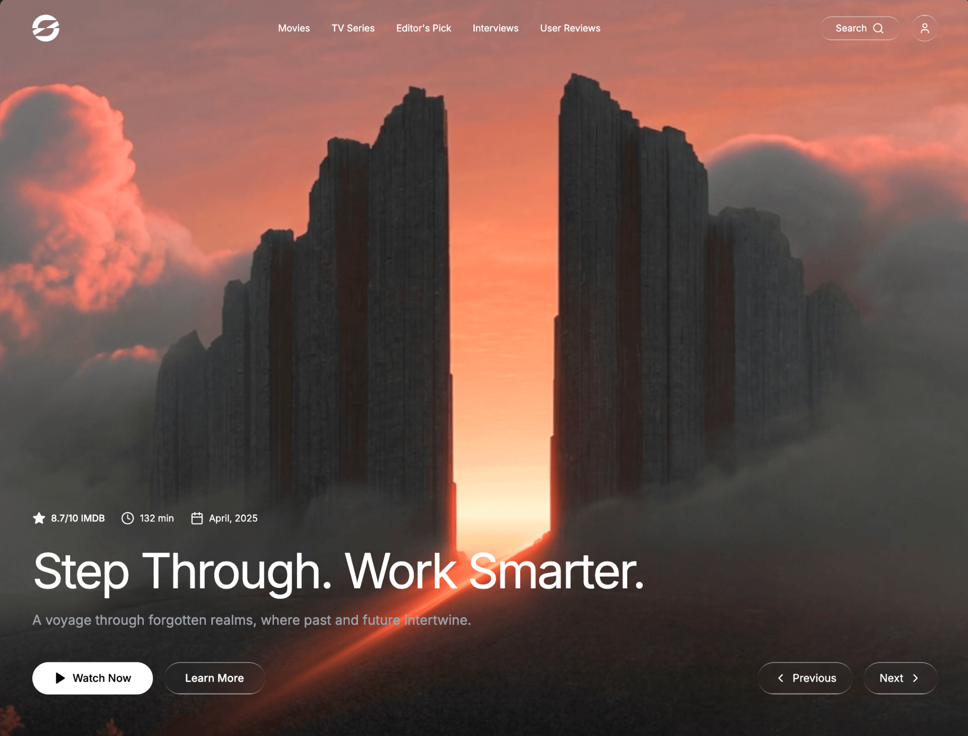
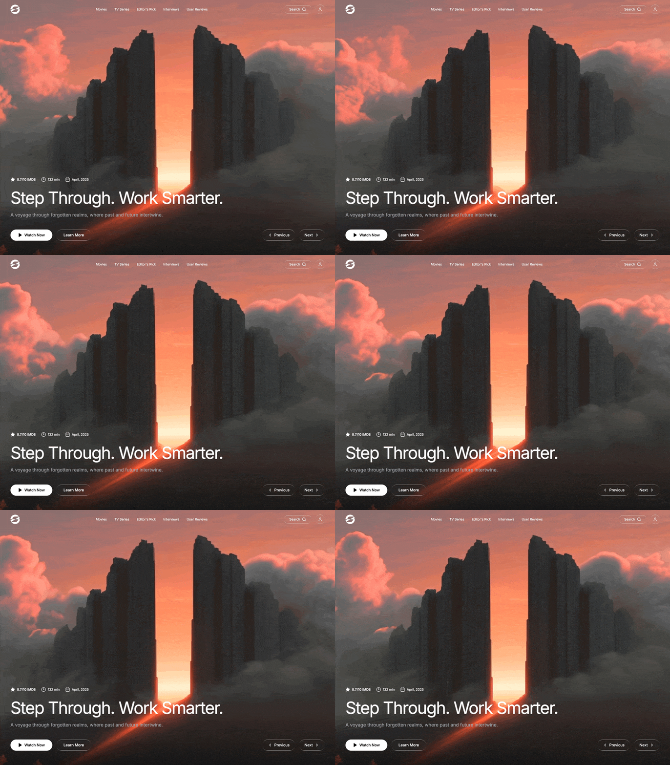
A preview-led hero section prompt for generating a polished AI-built interface.
Direct delivery
895 words · 116 linesPROMPT: Build a full-viewport cinematic movie/streaming hero section using React, Tailwind CSS, and Lucide React icons. Use the Inter font from Google Fonts. The entire page is a single full-height hero -- no scrolling, no additional sections. BACKGROUND VIDEO: A full-screen background video plays on loop, muted, autoplaying, covering the entire viewport with object-cover. The video is fixed-positioned behind everything at z-index 0. Video URL: https://d8j0ntlcm91z4.cloudfront.net/user_38xzZboKViGWJOttwIXH07lWA1P/hf_20260406_094145_4a271a6c-3869-4f1c-8aa7-aeb0cb227994.mp4 BOTTOM BLUR OVERLAY (no gradient darkening): Over the video, there is a single fixed, full-screen overlay div that applies a strong backdrop-blur-xl. This div uses a CSS mask so the blur only appears at the bottom and fades to transparent toward the middle of the screen. There is NO dark gradient overlay -- only blur. The mask: mask-image: linear-gradient(to top, black 0%, transparent 45%) (with the -webkit- prefix too). This overlay is pointer-events-none and sits at z-index 1. FONT: Import Inter from Google Fonts (weights 300-700). Set font-family: 'Inter', sans-serif on the body. LIQUID GLASS EFFECT (used on multiple buttons): Create a reusable .liquid-glass CSS class with these exact properties: background: rgba(255, 255, 255, 0.01) with background-blend-mode: luminosity backdrop-filter: blur(4px) (with -webkit- prefix) border: none box-shadow: inset 0 1px 1px rgba(255, 255, 255, 0.1) position: relative; overflow: hidden A ::before pseudo-element that creates a thin glowing border effect: position: absolute; inset: 0; border-radius: inherit; padding: 1.4px background: linear-gradient(180deg, rgba(255,255,255,0.45) 0%, rgba(255,255,255,0.15) 20%, rgba(255,255,255,0) 40%, rgba(255,255,255,0) 60%, rgba(255,255,255,0.15) 80%, rgba(255,255,255,0.45) 100%) Uses -webkit-mask with linear-gradient(#fff 0 0) content-box and linear-gradient(#fff 0 0) combined with -webkit-mask-composite: xor and mask-composite: exclude to create a border-only gradient stroke pointer-events: none BLUR-FADE-UP ANIMATION (used on every element with staggered delays): Create a @keyframes blurFadeUp animation: From: opacity: 0; filter: blur(20px); transform: translateY(40px) To: opacity: 1; filter: blur(0); transform: translateY(0) The .animate-blur-fade-up class applies this as animation: blurFadeUp 1s ease-out forwards with initial opacity: 0. Each element on the page gets a staggered animationDelay via inline style. NAVBAR (z-index 50, relative positioned): A horizontal navbar with justify-between, padding px-4 sm:px-6 md:px-12 py-4 md:py-6. Left: A text logo (e.g. your brand name like "CINEMATIC" or similar) styled as h-8 md:h-10, with blur-fade-up animation at delay 0ms. Center (desktop only, hidden below lg): Navigation links -- "Movies", "TV Series", "Editor's Pick", "Interviews", "User Reviews" -- each as an anchor with text-sm, hover:text-gray-300 transition-colors, and staggered blur-fade-up delays from 100ms to 300ms (50ms increments). Right: Two buttons visible on sm and up: A "Search" button -- rounded-full liquid-glass pill with the text "Search" and a Lucide Search icon (size 18), padding px-4 md:px-6 py-2, blur-fade-up at 350ms. A user/profile circle button -- w-10 h-10 rounded-full liquid-glass with a Lucide User icon (size 18), blur-fade-up at 400ms. A hamburger menu button visible only below lg -- w-10 h-10 rounded-full liquid-glass with animated icon transition between Lucide Menu and X icons. The transition uses rotate-180, opacity, and scale-50 with duration-500 ease-out. Blur-fade-up at 350ms. MOBILE MENU (below lg breakpoint): An absolutely positioned dropdown below the navbar (top-[72px]), z-index 40. It slides in with translate-y-0 opacity-100 when open, -translate-y-4 opacity-0 pointer-events-none when closed, duration-500 ease-out. Background: bg-gray-900/95 backdrop-blur-lg with border-t border-b border-gray-800 shadow-2xl. Contains the same 5 nav links, each in a column with py-3 px-3 rounded-lg, hover:bg-gray-800/50, and staggered slide-in animations (translate-x based, 50ms delay increments). Below sm, also shows Search and Profile buttons in a bordered section at the bottom. HERO CONTENT (bottom of viewport): A flex container that grows to fill remaining space and aligns content to the bottom (flex-1 flex flex-col justify-end), with padding px-4 sm:px-6 md:px-12 pb-8 md:pb-16, z-index 10. Inside, a flex-col md:flex-row items-end gap-8 layout: Left side (flex-1): Metadata row -- a horizontal flex-wrap row with gap-3 sm:gap-6 mb-6 md:mb-8 text-xs sm:text-sm, blur-fade-up at 300ms: Star icon (size 16, fill-white, responsive to sm:w-5 sm:h-5) + "8.7/10 IMDB" (font-medium) Clock icon (size 16) + "132 min" Calendar icon (size 16) + "April, 2025" Title -- text-3xl sm:text-5xl md:text-6xl lg:text-7xl font-normal, letter-spacing -0.04em, mb-4 md:mb-6, blur-fade-up at 400ms. Text: "Step Through. Work Smarter." Description -- text-base sm:text-lg md:text-xl text-gray-400 mb-6 md:mb-12 max-w-2xl, blur-fade-up at 500ms. Text: "A voyage through forgotten realms, where past and future intertwine." CTA buttons -- flex-wrap row with gap-3 sm:gap-4: "Watch Now" -- bg-white text-black rounded-full font-medium, px-6 sm:px-8 py-2.5 sm:py-3, with a Lucide Play icon (size 18, fill-black), hover:bg-gray-200, blur-fade-up at 600ms. "Learn More" -- rounded-full font-medium liquid-glass, same padding, blur-fade-up at 700ms. Right side (navigation arrows): A row of two pill buttons (md:w-auto, aligned right on desktop, left on mobile): "Previous" button -- rounded-full liquid-glass, px-4 sm:px-6 py-2.5 sm:py-3, with Lucide ChevronLeft icon, blur-fade-up at 800ms. "Next" button -- same styling with Lucide ChevronRight icon, blur-fade-up at 900ms. COLOR PALETTE: Background: pure black (bg-black) Text: white, with text-gray-400 for the subtitle All interactive glass elements use the .liquid-glass class (nearly transparent white with blur) The only solid-colored element is the "Watch Now" button (white background, black text) STAGGER TIMING SUMMARY: Logo: 0ms Nav links: 100ms, 150ms, 200ms, 250ms, 300ms Search button: 350ms User button: 400ms Metadata row: 300ms Title: 400ms Description: 500ms Watch Now: 600ms Learn More: 700ms Previous: 800ms Next: 900ms RESPONSIVE BREAKPOINTS: Below sm (< 640px): Smaller text, tighter padding, Search/User buttons hidden (available in mobile menu) Below lg (< 1024px): Nav links hidden, hamburger menu shown md and up: Side-by-side layout for hero content and navigation arrows lg and up: Full desktop navbar with all links visible
Keep exploring
A preview-led hero prompt for generating a polished AI-built interface.
A preview-led hero prompt for generating a polished AI-built interface.
A preview-led hero section prompt for generating a polished AI-built interface.

.webp)