
Portfolio
3D Jack Portfolio
A preview-led portfolio prompt for generating a polished AI-built interface.
by MotionSites View full prompt
A preview-led portfolio prompt for generating a polished AI-built interface.
Direct delivery
1076 words · 181 linesPrompt to recreate this landing page:
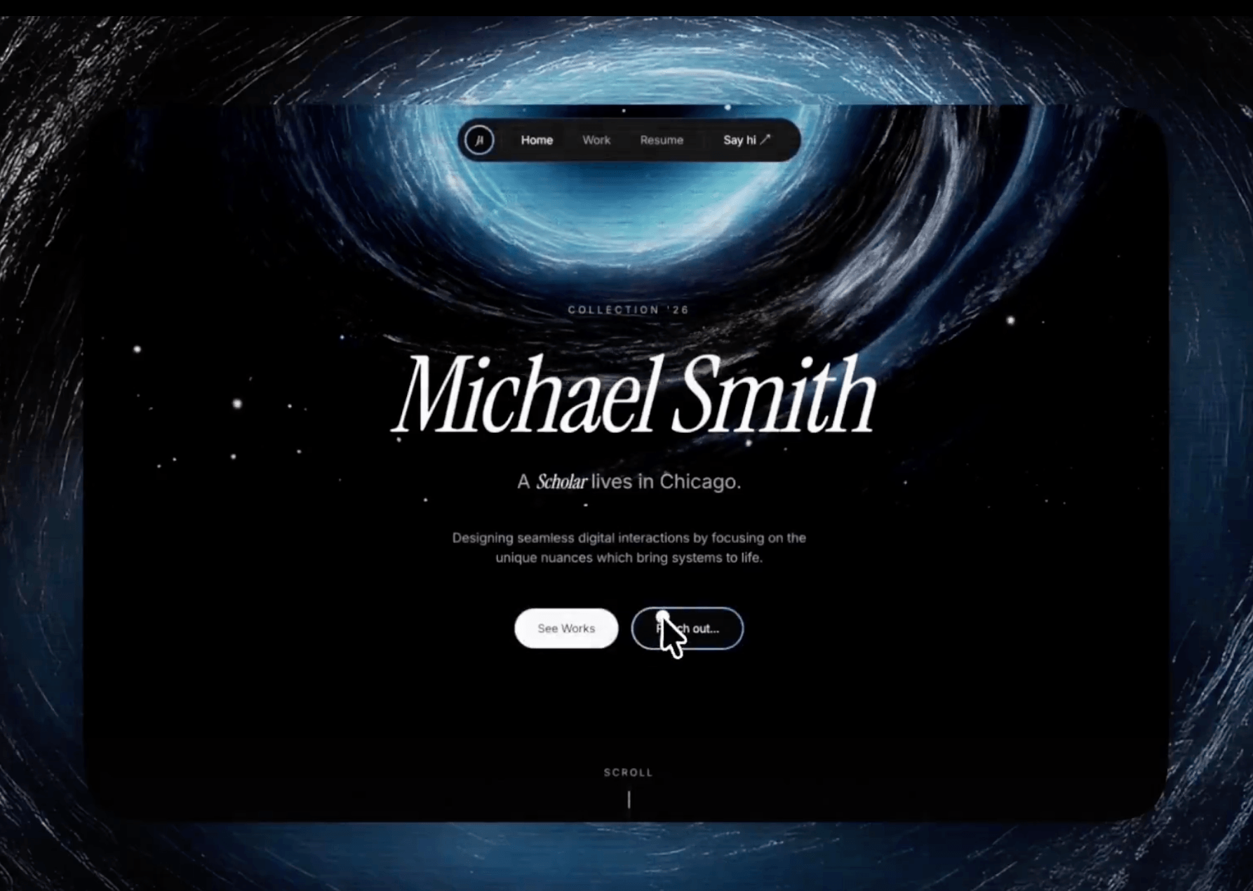
Build a single-page dark portfolio landing page using React + Vite + Tailwind CSS + TypeScript + GSAP + Framer Motion + hls.js.
---
## Global Design System
### Fonts
Google Fonts import: Inter (300–700) and Instrument Serif (italic, 400).
- --font-body: 'Inter', sans-serif → Tailwind font-body
- --font-display: 'Instrument Serif', serif → Tailwind font-display
### CSS Custom Properties (HSL, no hsl() wrapper — Tailwind adds it)
--bg: 0 0% 4%;
--surface: 0 0% 8%;
--text: 0 0% 96%;
--muted: 0 0% 53%;
--stroke: 0 0% 12%;
--accent: 0 0% 96%;
### Tailwind Custom Colors
bg: "hsl(var(--bg))",
surface: "hsl(var(--surface))",
"text-primary": "hsl(var(--text))",
muted: "hsl(var(--muted))",
stroke: "hsl(var(--stroke))",
### Accent Gradient
linear-gradient(90deg, #89AACC 0%, #4E85BF 100%) — used on logo ring, hover borders, progress bars. CSS utility class .accent-gradient.
### Custom Animations (in index.css)
- @keyframes scroll-down — translateY(-100%) → translateY(200%), 1.5s ease-in-out infinite
- @keyframes role-fade-in — opacity 0 + translateY(8px) → opacity 1 + translateY(0), 0.4s ease-out
- @keyframes gradient-shift — background-position 0% 50% → 100% 50% → 0% 50%, 6s ease infinite (for animated gradient borders)
### Forced dark theme — no light mode toggle. body gets bg-bg text-text-primary.
---
## Page Structure (Index.tsx)
{isLoading && <LoadingScreen onComplete={() => setIsLoading(false)} />}
---
## Section 1: Loading Screen
Full-screen overlay (fixed inset-0 z-[9999] bg-bg). Uses requestAnimationFrame counter from 000→100 over 2700ms.
- Top-left: "Portfolio" label — text-xs text-muted uppercase tracking-[0.3em]. Animates y:-20→0, opacity 0→1.
- Center: Rotating words ["Design", "Create", "Inspire"] cycling every 900ms. AnimatePresence mode="wait" with y:20→0→-20 transitions. text-4xl md:text-6xl lg:text-7xl font-display italic text-text-primary/80.
- Bottom-right: Counter display — text-6xl md:text-8xl lg:text-9xl font-display text-text-primary tabular-nums. Shows String(count).padStart(3, "0").
- Bottom progress bar: h-[3px] bg-stroke/50, inner div with .accent-gradient, scaleX(count/100) transform, box-shadow: 0 0 8px rgba(137, 170, 204, 0.35).
- On complete (count reaches 100): 400ms delay then calls onComplete.
---
## Section 2: Hero
Full-viewport section with background HLS video and centered content.
### Background Video
- HLS source: https://stream.mux.com/Aa02T7oM1wH5Mk5EEVDYhbZ1ChcdhRsS2m1NYyx4Ua1g.m3u8
- Uses hls.js — if Hls.isSupported(), create HLS instance; else if native HLS support, set video.src directly.
- Video: autoPlay muted loop playsInline, absolutely positioned and centered with min-w-full min-h-full object-cover -translate-x-1/2 -translate-y-1/2.
- Dark overlay: bg-black/20
- Bottom fade: h-48 bg-gradient-to-t from-bg to-transparent
### Navbar (fixed, floats at top center)
fixed top-0 left-0 right-0 z-50 flex justify-center pt-4 md:pt-6 px-4.
Inner pill: inline-flex items-center rounded-full backdrop-blur-md border border-white/10 bg-surface px-2 py-2. Gets shadow-md shadow-black/10 when scrollY > 100.
Contents (left to right):
1. Logo: 9×9 circle with accent gradient border (reverses direction on hover). Inner bg-bg circle with "JA" in font-display italic text-[13px]. Scales 110% on hover.
2. Divider: w-px h-5 bg-stroke mx-1 (hidden on mobile)
3. Nav links: ["Home", "Work", "Resume"] — text-xs sm:text-sm rounded-full px-3 sm:px-4 py-1.5 sm:py-2. Active: text-text-primary bg-stroke/50. Inactive: text-muted hover:text-text-primary hover:bg-stroke/50.
4. Divider
5. "Say hi" button: Same size as nav links. On hover, shows accent gradient border behind (using absolute span with inset: -2px). Inner content wrapped in bg-surface rounded-full backdrop-blur-md. Includes "↗" arrow.
### Hero Content (centered, z-10)
- Eyebrow: text-xs text-muted uppercase tracking-[0.3em] mb-8 — "COLLECTION '26". Class blur-in.
- Name: text-6xl md:text-8xl lg:text-9xl font-display italic leading-[0.9] tracking-tight text-text-primary mb-6 — "Michael Smith". Class name-reveal.
- Role line: "A {role} lives in Chicago." — roles cycle every 2s through ["Creative", "Fullstack", "Founder", "Scholar"]. Role word uses font-display italic text-text-primary animate-role-fade-in inline-block with key={roleIndex} for re-triggering animation.
- Description: text-sm md:text-base text-muted max-w-md mb-12 — "Designing seamless digital interactions by focusing on the unique nuances which bring systems to life."
- CTA Buttons (inline-flex gap-4):
- "See Works": Solid button. Default: bg-text-primary text-bg. Hover: bg-bg text-text-primary with accent gradient border ring.
- "Reach out...": Outlined button. Default: border-2 border-stroke bg-bg text-text-primary. Hover: border-transparent with accent gradient border ring.
- Both: rounded-full text-sm px-7 py-3.5 hover:scale-105.
### GSAP Entrance
Timeline with ease: "power3.out":
- .name-reveal: opacity 0→1, y 50→0, duration 1.2s, delay 0.1s
- .blur-in: opacity 0→1, filter blur(10px)→blur(0px), y 20→0, duration 1s, stagger 0.1, delay 0.3s
### Scroll Indicator
Bottom-center, text-xs text-muted uppercase tracking-[0.2em] "SCROLL" label above a w-px h-10 bg-stroke line with animated highlight using .animate-scroll-down.
---
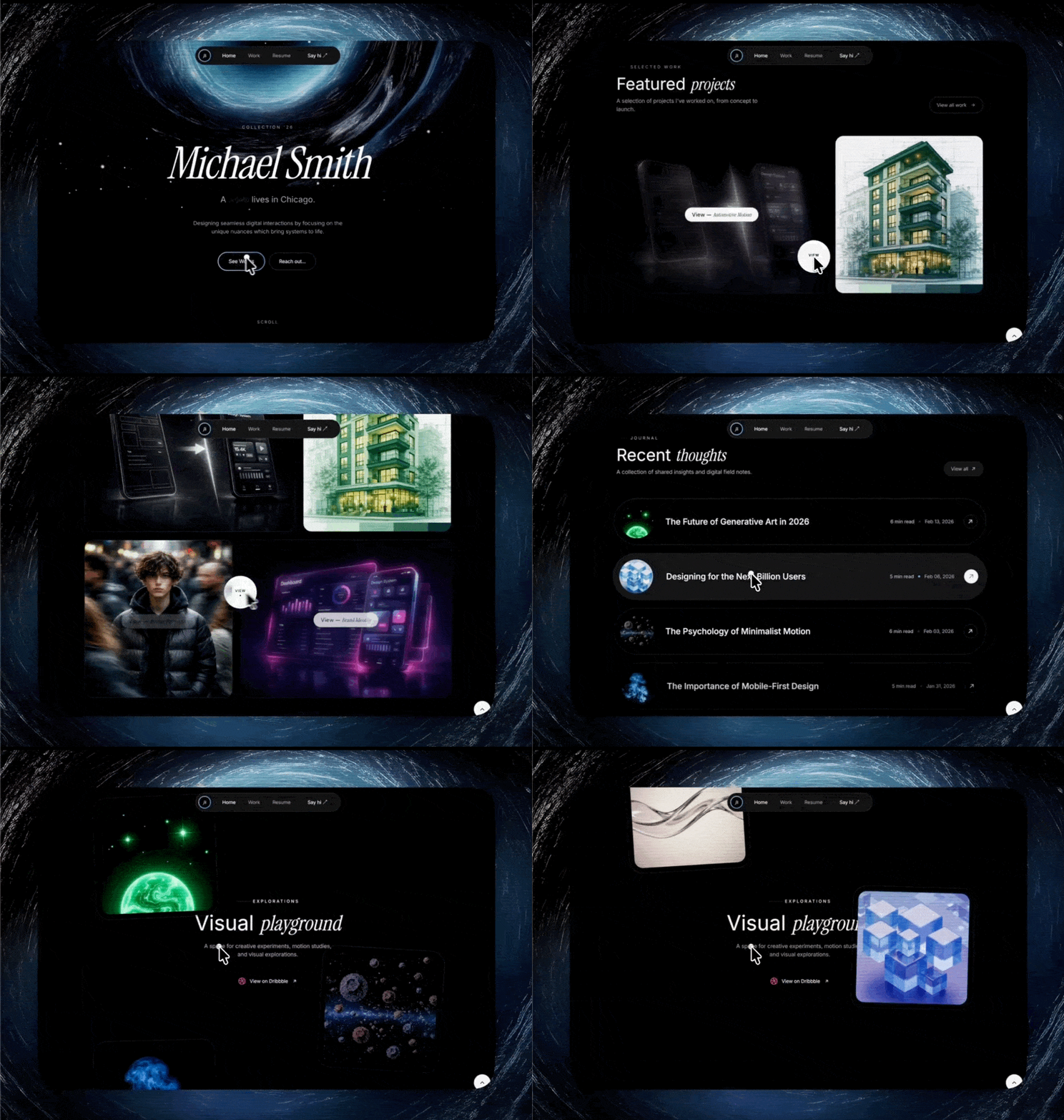
## Section 3: Selected Works
bg-bg py-12 md:py-16. Inner: max-w-[1200px] mx-auto px-6 md:px-10 lg:px-16.
### Header
Framer Motion whileInView — opacity 0→1, y 30→0, duration 1s, ease [0.25,0.1,0.25,1], viewport once margin "-100px".
- Eyebrow: w-8 h-px bg-stroke + "Selected Work" text-xs text-muted uppercase tracking-[0.3em]
- Heading: "Featured *projects*" — italic word in font-display italic
- Subtext: "A selection of projects I've worked on, from concept to launch."
- "View all work" button (desktop only, hidden md:inline-flex) — rounded-full with gradient hover border ring + right arrow
### Bento Grid
grid grid-cols-1 md:grid-cols-12 gap-5 md:gap-6. Column spans alternate: 7/5/5/7.
4 project cards with titles: Automotive Motion, Urban Architecture, Human Perspective, Brand Identity.
Each card: bg-surface border border-stroke rounded-3xl with aspect ratios. Contains:
- Background image with object-cover group-hover:scale-105
- Halftone overlay: radial-gradient(circle, #000 1px, transparent 1px) at 4×4px, opacity-20 mix-blend-multiply
- Hover: bg-bg/70 opacity-0→1 + backdrop-blur-lg
- Hover label: pill with animated gradient border, white bg, "View — *Title*" (title in font-display italic)
---
## Section 4: Journal
bg-bg py-16 md:py-24. Same header pattern (eyebrow + "Recent *thoughts*" + subtext + "View all" button).
4 journal entries displayed as horizontal pills (rounded-[40px] sm:rounded-full) with titles, images, read times, and dates.
Each entry: flex items-center gap-6 p-4 bg-surface/30 hover:bg-surface border border-stroke.
---
## Section 5: Explorations (Parallax Gallery)
min-h-[300vh] section for scroll-driven parallax.
### Layer 1: Pinned Center (z-10)
h-screen div pinned with GSAP ScrollTrigger.create({ pin: contentRef, pinSpacing: false }).
- Eyebrow: "Explorations"
- Heading: "Visual *playground*"
- Subtext + Dribbble button
### Layer 2: Parallax Columns (z-20, absolute)
grid grid-cols-2 gap-12 md:gap-40 inside max-w-[1400px].
6 items split into 2 columns with GSAP scroll-driven parallax movement.
Cards: aspect-square max-w-[320px], with rotation and lightbox on click.
---
## Section 6: Stats
bg-bg py-16 md:py-24. 3-column grid with stats: 20+ Years Experience, 95+ Projects Done, 200% Satisfied Clients.
---
## Section 7: Contact / Footer
bg-bg pt-16 md:pt-20 pb-8 md:pb-12 overflow-hidden.
### Background Video
Same HLS source as hero, but flipped vertically (scale-y-[-1]). Heavier overlay: bg-black/60.
### GSAP Marquee
"BUILDING THE FUTURE • " repeated 10×. GSAP xPercent: -50, duration 40, ease "none", repeat -1.
### CTA
Email button: mailto:hello@michaelsmith.com with gradient hover border ring.
### Footer Bar
Social links [Twitter, LinkedIn, Dribbble, GitHub] + Green pulsing dot + "Available for projects"
---
## Dependencies
gsap, framer-motion, hls.js, react-router-dom, tailwindcss-animate
Add smooth scroll nav and page transitions.Keep exploring
A preview-led portfolio prompt for generating a polished AI-built interface.
A preview-led agency prompt for generating a polished AI-built interface.
A preview-led agency prompt for generating a polished AI-built interface.
.webp)