.webp)
Hero
Bold Studio
A preview-led hero prompt for generating a polished AI-built interface.
by MotionSites View full prompt
A preview-led hero section prompt for generating a polished AI-built interface.
Direct delivery
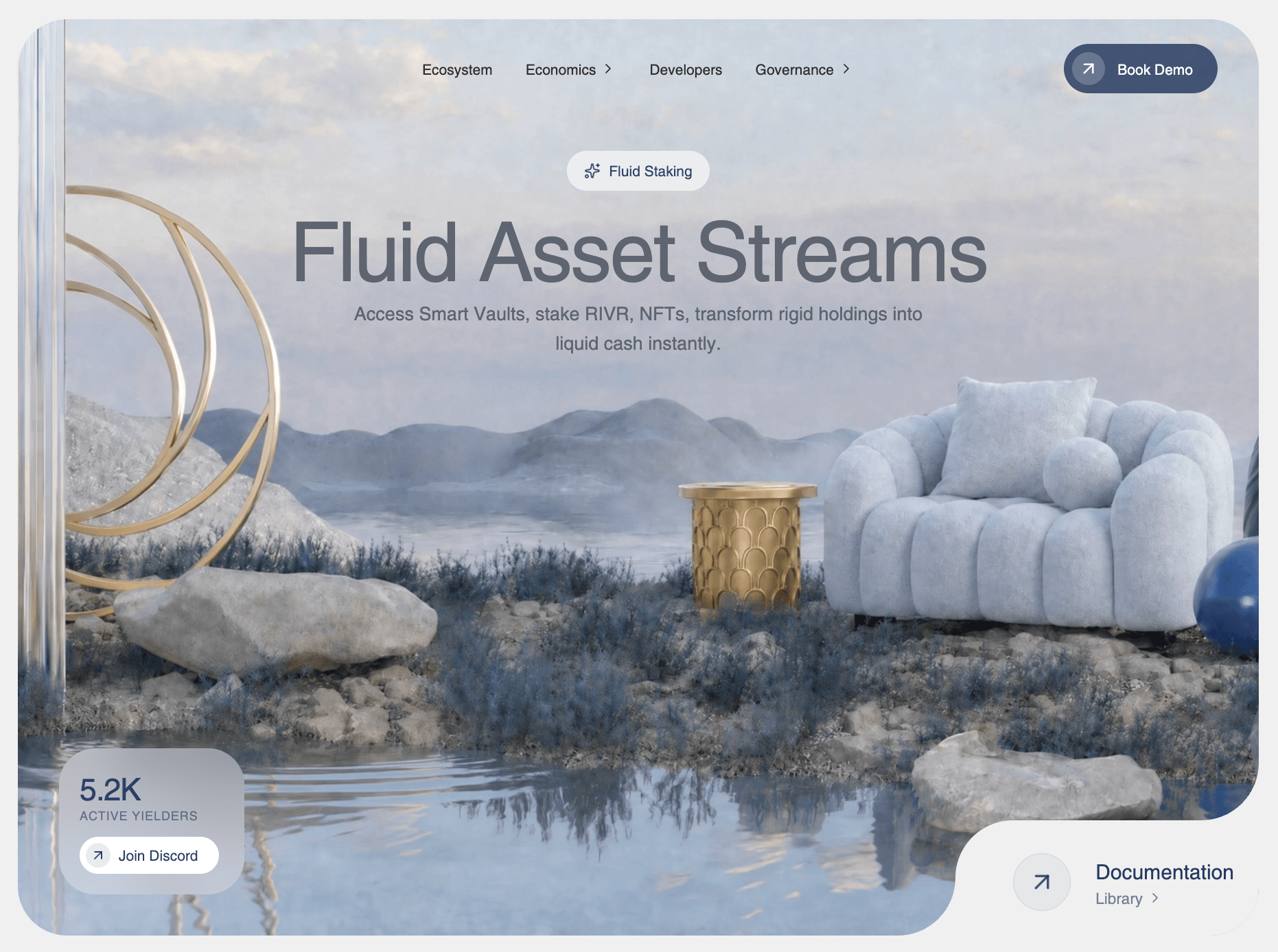
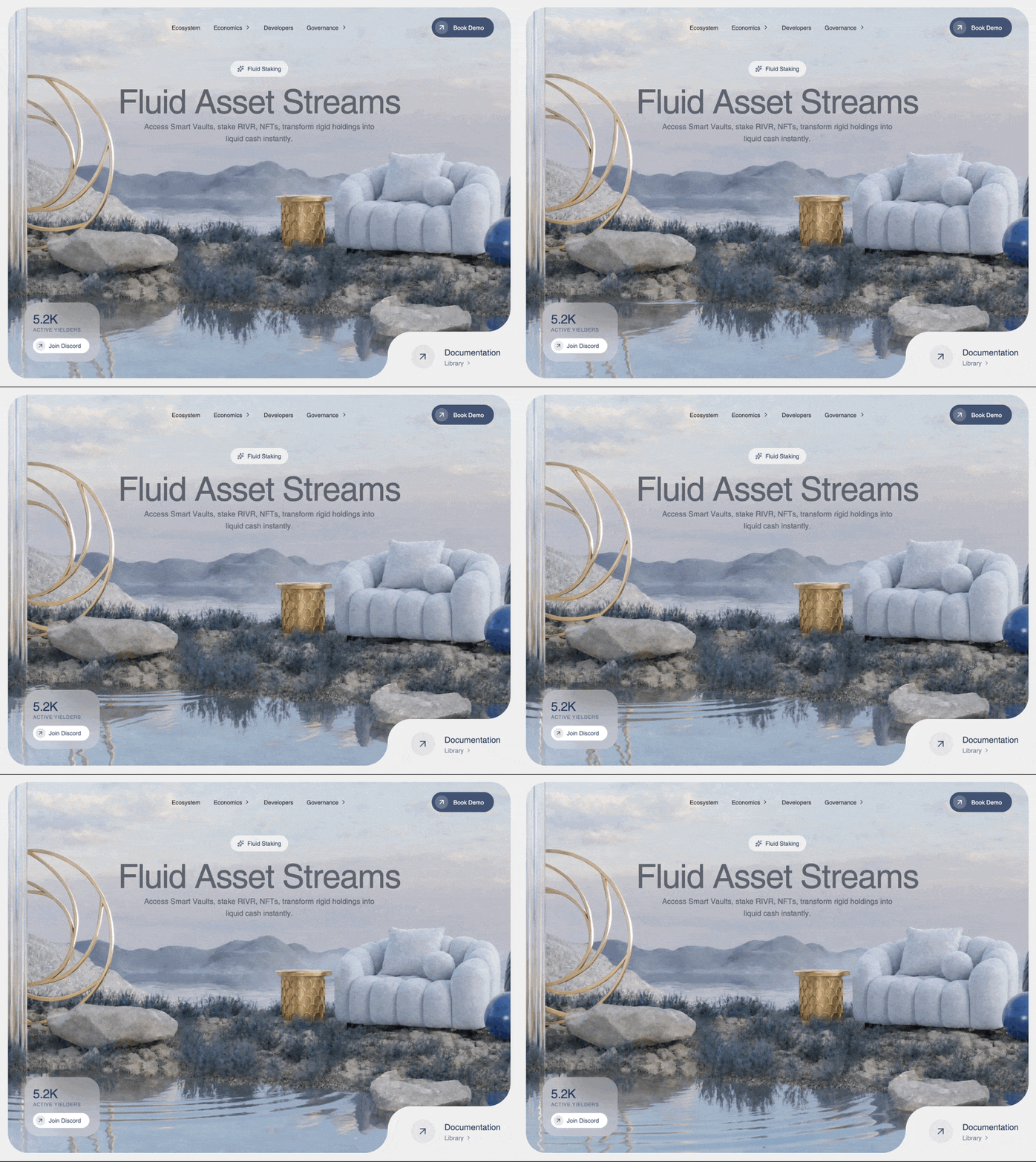
786 words · 82 linesBuild a Hero section for a DeFi dashboard named RIVR showcasing a sleek, glassmorphism aesthetic. Please mimic these exact specifications to ensure a premium UI.
Dependencies:
- Use `lucide-react` for icons.
- Use `motion` (imported from `'motion/react'`) for animations.
1. Global Styles (`src/index.css`)
Import the custom 'Helvetica Regular' font, set the Tailwind theme properly, and reset the body. Exact CSS to include:
@import "tailwindcss";
@font-face {
font-family: "Helvetica Regular";
src: url("https://db.onlinewebfonts.com/t/a64ff11d2c24584c767f6257e880dc65.eot");
src: url("https://db.onlinewebfonts.com/t/a64ff11d2c24584c767f6257e880dc65.eot?#iefix")format("embedded-opentype"),
url("https://db.onlinewebfonts.com/t/a64ff11d2c24584c767f6257e880dc65.woff2")format("woff2"),
url("https://db.onlinewebfonts.com/t/a64ff11d2c24584c767f6257e880dc65.woff")format("woff"),
url("https://db.onlinewebfonts.com/t/a64ff11d2c24584c767f6257e880dc65.ttf")format("truetype"),
url("https://db.onlinewebfonts.com/t/a64ff11d2c24584c767f6257e880dc65.svg#Helvetica Regular")format("svg");
}
@theme {
--font-helvetica: "Helvetica Regular", ui-sans-serif, system-ui, sans-serif;
}
:root {
font-family: var(--font-helvetica);
}
body {
margin: 0;
overflow-x: hidden;
background-color: #f0f0f0;
}
2. App Structure (`src/App.tsx`)
Create a single `<main className="min-h-screen bg-[#f0f0f0]">` instance that returns the `<Hero />` component.
3. Hero Component (`src/components/Hero.tsx`)
Outer wrapper: `<div className="w-full h-screen flex items-center justify-center p-3 md:p-5 bg-[#f0f0f0]">`.
Inner container: `<section className="relative w-full max-w-[1536px] h-full rounded-[1.5rem] md:rounded-[3rem] overflow-hidden shadow-none flex flex-col items-center bg-white/10 group">`
Inside the `<section>`:
- The Video Background:
A `<video>` element with `autoPlay muted loop playsInline`.
Classes: `absolute inset-0 w-full h-full object-cover object-[65%] lg:object-center z-0`.
Source URL: `https://d8j0ntlcm91z4.cloudfront.net/user_38xzZboKViGWJOttwIXH07lWA1P/hf_20260428_193507_4286c423-2fd9-4efd-92bd-91a939453fc1.mp4` (Must use exactly this URL).
- The Content Layer:
A `<div className="relative z-10 w-full h-full flex flex-col items-center">`.
Inside it, place: `<Navbar />`, the text container, `<BottomLeftCard />`, and `<BottomRightCorner />`.
- Text Container:
`<div className="w-full flex flex-col items-center pt-8 px-6 text-center max-w-4xl">`. Inside it:
- `<HeroBadge />`
- A `<motion.h1>` with class: `text-4xl sm:text-5xl md:text-6xl lg:text-[80px] font-normal text-[#5E6470] mb-2 tracking-tight leading-[1.05]`. Text: "Fluid Asset Streams". Animation: initial={{ opacity: 0, scale: 0.98 }}, animate={{ opacity: 1, scale: 1 }}, transition={{ duration: 0.8, delay: 0.2 }}.
- A `<motion.p>` with class: `text-sm sm:text-base md:text-lg text-[#5E6470] opacity-80 leading-relaxed max-w-xl font-normal`. Text: "Access Smart Vaults, stake RIVR, NFTs, transform rigid holdings into liquid cash instantly.". Animation: initial={{ opacity: 0 }}, animate={{ opacity: 1 }}, transition={{ duration: 0.8, delay: 0.4 }}.
4. Navbar Component (`src/components/Navbar.tsx`)
Wrapper: `<nav className="flex items-center justify-between py-6 px-6 md:px-10 w-full relative z-10">`.
- Left Side (hidden spacer for centering): `<div className="flex-1 hidden md:block" />`
- Center Menu: `<ul className="hidden md:flex items-center gap-8 text-[rgb(45,45,45)] font-normal text-sm">`. Include items: Ecosystem, Economics (hasDropdown), Developers, Governance (hasDropdown). List items need: `cursor-pointer hover:opacity-70 transition-opacity flex items-center gap-1 group`. Append a `ChevronRight` icon (classes: `w-4 h-4 transition-transform group-hover:translate-x-0.5`) if hasDropdown is true.
- Mobile Logo: `<div className="md:hidden"><span className="font-regular tracking-tighter text-xl text-[rgba(30,50,90,0.9)]">RIVR</span></div>`
- Right Button: `<div className="flex-1 flex justify-end">` wrapping a `<motion.button>` (whileHover={{ scale: 1.02 }} whileTap={{ scale: 0.98 }}).
Button classes: `flex items-center bg-[rgba(30,50,90,0.8)] text-white rounded-full pl-2 pr-4 md:pr-6 py-1.5 md:py-2 gap-2 md:gap-3 hover:bg-[rgba(30,50,90,1)] transition-colors group`. Inside button: Add an icon wrapper `<div className="bg-white/20 p-1 md:p-1.5 rounded-full flex items-center justify-center">` containing `ArrowUpRight` (w-4 h-4 md:w-5 md:h-5 text-white), and a text node "Book Demo" (`text-xs md:text-sm font-normal`).
5. HeroBadge Component (`src/components/HeroBadge.tsx`)
Returns a `<motion.div>` (initial opacity 0, y 20; animate opacity 1, y 0; transition duration 0.6, ease "easeOut").
Classes: `flex items-center gap-2 px-4 py-2 rounded-full bg-white/60 backdrop-blur-md border border-white/20 mx-auto mb-3 w-fit`.
Contents: `<Sparkles className="w-4 h-4 text-[rgba(30,50,90,0.8)]" />` and text `<span className="text-[14px] font-normal text-[rgba(30,50,90,0.9)]">Fluid Staking</span>`.
6. BottomLeftCard Component (`src/components/BottomLeftCard.tsx`)
Returns a `<motion.div>` (initial x: -20, opacity: 0; animate x: 0, opacity: 1; transition: duration 0.8, delay 0.2).
Position/Styling: `absolute bottom-28 right-4 left-auto md:left-6 md:right-auto md:bottom-6 lg:bottom-10 lg:left-10 p-3 md:p-4 lg:p-5 rounded-[1.2rem] md:rounded-[1.5rem] lg:rounded-[2.2rem] bg-white/30 backdrop-blur-xl flex flex-col gap-2 lg:gap-3 min-w-[140px] md:min-w-[150px] lg:min-w-[180px] w-fit`.
- Top text block: column with "5.2K" (classes: `text-2xl md:text-3xl font-normal text-[rgba(30,50,90,0.9)] tracking-tight`) and "Active Yielders" (classes: `text-[10px] md:text-[12px] font-normal text-[rgba(30,50,90,0.6)] uppercase tracking-wider`).
- Join Discord `<motion.button>` (hover/tap scale 1.02/0.98). Classes: `flex items-center bg-white rounded-full pl-1.5 pr-5 py-1.5 gap-2 hover:bg-white/90 transition-colors self-start group`. Inside: wrap `ArrowUpRight` in `<div className="bg-[rgba(30,50,90,0.1)] p-1 rounded-full ...">` (using `text-[rgba(30,50,90,0.9)]` for icon) and append "Join Discord" text (`text-[14px] font-normal text-[rgba(30,50,90,0.9)]`).
7. BottomRightCorner Component (`src/components/BottomRightCorner.tsx`)
This requires a complex faux-cutout layout. Use a `<motion.div>` (initial y: 20, opacity: 0; animate y: 0, opacity: 1; duration: 0.8, delay: 0.4).
Classes: `absolute bottom-0 right-0 p-3 pt-5 pl-8 sm:p-4 sm:pt-6 sm:pl-10 md:p-6 md:pt-8 md:pl-14 bg-[#f0f0f0] rounded-tl-[1.5rem] sm:rounded-tl-[2rem] md:rounded-tl-[3.5rem] flex items-center gap-3 sm:gap-4 md:gap-6`.
CRITICAL corner masks to include inside this container:
- Top intersection mask: `<div className="absolute -top-[1.5rem] sm:-top-[2rem] md:-top-[3.5rem] right-0 w-[1.5rem] sm:w-[2rem] md:w-[3.5rem] h-[1.5rem] sm:h-[2rem] md:h-[3.5rem] pointer-events-none"><svg width="100%" height="100%" viewBox="0 0 56 56" fill="none" xmlns="http://www.w3.org/2000/svg"><path d="M56 56V0C56 30.9279 30.9279 56 0 56H56Z" fill="#f0f0f0"/></svg></div>`
- Left intersection mask: `<div className="absolute bottom-0 -left-[1.5rem] sm:-left-[2rem] md:-left-[3.5rem] w-[1.5rem] sm:w-[2rem] md:w-[3.5rem] h-[1.5rem] sm:h-[2rem] md:h-[3.5rem] pointer-events-none"><svg width="100%" height="100%" viewBox="0 0 56 56" fill="none" xmlns="http://www.w3.org/2000/svg"><path d="M56 56H0C30.9279 56 56 30.9279 56 0V56Z" fill="#f0f0f0"/></svg></div>`
Content:
- Circle Icon: A div with `bg-[rgba(30,50,90,0.05)] w-10 h-10 md:w-14 md:h-14 rounded-full flex items-center justify-center border border-[rgba(30,50,90,0.1)]` using `ArrowUpRight` (`text-[rgba(30,50,90,0.8)]`).
- Info column containing title "Documentation" (`text-[16px] md:text-[20px] font-normal text-[rgba(30,50,90,0.95)]`). Below it, a line containing text "Library" and a `ChevronRight` icon wrapped in `<div className="flex items-center gap-1 text-[rgba(30,50,90,0.6)] cursor-pointer hover:text-[rgba(30,50,90,0.8)] transition-colors"><span className="text-[12px] md:text-[15px] font-normal">...`Keep exploring
A preview-led hero prompt for generating a polished AI-built interface.
A preview-led hero prompt for generating a polished AI-built interface.
A preview-led hero section prompt for generating a polished AI-built interface.

.webp)