.webp)
Hero
Bold Studio
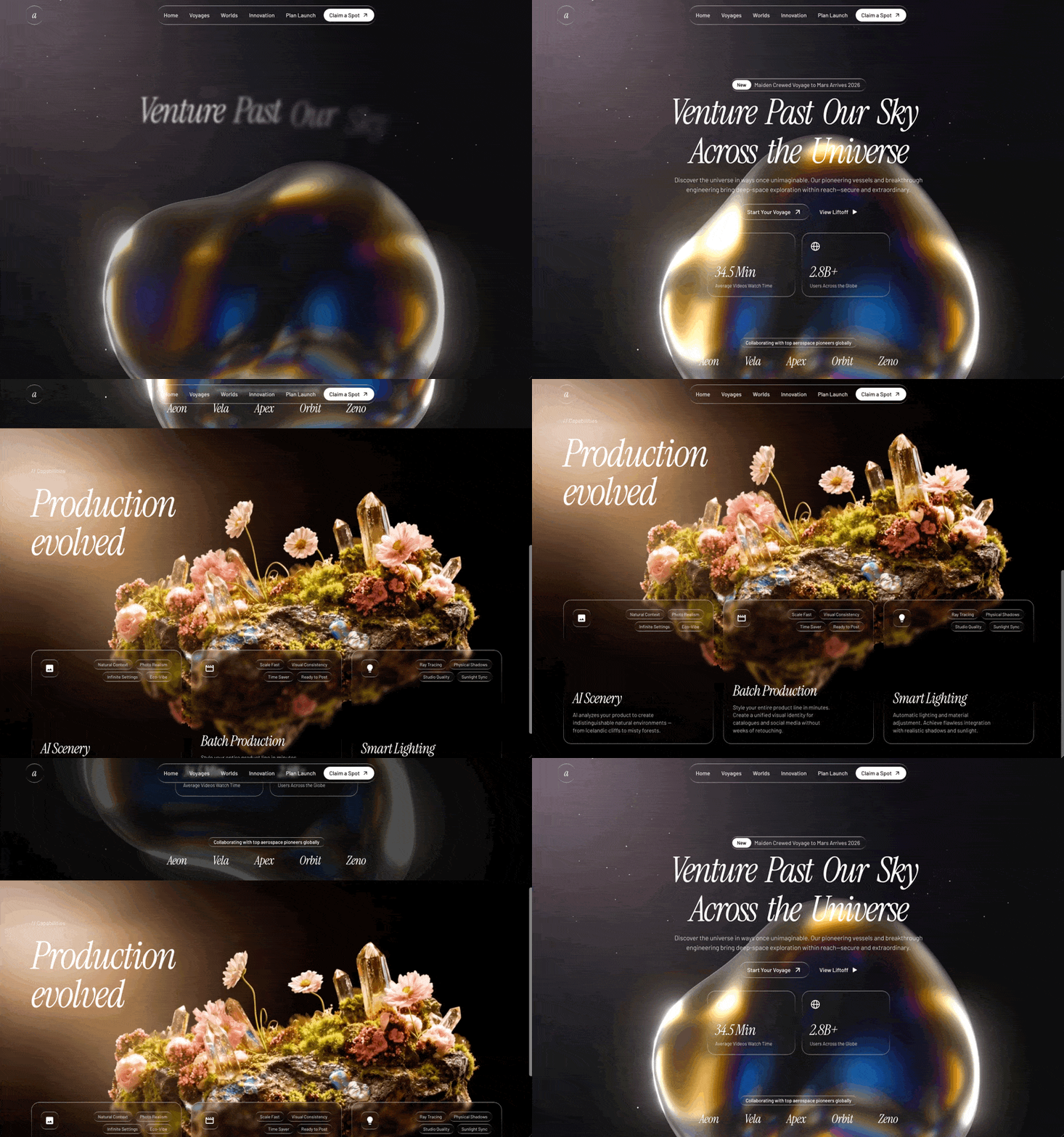
A preview-led hero prompt for generating a polished AI-built interface.
by MotionSites View full prompt
A preview-led hero section prompt for generating a polished AI-built interface.
Direct delivery
714 words · 90 linesCreate a full-screen dark hero landing page for a security company called "SENTINEL AI" using React, Vite, TypeScript, Tailwind CSS, shadcn/ui, and an embedded Spline 3D scene as the background. The tech stack uses @splinetool/react-spline and @splinetool/runtime for the 3D embed. Here is every detail:
FONT:
Google Fonts "Sora" with weights 300, 400, 500, 600, 700. Load it in index.html:
<link rel="preconnect" href="https://fonts.googleapis.com">
<link rel="preconnect" href="https://fonts.gstatic.com" crossorigin>
<link href="https://fonts.googleapis.com/css2?family=Sora:wght@300;400;500;600;700&display=swap" rel="stylesheet">
Set font-sora as the body font via Tailwind config: fontFamily: { sora: ["Sora", "sans-serif"] } and apply font-sora antialiased on body.
COLOR THEME (all HSL CSS custom properties, dark only, no light mode):
--background: 0 0% 10% (dark charcoal)
--foreground: 0 0% 96% (near-white)
--primary: 119 99% 46% (vivid green)
--primary-foreground: 0 0% 4% (near-black)
--secondary: 0 0% 18%
--secondary-foreground: 0 0% 96%
--muted: 0 0% 16%
--muted-foreground: 0 0% 60%
--accent: 119 99% 46% (same vivid green as primary)
--accent-foreground: 0 0% 4%
--destructive: 0 84% 60%
--border: 0 0% 20%
--input: 0 0% 20%
--ring: 119 99% 46%
--radius: 0.5rem
--nav-button: 0 0% 18%
--hero-bg: 0 0% 8% (the darkest background, nearly black)
Map these in Tailwind config using hsl(var(--variable)) pattern. Add custom color tokens: nav-button and hero-bg.
CUSTOM ANIMATIONS (Tailwind config keyframes + animation):
fade-up keyframe:
0%: opacity: 0, transform: translateY(20px), filter: blur(4px)
100%: opacity: 1, transform: translateY(0), filter: blur(0)
Animation: fade-up 0.7s cubic-bezier(0.16, 1, 0.3, 1) forwards
fade-in keyframe:
0%: opacity: 0
100%: opacity: 1
Animation: fade-in 0.5s ease-out forwards
NAVBAR (fixed, transparent, floating over the Spline scene):
fixed top-0 left-0 right-0 z-50, horizontal flex, justify-between, padding px-8 lg:px-16 py-5
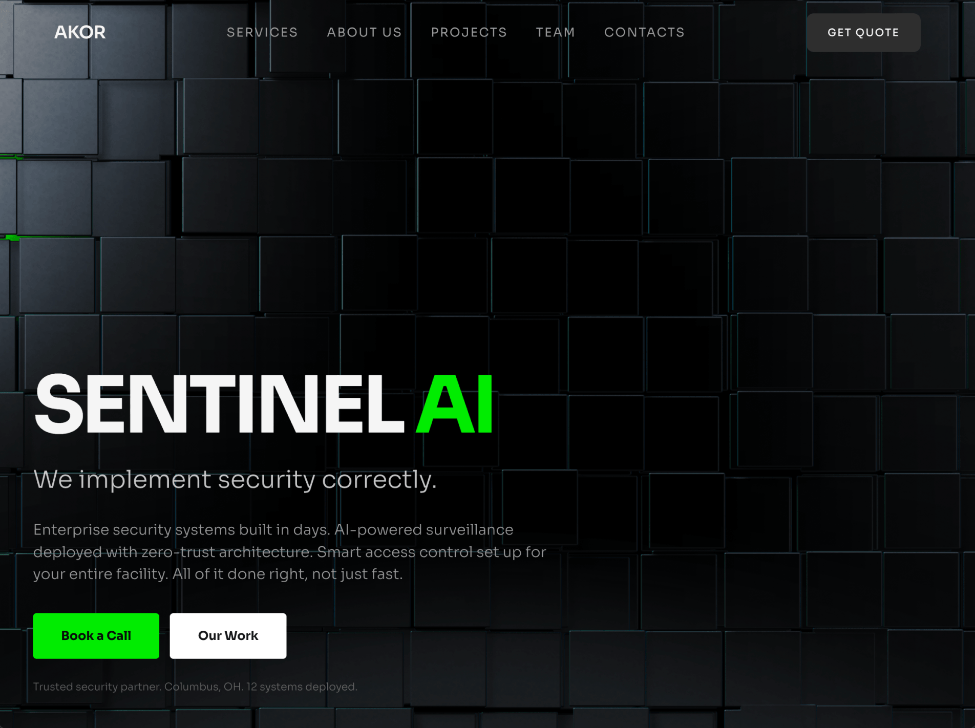
Left: Logo text "SENTINEL" -- text-foreground text-xl font-semibold tracking-tight
Center: Nav links array: ["Services", "About Us", "Projects", "Team", "Contacts"] -- each is text-sm text-muted-foreground hover:text-foreground transition-colors uppercase tracking-widest. Links use href={#section-name}. Hidden on mobile (hidden md:flex), with gap-8.
Right: "Get Quote" button using shadcn Button with a custom navCta variant: text-foreground bg-nav-button hover:bg-nav-button/80 active:scale-[0.97] transition-all. Size lg, with classes hidden md:inline-flex rounded-lg uppercase text-xs tracking-widest px-6.
HERO SECTION (full-screen, content at bottom-left):
Structure:
Outer <section>: relative min-h-screen flex items-end bg-hero-bg overflow-hidden
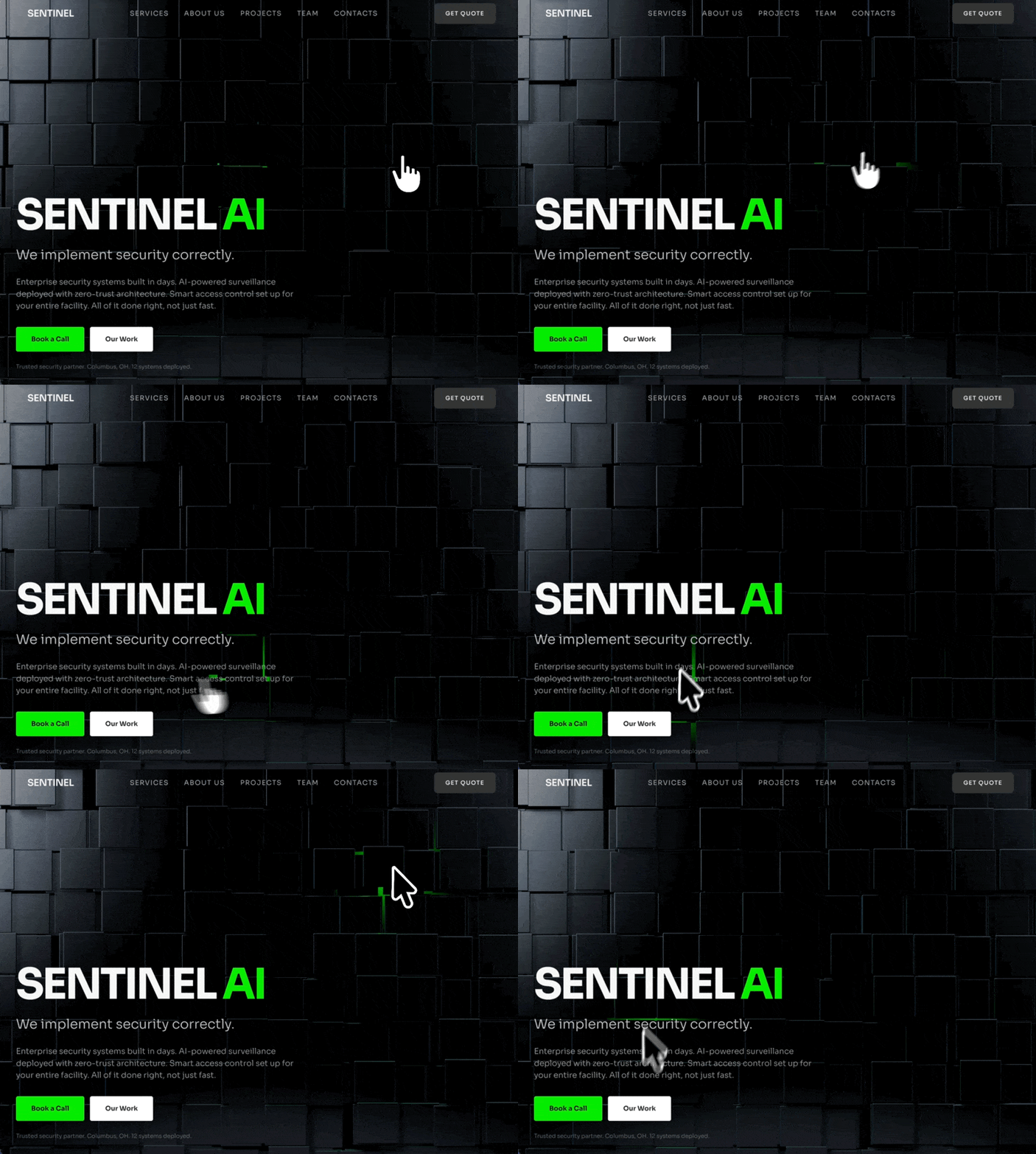
Spline 3D Background (absolute, full-size): Lazy-loaded via React.lazy(() => import("@splinetool/react-spline")) wrapped in <Suspense> with a fallback <div className="absolute inset-0 bg-hero-bg" />. The Spline component uses scene="https://prod.spline.design/Slk6b8kz3LRlKiyk/scene.splinecode" and className="w-full h-full". Placed inside <div className="absolute inset-0">.
Dark overlay: <div className="absolute inset-0 bg-black/30 z-[1] pointer-events-none" />
Content container: relative z-10 pointer-events-none w-full max-w-[90%] sm:max-w-md lg:max-w-2xl px-6 md:px-10 pb-10 md:pb-10 pt-32
Content elements (all with staggered animate-fade-up, starting opacity-0):
Heading (delay 0.2s): <h1> with text "SENTINEL" in white + " AI" in primary green. Classes: text-[clamp(3rem,8vw,6rem)] font-bold leading-[1.05] tracking-[-0.05em] text-foreground mb-2 md:mb-4 uppercase. The "AI" part is wrapped in <span className="text-primary">.
Subheading (delay 0.4s): <p> -- "We implement security correctly." -- text-foreground/80 text-[clamp(1.125rem,2.5vw,1.875rem)] font-light mb-3 md:mb-6
Description (delay 0.55s): <p> -- "Enterprise security systems built in days. AI-powered surveillance deployed with zero-trust architecture. Smart access control set up for your entire facility. All of it done right, not just fast." -- text-muted-foreground text-[clamp(0.875rem,1.5vw,1.25rem)] font-light mb-4 md:mb-8
Two CTA buttons (delay 0.7s): Wrapped in flex flex-wrap gap-3 font-bold. Both are plain <button> elements (not shadcn Button) with pointer-events-auto (to re-enable clicks since parent is pointer-events-none):
"Book a Call": bg-primary text-primary-foreground px-6 py-3 md:px-8 md:py-4 text-sm rounded-sm cursor-pointer hover:brightness-110 transition-all active:scale-[0.97]
"Our Work": bg-white text-background px-6 py-3 md:px-8 md:py-4 text-sm rounded-sm cursor-pointer hover:brightness-90 transition-all active:scale-[0.97]
Trust line (delay 0.85s): <p> -- "Trusted security partner. Columbus, OH. 12 systems deployed." -- text-muted-foreground/60 text-xs font-light mt-4 md:mt-6
All animated elements use style={{ animationDelay: "Xs" }} for the stagger, combined with the opacity-0 animate-fade-up classes.
PAGE WRAPPER (Index.tsx):
Simple wrapper: <div className="bg-hero-bg min-h-screen"> containing <Navbar /> and <HeroSection />.
KEY DEPENDENCIES:
@splinetool/react-spline and @splinetool/runtime for the 3D Spline embed
tailwindcss-animate plugin
shadcn/ui Button component with custom variants (navCta, hero, heroOutline)
class-variance-authority for button variants
IMPORTANT NOTES:
The Spline scene URL is https://prod.spline.design/Slk6b8kz3LRlKiyk/scene.splinecode -- this is the exact 3D scene used
The entire content area has pointer-events-none so clicks pass through to the Spline scene, but buttons re-enable with pointer-events-auto
Responsive fluid typography uses clamp() for the heading, subheading, and description
The content is anchored to the bottom-left of the viewport (flex items-end on the section + padding-bottom on the content)
No hamburger menu on mobile -- the nav links and CTA simply hide (hidden md:flex / hidden md:inline-flex)Keep exploring
A preview-led hero prompt for generating a polished AI-built interface.
A preview-led hero prompt for generating a polished AI-built interface.
A preview-led hero section prompt for generating a polished AI-built interface.

.webp)