.webp)
Hero
Bold Studio
A preview-led hero prompt for generating a polished AI-built interface.
by MotionSites View full prompt
A preview-led hero section prompt for generating a polished AI-built interface.
Direct delivery
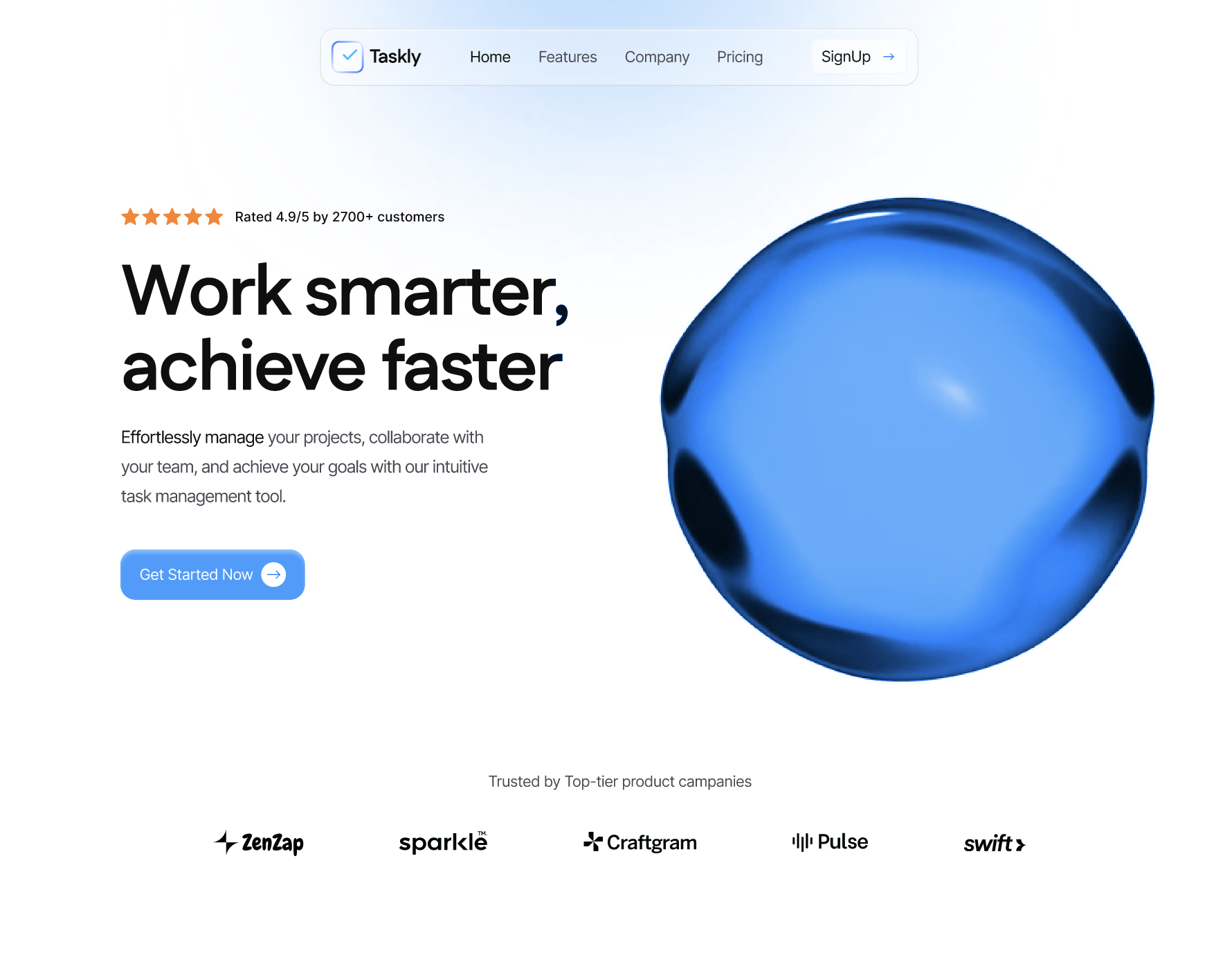
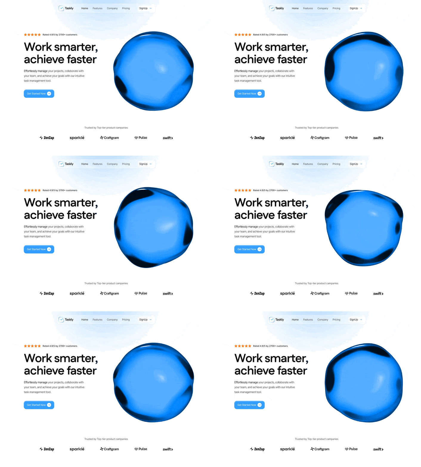
330 words · 42 linesSystem Prompt: High-Fidelity "Liquid Glass" Hero Section Core Layout: Create a 1600px max-width landing page hero section. The background should be pure white with a subtle, layered gradient glow in the top-left (using blurred ellipses in light blue #60B1FF and #319AFF). The design must be fully responsive, transitioning from a single-column mobile view to a dual-column desktop layout. Typography: Headlines & Brand: Use Fustat (Bold). Body & UI: Use Inter (Normal/Medium). Hero Headline: "Work smarter, achieve faster" (75px, 1.05 line-height, -2px tracking). The "Strong Liquid Glass" Navbar: Position: Sticky at top-[30px], centered, w-fit. Visuals: backdrop-blur-[50px], background rgba(255,255,255,0.3), rounded-[16px]. Fidelity Details: Outer Stroke: 1px solid rgba(0,0,0,0.1). Inner Highlight Shadow: inset 0px 4px 4px 0px rgba(255,255,255,0.25). Items: Logo "Taskly" (Fustat), Nav links (Home, Features, Company, Pricing), and a glassy "SignUp" button with an arrow icon. The Glassy Orb (Hero Right): Source URL: https://future.co/images/homepage/glassy-orb/orb-purple.webm Blending Mode: Must use mix-blend-screen to filter the black background. Scaling: scale-125 to make it massive and bleed slightly off-center. Exact Color Grade (CSS Filter): hue-rotate(-55deg) saturate(250%) brightness(1.2) contrast(1.1). This transforms the purple asset into a vibrant, high-end "Electric Brand Blue" that matches the primary CTA. Hero Content (Hero Left): Social Proof: A "Rated 4.9/5 by 2700+ customers" badge with five orange #FF801E stars. Subheadline: "Effortlessly manage your projects, collaborate with your team, and achieve your goals with our intuitive task management tool." (18px, Inter, -1px tracking). Primary CTA: "Get Started Now" button. Color: rgba(0,132,255,0.8) with backdrop-blur-[2px]. Details: rounded-[16px], white text, inner highlight shadow inset 0px 4px 4px 0px rgba(255,255,255,0.35), and a white circular arrow icon. Animation: Scale 1.02 on hover with a smooth transition. Footer Logos: Include a "Trusted by Top-tier product companies" section at the bottom with 5 grayscale SVG logos (e.g., placeholder logos for tech companies) spaced at gap-[100px]. Key Technical Specs for the Developer: Video Tag: autoPlay loop muted playsInline. Container: Use a relative wrapper for the background glow and a z-10 main container for the content. Smoothing: Apply -webkit-font-smoothing: antialiased for the sharpest typography.
Keep exploring
A preview-led hero prompt for generating a polished AI-built interface.
A preview-led hero prompt for generating a polished AI-built interface.
A preview-led hero section prompt for generating a polished AI-built interface.

.webp)